
Concept design for The Walt Disney Studios main restaurant (commissary), 1939; Kem Weber; ©UCSB
When Kem Weber was hired by Walt Disney to be the chief designer of the Disney Studio complex in Burbank in 1939, he was already on the leading edge of the Streamline Modern movement. To understand why the Disney animation furniture is so revered, one has to look at Weber’s earlier career and the design movements that influenced him, to more fully appreciate the furniture that he designed for Disney.
By 1910, Karl Emanuel Martin (KEM) Weber was an apprentice to leading furniture designer Bruno Paul, a great modernist thinker of the day in Germany and Austria. Pleased with Weber’s work, Paul recommended that he design the German section of the 1915 Panama-Pacific Exposition in San Francisco. In May 1914, Weber then left Germany for San Francisco to supervise the construction at the Exposition. But in August 1914, with the outbreak of World War I, the construction drawings he brought with him were confiscated by the U.S. Government, and Weber was stranded in the Bay Area.
Unable to return home, Weber took on a series of jobs, including decorating flowerpots, designing ads for an outdoor advertising company, working as a lumberjack, and even operating a chicken farm until the war ended in 1918. He briefly opened a design studio in Berkeley, California, but that didn’t last because of prejudice against anything of German influence. But California “…allowed him to take what he had learned and what he had been trained in of these early proto-modernist ideas of reductionism and following along with industrialized ideas rejecting classicism, rejecting historical precedent. In that regard, California was kind of the perfect place to practice this kind of philosophy,” said Peter Loughrey, an appraiser for PBS’s Antiques Roadshow and director of modern design and fine art at Los Angeles Modern Auctions.
After the armistice was signed, Weber moved to Santa Barbara, where he designed interiors for homes and produced furniture, wood carvings, draperies, and paintings. His work was predominately for homes in Santa Barbara and Montecito that were mostly in the Spanish Colonial Revival style. From there, he moved to Los Angeles in 1921 and went to work as a draftsman in the design studio at Barker Bros. Furniture. Within a year, he was promoted to art director. Weber became a U.S. citizen in 1924.
By this time, the Art Deco movement was in full swing. Short for Arts Décoratifs, Art Deco originated in France during the mid-1910s and combined the modernist styles that were emerging in Western Europe with influences from Art Nouveau, the Bauhaus movement, and Cubism. The term Art Deco was coined at the Exposition Internationale des Arts Décoratifs et Industriels Modernes (International Exposition of Modern Decorative and Industrial Arts), held in Paris in 1925, which Weber attended. Art Deco had several variants to it, most notably Zigzag Moderne and Streamline Moderne, both of which were made less formal by American designers as they blended elements of the Arts and Crafts movement from the turn of the twentieth century.
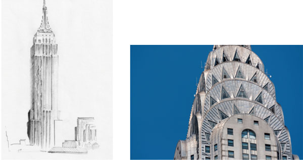
Zigzag Moderne details of the Empire State and Chrysler Buildings in New York City.
The Zigzag Moderne was a highly decorative form with zigzag designed buildings adorned with geometric ornamentation on the facades. It was inspired by design elements from ancient Egypt, Rome, Asia, and Greece, with aspects of industrialization —the Machine Age. This style was more distinctive to urban areas such as New York with skyscrapers like the Empire State Building, the Chrysler Building, and Radio City Music Hall. In urban centers there was a verticality to design. “People like [designer] Paul Frankel in New York, who had a built- in community of people who were supporting his ideas of the skyscraper mentality, of building big, building tall. Someone like Frankel was obsessed with the technology and industry around him which was building bigger and bigger buildings. So, his furniture and his designs naturally had a tall, thin, elegant structuralism to them. Out here in California it was not necessary to build tall. We had plenty of land, you could build out. And I think that at its core this is the basis of Kem Weber’s genius at that time. Almost everything he designed had a sense of horizontality to it, which was obviously in direct contrast to the verticality of Frankel on the East Coast,” said Loughrey.
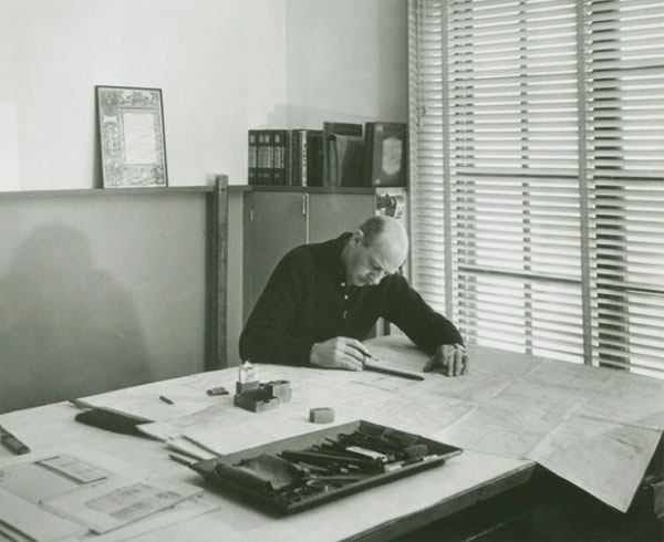
Kem Weber in his Los Angeles design studio circa. 1935; ©UCSB
In 1926, after returning from Europe, Weber created the Modes and Manners shop within furniture retailer Barker Bros. This was one of the first departments in the United States dedicated entirely to modern furniture and accessories, many of which were his designs. The following year he opened his own design studio in Hollywood. He not only designed furniture and products, but also buildings and integrated interiors for hotels, shops, and private homes. Then, in 1928, Weber had the opportunity to design a three-room apartment at Macy’s Second International Exposition of Art and Industry that brought him national notoriety, which resulted in commissions from companies across the country. Weber’s stature as an architect and forward- thinking designer was rising as he became a leading figure in the Moderne design movement, becoming the chairman of the department of industrial design of the newly organized Art Center School in Los Angeles in 1931. As the aesthetics of art moderne continued to change, Weber was fully immersed in what became known as Streamline Moderne by 1934, the origins of what is known as West Coast Moderne, a more casual form of the modern movement most associated with the California lifestyle.

Kem Weber’s 1928 Macy’s Second International Exposition of Art and Industry award-winning apartment design. It is an example of Streamline moderne style. Note the clean lines and lack of ornamentation. ; Courtesy of The Library of Congress
The Streamline Moderne style was a continuing evolution of Art Deco that emerged from the Great Depression and focused more on stripping away unnecessary ornamentation and streamlining forms. It focused on smooth curved walls, rounded edges, and long horizontal lines with an emphasis on a clean look. “So, we have these soft rounded edges, which actually come out of the Arts and Crafts movement that preceded it,” said Paula Sigman-Lowery, archivist and historian.
There were nautical elements such as circular “porthole” windows, steel railings and “a signature trio of horizontal speed stripes suggesting motion” that acted as a design thread in the holistic thinking of creating the structure, interiors, and furnishing of a single project. The Streamline Moderne style was a direct reflection of the growth of modern transportation during the 1930s— automobiles, planes, trains, and ocean liners—which used aerodynamic design elements to create a clean, sleek appearance. “So, the prevailing industry at that moment was transportation. That was kind of the most modernist industry at the time. Steamship lines were constantly trying to outdo each other and go faster across the Atlantic. There was this idea of using technology and using manufacturing ideas to constantly create a better ship,” said Loughrey. “Airplanes themselves were in their infancy and were becoming a fascination of modernists because here is an object that has no room for decoration. The fuselage of an airplane has got to be functional and for someone like Kem Weber, the fascination with the discipline of that type of object drove his interest in architecture and design.” These were design elements that Weber embraced and are evident in his work including the cabin interior he designed for a private airplane. It was those projects and inspirations that influenced the work he did on Walt Disney’s new animation studio complex in Burbank later in that decade.
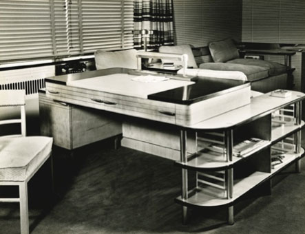
Modular desk for the master sitting room at the Bixby House in Kansas City, Missouri.
Weber’s fortunes were up and down during the Great Depression, and his position at the Art Center School afforded him the ability to have a regular income and to continue his independent design work. He designed sets for Paramount Pictures and established the Tempo shop at Barker Bros., in which he designed the showroom and much of the furniture. He designed clocks, light fixtures, and dozens of chairs and occasional tables for a variety of companies that were in a price range that appealed to a broad middle-class buyer. In describing the furniture in an interview, Weber told a reporter, “It is a matter, as well, of harmonizing lines and low, restful tones, and a sensation of unlimited space even in a small room.” Weber also designed high-end pieces for wealthier clients including all the furnishings for the Bixby House in Kansas City, Missouri, for Walter Edwin Bixby Sr., a successful insurance executive who helped establish Kansas City Life as one of the nation’s leading insurance firms at the time.
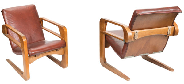
In 1936, Weber wrote a guest column in the Los Angeles Times on classicism in design with respect to progress. In the article he writes, “A true modern piece of furniture is designed to incorporate all the advantages of modern materials, production facilities and construction, and if it is good design it will give a beautiful result.” The Air Line Chair was a perfect example of that design philosophy. Weber continued, “It will be good to look at, practical in its uses and becoming to ourselves. It will be less expensive and better in quality.” That sums up all the furniture that Weber designed for the Disney studio complex—it is good to look at as well as very practical since the designs were arrived at with input from the artists that would be using the furniture.
This essay is a partial extract from Dave Bossert’s latest book, Kem Weber: Mid-Century Furniture Designs for the Disney Studios, from The Old Mill Press (2018). All footnotes are listed in the Endnotes section of the book.
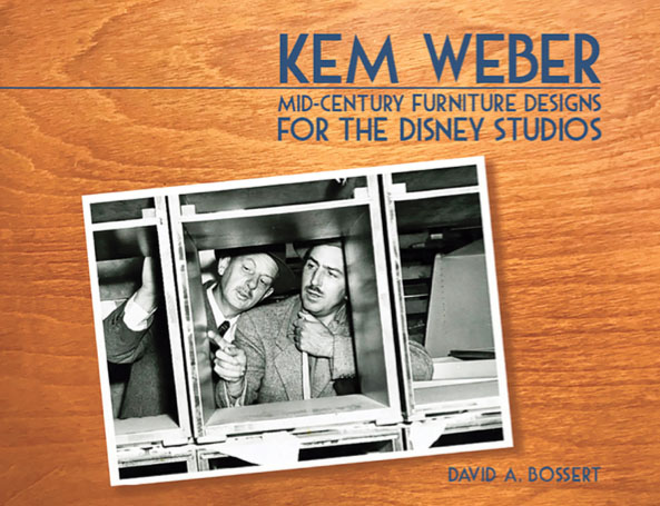
In his authoritative new work, Kem Weber: Mid-Century Furniture Designs for the Disney Studios, Dave Bossert once again shows a fusion of erudition and passion for his subject, introducing a new generation to a remarkable and sadly-neglected artist, and documenting the significant and timeless cross-disciplinary design portfolio he created for Walt Disney. Kem Weber: Mid-Century Furniture Designs for the Disney Studios is a treasure for artists, aficionados of industrial design, fans of midcentury style, and Disney buffs; a remarkable story of the collaboration between two ingenious visionaries, and a lexicon of the ageless creative consequence of their association.”
—Jeff Kurtti, Author and Disney Historian
“Dave Bossert honors the important under-noticed things most of us seldom think about. Here he is, after a distinguished career as a Disney animator and exec, he’s written this book about the innovative studio furniture that made animated production possible from1939 until digital technology changed the processes. What a fascinating read!”
—Harry Youtt, Poet and Author
“A few years ago, Dave Bossert authored a beautiful book about an obscure chapter in the history of Disney Studios: a time when Walt Disney and Salvador Dali collaborated on an animated project. [Dali & Disney: Destino]. Now Dave honors the late architect and designer, Kem Weber and catalogs the custom studio furniture he designed with Walt Disney in Kem Weber: Mid-Century Furniture Designs for the Disney Studios. Thank you Dave for your meticulous attention!”
—Judith Simon Prager, Author: What the Dolphin Said
“Designers have long acknowledged Kem Weber’s furniture for Walt Disney’s studio in Burbank as beautiful yet utilitarian mid-century modern masterpieces. Now, for the first time, Disney artist and author Dave Bossert reveals the thoughtful approach with which Weber and Walt Disney himself developed these pieces, and explores their contribution to the creation of the animated classics beloved the world over.”
— Paula Sigman Lowery, Author and Disney Historia
“Kem Weber’s futuristic yet functional furniture was masterfully designed and skillfully crafted for just one purpose: to streamline the creation of the world’s most entertaining animated movies. Long overlooked, this book tells the story behind these stylish and elegant wooden works of art, which makes the heart of this animation veteran skip a beat!”
–Hans Perk, Animation Director & Historian


 David A. Bossert is an award-winning artist, filmmaker, and author. He received his B.A. from CalArts School of Film and Video with a major in Character Animation. As a 32-year veteran of The Walt Disney Company, he contributed his talents to The Black Cauldron (1985), Who Framed Roger Rabbit (1988), The Little Mermaid (1989), Beauty and the Beast (1991), Aladdin (1992), Tim Burton’s The Nightmare Before Christmas (1993), The Lion King (1995), Fantasia/2000 (1999), and the Academy Award-nominated shorts Runaway Brain (1995), Dali/Disney Destino (2003), and Lorenzo (2004), among many others. Bossert is now an independent producer, creative director, and writer.


Great article, Dave! Out of curiosity, did you help consult the recent remodeling of the two “Word of Disney” stores in the U.S. resorts. The new interiors are apparently based on the legendary animation building.
Thanks Nic. I appreciate your note and glad you enjoyed the article. No, I didn’t have anything to do with the “World of Disney” stores. Mid-Century Modern style is very popular at the moment and its influence can be seen all over.