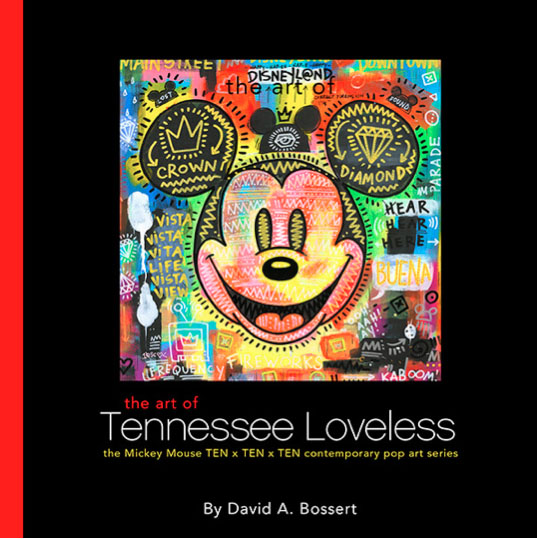
The Art of Tennessee Loveless: The Mickey Mouse TEN X TEN X TEN Contemporary Pop Art Series by David A. Bossert releases on October 31, 2017, from Disney Editions. © Disney
I love stories that showcase triumph over adversity. Those sometimes-devastating setbacks that turn into massive successes like when Walt Disney lost the contract to Oswald the Lucky Rabbit and bounced back by creating Mickey Mouse. But, how about those individuals who are presented with physical challenges that are beyond their control yet they defy the odds overcoming those handicaps and achieving success.
Chicago based pop artist Tennessee Loveless is just such an individual. He was diagnosed with limited achromatopsia, which is the state of being almost completely color-blind. Individuals with complete achromatopsia cannot see any colors other than black, white, and shades of gray. But incomplete or limited achromatopsia is a milder form of the condition that allows for some delineation of color. That means the person may be able to distinguish the warm color spectrum from the cooler color spectrum. For Loveless, he can see yellow.
Being able to see yellow is typical of those with blue cone monochromacy, a version of limited achromatopsia. Most people born with normal eyes have rods—which see black, white, and shades of gray—and cones—which can see red, green, and blue. In blue cone monochromacy, the individuals just have functioning rods and blue cones, which account for only 2 percent of all the cones in the retina portion of the eye. Essentially, 98 percent of Tennessee’s cones are not functioning at all. However, the fact that he has functioning blue cones does not mean that he sees the color blue like you or I would see it; he sees it differently.
The color-blindness coupled with learning disabilities made it difficult for Loveless to concentrate in school and he consequently started to doodle and draw pictures. He found that visually drawing out concepts helped him understand the material. So, he drew, and drew, and drew, which helped him develop a visual language that manifested itself in his art. All of those early school experiences helped shape Tennessee as an artist.
The drawing he did throughout high school led him to pursue advanced studies in art, and he went on to attend the Savannah College of Art and Design. His first year required taking the basic fundamental classes: painting, drawing, and color. Tennessee remembers, “It was disheartening because one instructor questioned where I was getting my color story from, asking me, ‘Why do you think that this is appropriate use of color?’”

Twice Upon a Time
At the time, Tennessee was painting using extreme fluorescent colors, especially fluorescent yellows and oranges, because he could visually grasp the highly saturated color values. He was using the brightest colors, but he didn’t really understand how to use them, putting vibrant yellow and brilliant cerise with brown in portraits he was painting. His instructor commented that his paintings were “nauseating!” To the instructor’s credit, she did emphasize a need to understand color but that encouragement was short-lived. That was when he informed her that he was color-blind. She recommended he step back and research his condition more thoroughly before becoming a painter. She said, “As it stands, you’re never going to be commercially successful if you don’t learn to understand color.” Those harsh words had a profoundly negative effect on Tennessee’s art career before it even got started.
That comment threw him into a tailspin and made him question what he was doing. He subsequently left the Savannah College of Art and Design and transferred to the American College of Applied Arts, now called American Intercontinental University, where he shifted his focus to fashion design. “It was just a no-name school. I graduated with not really understanding anything, and that was it and I thought that was the end of my art career,” he laments.
He would not paint again for nearly seven years.
After moving to San Francisco, Loveless started to paint again, “I painted a drag queen in San Francisco mainly because the previous week, she’d asked me to. And so, I did that and then another drag queen asked me to paint her and, suddenly, I became the painter of cabaret girls and drag queens in San Francisco,” recalls Tennessee. Before he knew it, he had a series of twelve paintings dubbed the Drag and Deities collection.

Wake Up and Smell the Sound of Coffee
Loveless then moved to Los Angeles where he started working for Disney Consumer Products. It was during this time that he started to seriously study color. Because he initially lacked understanding of the subject, Tennessee threw himself into studying color theory. “It was like, well, I’m going to have to understand what the word means and I’m going to have to get that there are two colors that go together and there are two colors that don’t go together,” he recalls. “Then I’m going to have to have an index of what that is and what it means to me.” In the beginning, he worked with acrylics and came up with his own color-indexing system.
There are variations in the indexing codes among acrylic, oil, and other types of paints, as well as among manufacturers, but for the most part they are close. There may be some difference between two colors having the same code, with one color being slightly lighter or darker, but the important part is that the codes were consistent and Tennessee was able to memorize them. In the beginning, it was easier because he was dealing with mostly primary colors, but as his paintings began to proliferate he started to get into more complex color schemes.
“Pop is an art of immediacy, of brilliance, of mirth and joy. In their work, these artists face the now, the present, the today with pleasure and acceptance,” asserts Samuel Green, the director of the Institute of Contemporary Art in Philadelphia. Art historian Sara Doris put it this way: “Pop art was, in the most fundamental way, an art about consumer culture.” writes Bradford R. Collins in his book Pop Art. This argument was most evidenced by artworks such as Campbell’s Soup Cans, Brillo Boxes, Flowers, and Marilyn Diptych by Andy Warhol and Masterpiece by Roy Lichtenstein.

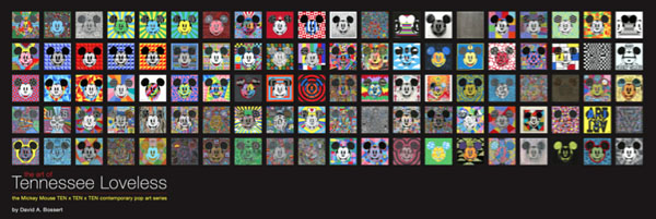
The inside of The Art of Tennessee Loveless: The Mickey Mouse TEN X TEN X TEN Contemporary Pop Art Series dustcover features all 100 paintings
By those definitions, the art being created by Tennessee falls squarely within contemporary pop art. His TENxTENxTEN series features the ubiquitous and iconic Mickey Mouse, who has become an indelible part of American—if not global—pop culture. Like the omnipresent Campbell’s Soup cans found in supermarkets around the world, Mickey Mouse represents a sense of comfort and happiness, a symbol of all that is good and wholesome. It is one reason why Mickey Mouse adorns so many products, from T-shirts to diapers to lunch boxes.
Choosing Mickey Mouse was not an accident, says Tennessee. “But I just never envisioned it being this big. This changed my whole entire way of thinking. Honestly, I think that it’s a really good idea to go insane and do something repetitive over and over again until you get tired of it and you find out something new about yourself.”
Initially, Tennessee’s paintings were all about color story. He was insecure about being an artist among people who could see color; he wanted to go above and beyond, to tell a color story through emotions. All of the color schemes were supposed to be about something very dramatic and each canvas told its own story. Each piece was hand-drawn and he would add the coded pigments inside each block or circle or line so he knew what he was painting. It was his own paint-by-number method. This work-around system addressed the criticism he received about using garish colors while at the Savannah School of Art and Design years earlier.
But it was more than paint-by-number to Tennessee; it was a way for him to associate with the image. And early on he wanted desperately to prove himself as an artist—to get out from underneath that crushing analysis he’d received in art school.
I met Tennessee Loveless at a dinner in Chicago in 2015 while I was there on business. We were seated next to each other and it was the first time I had a chance to get to know him and hear his story. By the end of dinner, he asked me if I’d be interested in doing a book on his one hundred paintings of Mickey Mouse. Without hesitation, I said yes and in the ensuing weeks pitched it to Disney publishing. It was a no-brainer great story and it featured a hundred wonderful paintings of Mickey Mouse that were fresh. And it didn’t hurt that a major anniversary of Mickey Mouse was approaching in 2018.
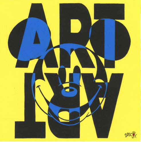
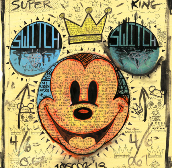
Loveless has a visual language that incorporates writing and iconography into many of the paintings within the TENxTENxTEN series as well as other paintings that he has created. He uses recognizable shapes and images such as diamonds, lightbulbs, leaves, clouds, crowns, and skulls to tell his stories and evoke emotional responses. Each painting seems to tell a story. It is the kind of art that you can look at over and over again and see something different each time. One painting tells the story of Walt Disney using words and recognizable icons and symbols. Each painting has is different and fits into one of ten categories. The chapter titles are Loveless Letters, Contemporary Modern, Battle of the Senses, Around the World, Metropolitan, Human Condition, Children of the 1980s, Odds and Ends, Sketch Wave, and Geometric Spectrum.
When asked what he wants people to get out of the TENxTENxTEN series of paintings, Tennessee Loveless says, “I think from a Disney perspective I want people to enjoy the world that they see and understand that with Mickey it’s infinite. He has an infinite possibility of being in multiple worlds and doing all these wonderful things. In the beginning, this was an idea of recreating and, in a sense, reimagining this great icon and finding the artist underneath.”
The new book, The Art of Tennessee Loveless: The Mickey Mouse TEN x TEN x TEN Contemporary Pop Art Series, releases on October 31st, 2017 just in time for the holiday shopping season. It is beautiful twelve-inches by twelve-inch book that features all one hundred paintings by the artist. It is a fascinating story of triumph over adversity coupled with the visually rich artwork of this contemporary pop artist.


 David A. Bossert is an award-winning artist, filmmaker, and author. He received his B.A. from CalArts School of Film and Video with a major in Character Animation. As a 32-year veteran of The Walt Disney Company, he contributed his talents to The Black Cauldron (1985), Who Framed Roger Rabbit (1988), The Little Mermaid (1989), Beauty and the Beast (1991), Aladdin (1992), Tim Burton’s The Nightmare Before Christmas (1993), The Lion King (1995), Fantasia/2000 (1999), and the Academy Award-nominated shorts Runaway Brain (1995), Dali/Disney Destino (2003), and Lorenzo (2004), among many others. Bossert is now an independent producer, creative director, and writer.


I am a huge Tennessee Loveless Fan! I am a proud owner of one of his Mickey originals. His art is so evocative, and smart and funny. So happy that he came back to art – I’m richer for it.