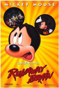
Runaway Brain, an Academy Award-nominated, seven-minute short animated primarily by Walt Disney Feature Animation Paris, was released on August 11, 1995, as part of the live-action feature A Kid in King Arthur’s Court.
The short marked the first appearance on Mickey Mouse on the big screen since the 1990 featurette The Prince and the Pauper.
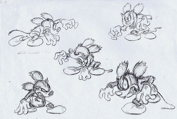
Several story ideas were under consideration when animator Andreas Deja remembered that: “Someone at a meeting, and almost out of boredom, drew Mickey Mouse as a monster. Someone else saw it and said, ‘That’s hysterical!’ All of a sudden, the idea came up to do a satire of Frankenstein.”
While it does satirize the 1931 film version of Frankenstein, the mad doctor is named Dr. Frankenollie, a tribute to two of Disney’s legendary animators, Frank Thomas and Ollie Johnston.
The design of the character is reminiscent of Professor Ecks, a mad scientist monkey Mickey tangled with in one of his classic 1933 comic-strip adventures drawn by Floyd Gottfredson. Dr. Frankenollie’s laboratory is located at 1313 Lobotomy Lane; Disneyland’s street address is 1313 Harbor Boulevard.

In the film, Mickey is at home intently focused on playing a video game. Minnie arrives to find that Mickey has forgotten their anniversary. Mickey comes up with a last-minute idea to take her to a miniature golf course, but Minnie misinterprets what she is supposed to be looking at in the newspaper and thinks Mickey is taking her to Hawaii.
Mickey finds a “help wanted” ad where he can earn the entire cost of the Hawaiian trip for one day of “mindless work.” Dr. Frankenollie intends to switch Mickey’s brain with that of his monster, Julius. The name Julius is a reference to one of Walt Disney’s first animated characters, a black cat in the Alice Comedies, though Julius looks more like a monstrous version of Mickey’s nemesis, Pete.
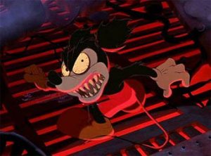
 The brain transfer is a success, with Mickey’s mind ending up in Julius’ giant body, and Julius finding himself in control of Mickey’s body which now has wild eyes, sharp teeth, and ragged, torn ears.
The dimwitted Julius opens Mickey’s wallet and finds a photo of Mickey and Minnie. The rest of the contents of the wallet are a black-and-white picture from Steamboat Willie, a library card from Guillard County Library (#2495 21095), a Social Security card (#746-55-2769), a stamp, a ticket stub, and a coin.
Julius falls instantly in love with Minnie’s picture and escapes the laboratory to search for her.
Mickey in the monster body is finally able to convince Minnie of his real identity. A climatic battle between Mickey and Julius ensues on top of a building.
During the course of their battle, Julius and Mickey fall onto electric wires, which cause their minds to transfer back to their correct bodies.

Director Chris Bailey said: “My goal was to capture the appeal Mickey had in the black-and-white short days but place it in a color body.”
Bailey claimed that Mickey’s body was inspired by the short film The Little Whirlwind (1941) but the personality was from the black-and-white era of Two Gun Mickey (1934). “We watched a lot of the early shorts,” Bailey remembered.
Supervising animator Andreas Deja was selected to be Mickey’s supervising animator. He had previously animated Mickey in Who Framed Roger Rabbit and The Prince and the Pauper.
Deja’s favorite Mickey Mouse moments in animation include Brave Little Tailor (1938), Society Dog Show (1939), Mr. Mouse Takes a Trip (1940), and of course, the “Sorcerer’s Apprentice” segment of Fantasia (1940). He used those scenes as inspiration for his work on Mickey.
Deja said: “It’s a kick to do this character that you’ve grown up with. You get the opportunity to pass it on and he gets a little encore in life. We all wanted to do something a little different with the character, though, a little edgier.”

The first animation Deja did on the short was the opening scene of Mickey playing a segment of the video game in which Dopey battles the Wicked Witch from Snow White who is throwing poisoned apples.
Deja recalled: “At first I wasn’t sure if we should push it with the video game sequence, but once I saw the designs and got into it, I thought it fit the character. He would do that now.”

Andreas Deja
The film had its beginning and its end produced in California, but most of its middle section was done at Walt Disney Feature Animation Paris, France.
Deja said about working with the French animators: “We had to go through lots of explanation, chalk-talk and explanation about how the character’s put together and how he’s drawn. They have a lot of talented people there.”
Although Runaway Brain received an Oscar nomination and was enjoyed by most of the people who saw it, many Disney Studio executives quietly commented that it was too much like a wacky Warner Brothers cartoon with its raucous action and swift pacing and didn’t like it at all.
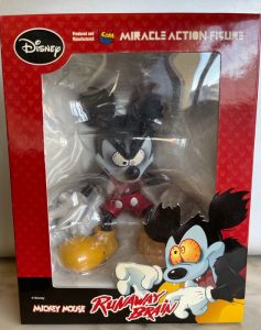
 Disney Merchandise was even more horrified. They couldn’t create items with Mickey in his huge monster body because it didn’t look like Mickey; it looked like a huge Frankenstein Pete. And if they created merchandise of Mickey’s body when Julius’s brain was in it, then they had this horrific-looking Mickey with sharp teeth and torn ears.
Director Bailey defended his artistic design choice: “We had the opportunity to play with a corporate symbol and not have it be him. We could scruff him up a little, give him shark teeth and have fun without tarnishing the image.”
Animator Deja added: “We knew we wouldn’t be jeopardizing his personality because it really wasn’t Mickey.
“The goal with Runaway Brain was to make a modern short that people wouldn’t confuse with a cartoon dug from the vault. That’s why I made him younger and a bit more aggressive, which was actually consistent with his early black-and-white film persona from films like Building a Building (1933).”

Director Chris Baily
“Several shots were cut, drool removed and ending changed. America’s moms that didn’t see the cartoon but saw merchandise in the Disney stores thought Disney changed Mickey’s design just to appeal to the skateboard crowd. In that respect, they [the Disney Studio] probably see the cartoon as a misfire.”
Interestingly, Bailey’s work on this short got him a job as the Supervising Director on Kevin Smith’s short-lived animated series, Clerks.
Bailey recalled: “Kevin Smith didn’t know my name but liked the Mickey Mouse cartoon I directed titled Runaway Brain and wondered if I was available. I suppose he figured that anyone who could get a cartoon made at Disney where Mickey Mouse ran around like a mad monster would be a good fit for him.”
Runaway Brain remains a problematic Mickey Mouse short even though merchandise, such as a comic book adaptation by Gemstone comics (Mickey Mouse And Friends #269), continues to be produced.


 Jim Korkis is an internationally respected animation historian who in recent years has devoted his attention to the many worlds of Disney. He was a columnist for a variety of animation magazines. With his former writing partner, John Cawley, he authored several animation related books including The Encyclopedia of Cartoon Superstars, How to Create Animation, Cartoon Confidential and Get Animated’s Animation Art Buyer’s Guide. He taught animation classes at the Disney Institute in Florida as well as instructing classes on acting and animation history for Disney Feature Animation: Florida.


This is one case where the Disney executives were correct.
It resembles an amateur version of a Looney Tunes cartoon, all over the place, cringeworthy, and difficult to watch.
Even the Mickey Mouse stories on “Mouseworks”/ “House Of Mouse”, although too often bland, are sadly far superior to this effort.
Andreas Deja says “It wasn’t really Mickey” –
in some ways it resembles “Ralph Breaks The Internet” or the latest Space Jam movie, where they take classic characters, and try to make a mockery of them (i.e. artistic disparagement), resulting in something out of “Drawn Together”.
Chris Bailey’s style seemed more at home with the original characters of “Kim Possible”, where even though at times episodes made little sense, it won a fanbase for what it was, much bigger than Disney had expected (especially with females).
As for “Runaway Brain” , toss this one in the Black Hole and watch “Building A Building” instead.
I really disagree there. Seriously, the studio was doing the Warner style more or less starting in the late 40s and 50s (see “Donald’s Dilemma” and “Two Chips and a Miss” for example). I thought this and “Mouseworks/House of Mouse” were good examples of reviving Mickey even better than most of Aaron’s recent shorts(where Mickey feels very out of character to the point of being an idiot).
Matter of fact, I really would like to see Chris doing a Looney Tune of his own or at least even have Daffy in a guest appearance in his recent “Scooby Doo and Guest Who” series (calm down, guys, this ain’t the ’70’s anymore)
Runaway Brain is hardly any ideal cartoon but I thought it was a lot more inspired than those banal House of Mouse/Mouseworks shows. However, all of them are easily trumped by the 2013 revival show even though it seemed to draw more inspiration from Ren and Stimpy than vintage Disney.
A very cute cartoon, and a nice tribute to both classic Disney cartoons and classic horror films. I just about died laughing when the Hawaiian girl on the billboard started playing with Julius like a yoyo!
I didn’t realise that Disneyland had a street address, but we Munsters fans know that the family’s spooky old house was at 1313 Mockingbird Lane.
Anyone thinking of using Mickey’s social security number to steal his identity is in for a disappointment. At the time “Runaway Brain” was made, and for many years before that, the first group of three digits in the SSN was known as the “area number”, based on a person’s state or territory of residence at the time the number was assigned. Like zip codes, area numbers were smallest in the New England states and got larger as you went west. But “746” was never a valid area number, and no social security card has ever been issued beginning with those three digits. I guess it’s like those “555-” phone numbers that everyone on TV has.
Just for fun, I googled Mickey’s library card number and found out that at today’s exchange rate, 2495 Turkish liras equal 21,095 Indian rupees. I don’t know what I was expecting, but it wasn’t that!
“Too much like a wacky Warner Brothers cartoon”…
In what lost universe is that ever a bad thing?
That’s what happens when a cartoon character becomes institutionalized, monetized, homogenized. The Suits weigh in. “How are we supposed to peddle a billion Funko toys out of THAT?”
Maybe you let it go just one time in the interest of making a great one-off with surprising, unexpected elements.
Which, thankfully, got done here.
The yo-yo gag made me howl!
What I particularly liked about this cartoon is that the 1930s adventurous side of Mickey is on full display here. Yes, there’s a lot of “Warner Bros” style – particularly in the music and sound effects and distorted Bob Clampett or Tex Avery-like reactions, but I enjoyed it quite a lot!
When I was a youngster watching THE MICKEY MOUSE CLUB in reruns back on Chicago TV in the middle-’60s or so, I had a hard time making the connection between the “nicer goody-two-shoes” version of Mickey on the show and his more exciting earlier “self” on the vintage cartoons that were shown. RUNAWAY BRAIN kind of combined the two images, but I would have liked this film even more had the mid-late ’30s version of Mickey been used!
Combining the two with his Fred Moore design just feels wrong.
I’ve loved this one ever since I saw it on the 2nd “Mickey Mouse in Living Color” Walt Disney Treasures DVD. All the points raised against it (the “evil” Mickey design, the WB-style jokes and slapstick, the manic pace) are all what make it a fun watch in my book. I can see why Disney executives and even animation people didn’t like it (I think Frank Thomas and Ollie Johnston were unsurprisingly not fans, ditto for John Lasseter) but if you’re gonna adapt Mickey and try to make him relevant for a 90s audience, they could’ve done a lot worse. (Look up “Mickey Unrapped” from just a year before!)
There’s even a sly reference to Katzenberg infamously leaving the studio, which happened right around the time of the short’s production: A pink slip labelled “J.K.” can be seen very briefly.
“(Look up “Mickey Unrapped” from just a year before!)”
I, er, had the cassette version…
Never understood the corporate resistance to “Runaway Brain”. It received huge laughs and applause from every audience I ever saw it with.
It was an attempt to break Mickey free of the blandness that had haunted his career ever since Fred Moore redesigned him unnecessarily (how do you improve what’s already perfect?). Beats having him just stand around and chuckle while Pluto does something. Mickey at his most demonic in this cartoon is nowhere near as scary as his huge bare feet in “Mickey and the Seal” (1948).
1. Ward started the new design (at least the eyes).
2. How can you consider “The Sorcerer’s Apprentice” bland? That’s like his highlight of his career.
I thought it was like a remake of the 1933 MM cartoon ‘The Mad Doctor’.
I really liked Julius and Dr. Frankenollie (voiced by the great Kelsey Grammar).