
Suspended Animation #390
As I have grown older and re-watch some of my favorite Disney animated features, I find myself spending more time studying some of the details that I always took for granted because they were so seemlessly incorporated.
When we discuss animation, it usually revolves around the characters, animation or even the writing. However, as we all know there are many other elements important in an animated feature including the setting and the use of color.
Although an early proposed version of Lady and the Tramp was set in San Francisco during the 1906 earthquake, the familiar animated feature film classic actually takes place in a quaint unidentified New England town in 1910.
Imagineer Tony Baxter stated, “What you see in Lady and the Tramp is a beautifully detailed real Victorian world.”
Animator Andreas Deja added, “It’s almost like a Norman Rockwell painting. It has that detail and Americana styling to it.”
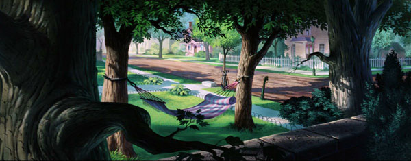
 The primary setting for the film’s story is the interior and exterior of the charming two story house belonging to Jim Dear and Darling, the owners of a beautiful, playful cocker spaniel named Lady.
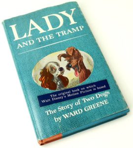
This ideallic turn-of-the-century location is much more detailed and delightful than the simple description from the original novel Lady and the Tramp: The Story of Two Dogs written by Ward Greene in 1953 that was the basis for the Disney film.
Author Greene wrote, “Once upon a time—a time not so long ago but a time when most people still used gaslight and preferred horses and carriages to gas buggies—there lived in a white and green house on a pleasant street, a cocker spaniel named Lady.
“It was a wonderful house. It wasn’t large but it was brand new and everything in it was new. The floors were so new and shiny that Lady slipped and slid on them. But when the rugs came, they were delightful to the paws. So was the furniture. It was soft… the beds, for instance, where it was supposed to be soft… and it was not so soft like the man’s big leather chair when a dog wanted a cool place to nap.”
In the film, the house is an accurate representation of Queen Anne architecture that was the preferred fashion from the late 1800s to around 1910. Queen Anne became the predominant style in small American towns that experienced an increase in wealth at the turn-of-the-century and wanted to capture some of the sophisticated flair of larger cities.
These expansive and expressive houses proved expensive and difficult to maintain and so fell out of favor shortly after the time period in the film.
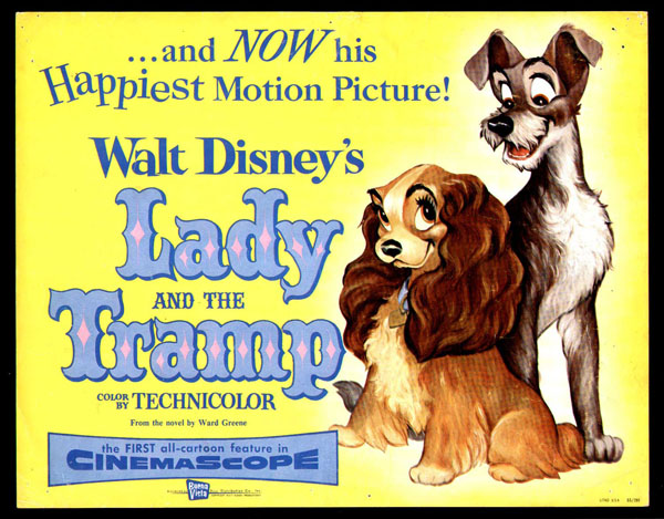
Lady and the Tramp was the first Disney animated feature film to utilize the new innovation of Cinemascope and this presented additional problems for the talented artists. Layout artists had to extend and fill the viewing area on the right and the left of the usual frame of action.
Fortunately the intricate detail of Queen Anne architecture and the picturesque interior furnishings helped keep the background interesting without being distracting from the action.
As Imagineer Tony Baxter pointed out, “When you look at the backgrounds, they create pools of light where the action is going to take place.”
To help get a sense of the story from a “dog’s eye view”, background artist Claude Coats who supervised the art work on the house built an actual scale model of the interior. The model was built to the scale of one and a half inches to a foot. This set included painted wallpaper.

Imagineer Bruce Bushman was also involved in creating the model that was hoped to be both useful and practical in creating some animation shortcuts just as a live-action film had been for Cinderella (1950). Primarily, it solved the problem of perspective, getting just the right view, like little Lady’s first look at the Matterhorn-like stairway soaring from the floor of the front hall.
The tiny rooms helped unify the vision of all the artists so that the job of getting all the backgrounds and objects identical on the drawing board was greatly simplified. While the time period chosen was an age of cluttered furnishings, by using a model, things could be arranged so they preserved the nostalgia of the era without becoming too “busy.”
Everything from the dainty kitchen and its finely carved wooden swinging door to the imposing staircase with the stately grandfather clock anchored at the bottom were painstakingly created to stage the horizontal world seen by the canine stars of the film.
“Claude Coats was trained in architecture so was particularly good at giving credibility to the setting. Coats liked to build models so he could see how things would translate dimensionally,” remarked Imagineer Tony Baxter.
Animator Mike Gabriel who co-directed Pocahontas (1995) is a particular fan of Coats’ work on the house, “Claude Coats created detail without distracting you.”
While the interior of the house may seem overly cluttered with furniture and knick knacks, the fashion of the time was that a bare room was in poor taste so every surface was filled with objects that reflected the owner’s interests and social status.
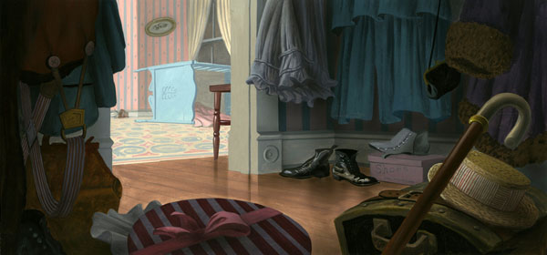
At this time period, gas lighting had become the most common and inexpensive way to light a home with a variety of fixtures providing more than sufficient brightness. In the Jim Dear and Darling home, not only are there several graceful wall mounted fixtures and sconces but delicate overhead chandeliers. Slag glass bent panel lamps as well as enchanting cut crystal hand painted lamps sit on quarter swan round oak tables in the living room.
The living room wallpaper is green with a distinctive repeating dark green abstract floral decoration in keeping with the floral patterns in primary colors that was standard for upscale homes. Embellished hand carved wooden trim abounds in the room as well as the rest of the house.
To the right of the front doorway is the parlor, the most important room in the house since it was used for entertaining. The wallpaper is light blue with a faint laurel wreath pattern and serves as a pleasant background not only for a grand piano and artist easel but also several pets.
Around the corner from the parlor is the entrance to the kitchen. Linonelum flooring for family kitchens became popular at the end of the 1800s and in this home, it is a light green background with a pattern of white squares with a smaller interior blue square that sometimes proves a slippery surface for little Lady. A large black cast iron stove is placed to the left side of the well kept room to allow plenty of space for a Sudbury cupboard.
Just outside the kitchen’s hinged door is the classic grandfather clock that sits prominently next to a full length mirror at the bottom of the dark wooden staircase.
The stairs, with a single break for a windowed landing, are covered with a reddish patterned carpet and lead up to the master bedroom.
With casual elegance, Jim Dear and Darling’s house clearly establishes the time period and social status of the characters while at the same time presenting a warm and friendly stage with many fascinating variations for the actions needed to tell the story.
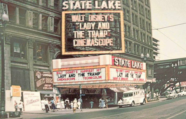
The ultimate Lady and the Tramp house – the movie house


 Jim Korkis is an internationally respected animation historian who in recent years has devoted his attention to the many worlds of Disney. He was a columnist for a variety of animation magazines. With his former writing partner, John Cawley, he authored several animation related books including The Encyclopedia of Cartoon Superstars, How to Create Animation, Cartoon Confidential and Get Animated’s Animation Art Buyer’s Guide. He taught animation classes at the Disney Institute in Florida as well as instructing classes on acting and animation history for Disney Feature Animation: Florida.


Thanks for this informative article. The backgrounds and setting for Lady and the Tramp are definitely deserving of a closer look.
One minor correction: “I find myself spending more time studying some of the details that I always took for granted because they were so seemlessly incorporated.” The word should be “seamlessly.”
I never knew that there was ever a plan to incorporate the 1906 SF earthquake into the storyline. It’s as well it was abandoned because it would have been a major distraction to the main storyline which is so beautifully worked out in such scenes as “Bella Notte.” But it’s still interesting to consider what the film would have been like in the event that the SF setting had been kept.
“Lady and the Tramp” is a film that makes excellent use of its setting. Each scene subtly reflects the time and place while supporting the story and the characters. It is fascinating to learn about the detailed craftsmanship that went into creating the backgrounds. The effort certainly pays off in the finished film.
The turn-of-the-century setting was abandoned in the comic book sequels such as the Scamp comic book and the Scamp comic strip. These had settings contemporary to the time they were written. But later in “Lady and the Tramp II: Scamp’s Adventure” the period setting was restored.
Not long after we got our dog, I was surprised to learn that my wife had never seen “Lady and the Tramp”, a deficit that I promptly rectified. She absolutely loved the house in the film, was continually pointing out details of the design and decor that particularly impressed her. So the artistry and care that Claude Coats and Bruce Bushman put into the model were very much appreciated even on a first viewing. I don’t suppose the model house still exists, or there are any photographs of it?
Long ago I came to the conclusion that the story was set, not in New England, but in New York — specifically the Bronx, because of the zoo. Also, the fact that the dogs in the pound address Lady as “Miss Park Avenue” seemed to indicate a New York setting. But then I suppose the juxtaposition of gritty urban neighbourhoods with affluent suburbs and open spaces shown in the film would have been common to most northeastern cities at the time, and even the mid-sized ones would have had zoos. It’s intriguing to consider what “Lady and the Tramp” might have been like had they gone through with the original plan of setting it during the San Francisco earthquake. But that probably would have blown the animation budget through the roof, and it would have detracted from the love story to turn the film into a disaster epic.
“Lady and the Tramp” is Disney’s first real romance, and the only one made during Walt Disney’s lifetime. The princes in “Snow White” and “Cinderella” are mere ciphers, and “Peter Pan” doesn’t proceed beyond adolescent flirting. Here we have two vivid, well-defined characters whose relationship proceeds through twists and turns until they ultimately fall in love. Not until the Renaissance would Disney make another romance so compelling. It’s a classic gem — like the house in which much of it takes place.
You can see some photos of the model in Andreas Deja’s blog.
I am really impressed with the sophistication in the design of the house of “Lady and the Tramp”, every detail from the architecture to the interior reflects the classic beauty and great care of the artists, bringing a lively and inspiring space.
I live near a community that includes a number of houses built in the period and style of the “Lady House”. Unfortunately, post WW2 nearly all of them have been divided up into apartments.
I’m truly a believer of this article and this post.
I felt like Claude Coats’s early Turn of the Century models for the film were a precursor to the full scale models he helped worked on for The New York World’s Fair/ Disney Parks attraction, “The Carousel of Progress”.
That’s some beautiful stuff. I live for the time when even Disney didn’t go UPA, but sadly that would change…
They were already doing UPA like stuff by the time “Lady and the Tramp” came out. Releases such as”Toot, Whistle, Plunk, and Boom” debuted two years prior.
I’ll defend that one, just because I’m a Kimball shill. And also he was stylized before Hubley and Schwartz decided they hated all things cartoon.
Uh huh. I think you might be over-analyzing what Hubley and Schartz said, the latter of which produced some cartoony commercials and projects for CTW later on.
Oh. I’ve never seen those, but they’re probably just doing expected conventions than being personal. Maybe you’re right, but from all the quotes I read from them in books gives me the indication they hated all cartoon conventions, in the contemptuous way they talked about Disney and ‘Warners’ humor”.
They evidently didn’t understand that the Disney principles they hated so much weren’t there because they were just pretty (and many times as they were), but because they were the only ways that WORKED. “Humanized pigs and bunnies” function better than humans in this environment because they offer better opportunities for caricature or fantasy. Gerald McBoing-Boing and similar films are not really cartoons except live-action films with “artistic” design. And characters blending into backgrounds makes them get lost in the splendor. Disney and what after did beautiful backgrounds that at the same time were taken for granted because Pinocchio and Bambi were at the forefront.
This is just my opinion, but I am more loyal to Uncle Walt and his followers than those trying to tear him down because they had a bone to pick with his politics or his reliance on commercial expectations.
The setting of Lady and the Tramp always reminded me of the “Old West End” in my town.
https://en.m.wikipedia.org/wiki/Old_West_End_District_(Toledo,_Ohio)
I don’t have any strong feelings for the movie, but those are some 10/10 backgrounds.
glad i came across this website. When Lady meets the Tramp, he takes her around posh houses and calls the area ‘Snob Hill”, which is also what some local San Franciscans refer to the Nob Hill area.
I am not mad at this because I absolutely love and the Tramp, but I want disney to go back to cartoon animation.
The house’s address in the movie is 2137 Park Avenue Old New England Town, USA.
I have strong feelings for the movie, but those are some 10/10 backgrounds.
The living room’s green wallpaper with dark floral patterns and hand-carved wooden trim creates an elegant and timeless atmosphere. The design details add charm and sophistication to the space, making it truly impressive.
Even though I love & the Tramp, I am not disappointed that Disney is not returning to cartoon animation.