

A short one this week, fellow cartoon researchers, but I promise a longer and more detailed article next week.
But first, thanks to everyone who made a comment last week. If you look through all the comments, it’s really a wonderful list of things that really should be available in better quality — and many that just are not available at all!
I’ve just finished classes for the semester as I write this. It’s been a difficult year in that, on Wednesdays, I’ve had class from 8:30 am all the way until 10 at night, with short breaks between each class. I’m happy to say goodbye to this semester for that reason alone, and I’ll never agree again to doing so many classes in a row, regardless of extenuating circumstance. The good news is that, with this last class, I’ve now hit the 20 year mark teaching animation at the College for Creative Studies. A mile marker!
 The winter break is especially long this year – 4 weeks. I’m excited to be able to spend some time on getting projects in order. A major hard drive crash last week left the Flip the Frog project in a bad way, but happily everything is backed up in one place or another for the cleanup. I’m not sure what else I’ve lost on the drive at this point, but hoping it isn’t too damaging to current projects. I hope to write about the precarious state of digital archiving in the coming weeks- much, much harder for the small ‘indy’ companies than for the large archives since resources are so much tighter. I have to wonder what the state of loss will be in the future.
One of the best things about having so many days off is that I can finally wrap up lots of things, semi-uninterrupted. There’s a stack, and I’ll be calling in favors from many friends. I’ll keep you all updated in the coming weeks as things roll along. Two new hires at Thunderbean are doing an excellent job in keeping orders and attacking the orders pile this week.
I’m very much looking forward to a few long standing steps to getting some of these things done. Our own Jerry Beck has lent me some rare films recently that will make their way into both some current projects and special discs. Going to UCLA and looking through the rest of the Comi-Color materials is also high on the list. This is a huge challenge, and I’m recruiting some of the best help I know to look them over with me. Getting a chance to revisit the Famous Studio’s Little Lulu cartoon series is another thing on the list. In more recent months I’ve managed to come across good prints of quite a few of them, and more in the past week. I’m looking forward to finally getting a chance to see the prints as they all get scanned. A visit to New York is also in the cards, with visits to friends and picking up some pretty rare material.
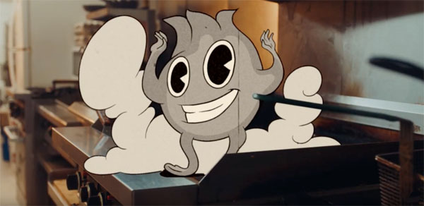
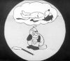
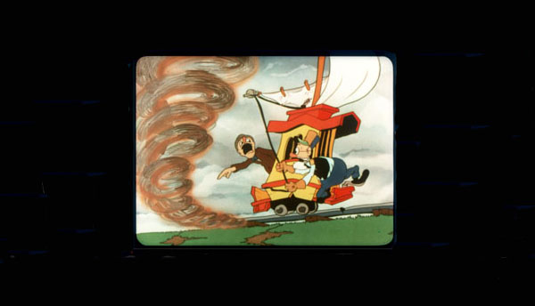
Onto new ‘old’ animation: Jerry Beck used to refer to this style as “Retro-Toons”. There’s no doubt about the eternal appeal of the 1930s cartoon style, the rubber hose limbs, pie-cut eyes, sometimes in black & white or using a limited color palette – and these days the added “film” damage of dirt lines, and maybe splices… It’s been used by filmmakers for decades – from Tezuka’s Broken Down Film to Disney’s recent Get A Horse. Then cometh Cuphead. It’s a full-on “style” now. Here are several recent examples of this “technique” applied to modern advertising.
Progressive Insurance. The animation was done by Passion Pictures in London:
Geico has an ad too – not sure who’s responsibe:
I have to wonder if these were inspired by the success of Cuphead — and I wonder what the future holds in terms of this stylistic influence – a TV series, or a feature film perhaps, in this style?
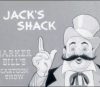
One more – a new Popeye spot for Bank of America:
Have a good week all — and much more next week!
 Steve Stanchfield is an animator, educator and film archivist. He runs Thunderbean Animation, an animation studio in Ann Arbor, Michigan and has compiled over a dozen archival animation DVD collections devoted to such subjects at Private Snafu, The Little King and the infamous Cubby Bear. Steve is also a professor at the College for Creative Studies in Detroit.


Wow- that Popeye spot looks incredible! Kudos to whoever made this for going the extra mile to give it that vintage vibe.
A beautiful homage to the Fleischers’ versions!
Actually, “Cuphead” added fuel to the fire. People have been using the rubberhose style long before Cuphead in commercials and such. SpongeBob’s Truth or Square have used a bit of animation that did this style. or to go further for Nicktoons, The Fairly OddParents used the 20s-30s style during the wish in “The Good Ol’ Days”. In fact, Viacom should have noticed the Popeye, Betty Boop and Screen Songs references in the episodes.
Animaniacs also paid tribute to the black-and-white Fleischer cartoons in “The Girl with the Googily Goop”, whose title song includes a faux Calloway chorus (“Hi-de hi-de Heidi Fleiss! He-de Hedy Lamarr! Yehudi-hudi Menuhin! Yo Yo Ma!”). And Act One of the Futurama episode “Reincarnation” is animated in a pre-Code Fleischer style; it even has a simulated 3D setback.
I hope artists will continue to be inspired by the early Fleischer cartoons well into the future. Having good quality restorations available will be a big help!
That Popeye commercial manages to look like a Turner-era retrace. Probably the best of the lot, though they were all fun.
Nice music for the Popeye Bank of America commercial. “I Got Rhythm” by the Quintette Of The Hot Club Of France featuring Django Reinhardt and Stéphane Grappelli.
Wow the Progressive and BoA ones were both excellent imho. The geico one doesn’t really pull it off, the vector/puppet tool aspect is too visible as opposed to frame by frame. Great write up, wouldn’t have seen any of these ad I don’t watch TV anymore and block the heck out of ads online 🙃
As long ago as 2010, the Squirrel Nut Zippers music video for “The Ghost of Stephen Foster” was in “retro” style.
https://www.youtube.com/watch?v=7sxFyu_U2go
That’s the greatest music video I’ve ever seen!
Any idea when Cartoon Commercials Vol 2 will be sent out? Have been waiting since August 2017.
Thanks.
Robert Crumb’s work always carried a strong 30s vibe, whether he was echoing rubber-hose cartoons or grim Depression photos. Back when commercials were trying to look “hip”, imitating (and sanitizing) Crumb often played like retro toons.
There were two Betty Boop TV specials back in the day. The first discarded everything but Betty’s look and voice, suggesting the makers had zero familiarity with (or interest in) the character or the Fleischers in general. The second committed to Fleischer spirit and included Koko and Bimbo, but only approximated the visual style.
Congrats on hitting 20 years of teaching! That’s a great milestone!
Hi Steve Still waiting those sets you promised in your las email. 🙁 I’m going to get them before the holidays?
Will appreciate your response…
Steve – call me !
A Cuphead cartoon series is already in development for Netflix, and the style is the same as the cut scenes in the game. It’s really amazing how close the digital animation studio was able to get.
Your 20 year (congrats) comment made me realize that if I had been able to get a teaching job when I graduated, it could have been 50 years by now. Your hard drive comment reminded me of something I noticed in my house this week. A box that had a bunch of super 8, 50′ reels of home movies seems to be okay. However, three short cores with 16mm TV spots from 1981, have decomposed. Preservation needs more protection.
They’re great. Well done. But for me, Cuphead stands out because it achieves animation principles unaffected by fully formed Disney principles that existed before DIsney. It’s more than animating pie-eyed characters behind film scratches.
I remember watching Disney’s Get A Horse a few years back. A good as it was, I felt the animation didn’t always maintain that “naivety”, for lack of a better word. That is sort of what I see when someone says to look at some new animation done in a Fleischer or early 1930s’ style.