

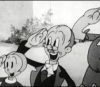
The reader known as ‘Paramount Cartoons’ – on the the Blu-ray forum – made the comment yesterday that he doesn’t want to wake up today to “another boring random cartoon”, so let’s mix it up a little! It’s a good thing we’re not showing Old McDonald Had a Farm this week — now THAT’S entertainment!
Last week’s animation history class here at the College for Creative Studies in Detroit was a lot of fun. It is, of course, a class made up of all animation and illustration students, so when I show things they’re often gasping at the designs and color. Thinking about it, I think any audience that had a fanbase with cartoon people like all of us that read this blog would react in a similar way.
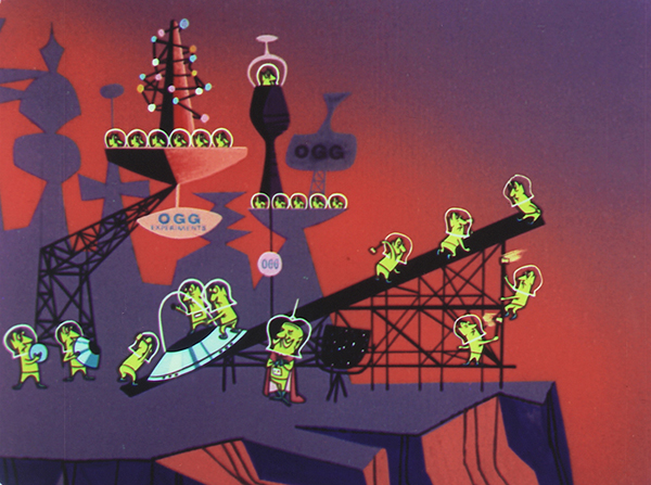
“Destination Earth”
If I get your comment soon enough, I’ll share them with my animation history class on Thursday morning here.
Off the top of my head, here are some of my favorite things from the 50s. I bet at least some of these cross over for you as well:
1) Rooty Toot Toot (1951) Quite honestly, I think this is the most ‘essential’ of modern design cartoons. It breaks all sort of rules very well- and if you haven’t seen it on a big screen you’re really missing out. We could all talk all day about this particular film.
2) Rocky And His Friends (or the retitled “The Bullwinkle Show” as I grew up with) from 1959. There’s so many good things about this particular show, especially in writing. On a side note: Bill Scott’s Bullwinkle is still one of my favorite things in any cartoon ever, as much as Daws Butler’s twangs in so many cartoons.
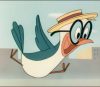
3) Destination Earth (1956) Tom Oreb and Bill Scott are Hall of famers for, well, most everything they worked on, but I think silly oil commercial is so much fun in design that it elevates it above most sponsored films.
4) The Tell-Tale Heart (UPA, 1953)
I really wish this had been photographed in 3D, or if it was that the material would surface. Bill Scott writes here, continuing a thread….
5) Ragtime Bear (1949)
SO many fascinating choices in design and timing, some working well, others barely at all. I love Hubley’s dialogue direction, something that would continue into his independent work beautifully, but so rare in commercial animation.
6) Those 50s Disney Nash Commercials
Produced on the Disney lot with Disney talent but *not* by Disney productions, these spots are some of my favorites of all time. Tom Oreb gets an additional bow.
7) Mars and Beyond (1957) (Life on other planets- Ward Kimball sequences)
Easily some of my favorite Disney things, ever. So many beautiful designs and funny ways of moving things.
8) Flebus ( Ernie Pintoff/ Gene Deitch / Terrytoons, 1957)
The fact that Terrytoons could produce a cartoon that can still speak perfectly to each new generation speaks to the great talent of artists thinking about how to make something entertaining that was different than any cartoon had been. And, in so many ways, it still is.
9) Gerald McBoing Boing (1950)
Bobe Cannon could very well be my favorite animator, and as director makes here what I consider to be a perfect film. I know this choice is a little obvious, but how could it not be included?
10) Rhapsody of Steel (1959)
A great capper to a list like this. Full of interesting and really varied design sensibilities, this long (22 minute) commercial was grandly produced and executed. Eyvind Earle’s work on the short is astonishing in many ways, and so many beautifully animated scenes throughout in many styles.
Ok — there’s my picks. And yours?
Have a good week all!
 Steve Stanchfield is an animator, educator and film archivist. He runs Thunderbean Animation, an animation studio in Ann Arbor, Michigan and has compiled over a dozen archival animation DVD collections devoted to such subjects at Private Snafu, The Little King and the infamous Cubby Bear. Steve is also a professor at the College for Creative Studies in Detroit.


Thank you for this fun and informative post, Mr. Stanchfield!
Um, may I name 3 favorites?
1. Rocky and Friends. This series I feel is the funniest, most satirical and socially relevant (of its time); above any other animated work in this category. (The most valuable kind of art and entertainment, in my opinion. A work that can make us laugh and think, put up a kind of mirror to us as a society, that is the highest art!)
2. Sidney the Elephant. (I’m trying to find out more about this series; that is, to confirm facts….so please correct me if needed….)
The series was the first animated one, AFAIK, to feature a group of animal characters in an African setting (?). It began as a series of theatrical shorts shot in cinemascope(?) Funny and charming with that slightly neurotic but amiable elephant with a big heart!
3. “Giddyap” (1950) – – Directed by the great Art Babbitt for UPA!
A genuine “hoofer”, once technologically unemployed, later gains confidence and adapts to a new medium! I love this, of course, ’cause a central character is a horse! (And “animated horses” is a primary and fascinating study of mine!)
Thank you!
Maybe you don’t consider them “mid-century”, but I think you need to go back a step, and include some of the roots that developed at the Columbia Studios before the founding of UPA. These would include the early works of Hubley and Paul Sommer on “Professor Small and Mr. Tall” and “The Vitamin G Man”. I would also include Bob Wickersham’s following in the footsteps of this style on “Willoughby’s Magic Hat”. There’s also of course from this period that political oddball, “Hell Bent For Election”, more closely associated with UPA’s early development.
Push back farther to the Chuck Jones Warner Bros shorts like The Dover Boys at Pimento University; or, The Rivals of Roquefort Hall. Wackiki Wabbit, The Aristo-Cat, Fin ‘N Catty – there are also other Jones shorts from that period that have background artwork that anticipated the limited animation movement (maybe lack of movement is a better descriptor) that UPA took to its extreme.
I’m not a big fan of the Mid-Century Modern genre. This is like asking me to make a list of my favourite Madonna songs. I don’t have any. Bring back the “boring” cartoons!
Dixieland Dog!!!
A personal choice of mine would be the Yugoslavian film, Surogat (1961)
The Owl And Fred Jones (1959) and A Is For Atom (1953). I especially love that the latter cartoon’s lead character has an atomic particle for his head.
Well, Steve, I would have to agree with just about every one of your choices. You know I also like Bob Clampitts BEANY AND CECIL And a wonderful later Terrytoons cartoon title, THE JUGGLER OF OUR LADY, A film that I believe was done in Cinemascope as well.
Loved today’s selections. That Mr. Magoo cartoon is a gem.
And a hearty “BOO!” to whoever called your posts “another boring cartoon”.
Ooh, if I had to pick only a few favorites…
I would definitely second (err, would that be third?) Rocky and Friends. Looks cool, sounds funny, major influence on making me not afraid to tell awful puns.
On a similar note, pretty much anything Hanna-Barbera pre-1969 or so; to be more “on-topic”, perhaps just pre-1964 (Sorry, Squiddly, I still like you.) Quick Draw McGraw, Pixie and Dixie, Huck and early Flintstones are particular highlights to me. I don’t wanna be starting something, but I feel Ed Benedict’s more perhaps orthodox version of that style was better than some of UPA’s version. Especially when you get near the end where they got TOO abstract for my liking. The great Don Yowp once posted a background from one of their later shorts, and it was too much for me. (https://tralfaz.blogspot.com/2018/06/the-critics-have-enough.html)
Stuff like Colonel Beep and the Mel-o-Toons, while not really all that animated (even by Mid-Cen Modern standards) are also real slick looking.
Here’s my favorites.
1. RHAPSODY OF STEEL (1959, John Sutherland Productions)
2. SLEEPING BEAUTY (1959, Walt Disney Productions)
3. IT’S EVERYBODY’S BUSINESS (1956, John Sutherland Productions)
4. DESTINATION EARTH (1956, John Sutherland Productions)
5. FUDGET’S BUDGET (1953, UPA)
6. BALLAD OF SOUP DU JOUR (1962, Jam Handy)
7. ‘ALIEN INTERMISSION SNIPE’ (1961, Filmack)
8. WHEN MAGOO FLEW (1954, UPA)
9. INSECT TO INJURY (1956, Paramount)
10. HIP! HIP! HURRY! (1957, Warner Brothers)
While we’re on the subject of “Fudget’s Budget”, a couple of mathematical masterpieces come to mind that haven’t been mentioned yet – Chuck Jones’ “The Dot and the Line” for MGM. and the independent “Flatland” (1965 version). giving credit to an idea from John Hubley. Yes, maybe both haven’t been given credit as based upon previous literary works. But their graphics and presentation are still striking on the big screen for how to do the most with the least in movement.
This is a great post and so many of the cartoons linked to – and additional titles from the readers – I concur with. I think when Steve uses the term “Mid-Century Modern” he really means the progressive designed shorts from 1942 through, approximately, 1962 or so. Much of what UPA did prior to Gerald McBoing Boing would fall into this.
All I can really do is add additional cartoons, favorites of mine, that should be noted: For example, Disney’s Toot Whistle Plink and Boom and Melody; Numerous Gene Deitch Terrytoons including Topsy TV, Sick Sick Sidney and It’s A Living; Jones/Noble cartoons like From A to Z-Z-Z-Z and Boyhood Daze, Nelly’s Folly, and of course What’s Opera Doc; and dare I mention the mid-century 1957-58 Paramount shorts like Ghost Of Honor, Jolly The Clown, Dante Dreamer and Chew Chew Baby.
I honestly don’t really watch a lot of these kinds of cartoons, but I can understand some of your listings. Also, who would ever consider your posts “another boring cartoon”? The cartoons themselves may be dwellers, but at least they’re properly and delicately restored from the ground up!
Also, is there any news on the reel with “Redskin Blues” I sent you? (I honestly don’t mind if you’re cleaning it up right now, as long as it gets sent back no worries)
-Jay Diaz
Hi Jay….
We haven’t scanned the cartoon as yet… but when we do I’ll of course send you the scan. Please send an email with your address so I can make sure to get it back to you too! it’s steves@thunderbeananimation.com.
I’ve recently rediscovered the early Zagreb Films cartoons on YouTube, and they look great. They take the UPA style further, but also have fun moving the designs in a way that doesn’t feel mechanical. Some personal favorites of mine are the aforementioned Surrogat, Piccolo, Boomerang, The Cow on the Moon, and the Inspector Mask series.
Also worth mentioning is The Little Island (1959), Richard Williams’ debut short. It looks nothing like the work we usually associate with him, but it’s still an interesting film, ambitious but still fun, with good looking graphics.
I would also concur with the inclusion of the Zagreb films on this list. The character designs in “Surogat” are hilarious, with the triangular male bather with an overhanging pot trying to get into his bathing suit, and the buxom babe balloon with both chest appendages resting one atop the other.
Another favorite take on the whole thing was from an early episode of the Simpsons, when Krusty the Klown loses the rights to screen the Itchy and Scratchy cartoons to a rival program, and offers instead the favorite cat and mouse of Eastern Europe. What follows is a thirty-second version of an almost Itchy and Scratchy redesigned into the best tribute the staff can do to the Zagreb house style, making no sense whatsoever. The camera cuts back to Krusty, his jaw agape and his cigarette hanging out of his mouth, who utters something to the effect of “What the [BLEEP] was that??”
I’d like to put in a vote for Roger Ramjet, which was on regular rotation on my TV once upon a time. Fred Crippen was, I believe, another alumnus of UPA.
AND a shout-out to the mid-century modernists at Canada’s National Film Board. On the NFB’s website (nfb.ca) you can see, along with much else, a couple of compilations of short animated spots from the late 50s and early 60s. These were done for TV, for the CBC (or Radio-Canada, as it’s called in French). The compilations “Pot-pourri” and “Hors-d’oeuvre” feature work from Kaj Pindal, Gerald Potterton, Derek Lamb, etc. etc. Lovely stuff.
Among my favorite mid-century modern cartoons are “Christopher Crumpet” and its sequel “Christopher Crumpet ‘s Playmate.” They are among the funniest UPA cartoons that I have ever seen. I also like “Gerald McBoing Boing On The Planet Moo.” The king thinking that earthlings actually talk like that is funny to me. I also like Tex Avery’s “Symphony In Slang,” a very hilarious cartoon.
Symphony in Slang is a favorite of mine for sentimental reasons: it was a favorite of my mother. She was born in 1930 and didn’t really mention liking any particular cartoon, other than this one. I don’t think she got to see many cartoons (or movies in general) growing up but she had to live through 6 kids watching whatever cut up bits and pieces were on tv throughout the 50’s and 60’s, and she would always be too busy to come see if you wanted her to watch a cartoon unless you appended “it’s your favorite cartoon!” appellation to your description. She mentioned the cartoon frequently in the 70’s when us kids talked about OUR favorite cartoons around her.
I’m also not a fan of Modern Design (or abstract art in general) I don’t mind the stylized backgrounds as long as the animation in the foreground is high quality.
All great choices, Steve. Without a doubt, my favorite of this style of cartoons is “Flebus.”
I hated “Rooty Toot Toot” when I first saw it, because it was so different. Now I realize what a masterpiece it is.
Gosh!
Not much on angular, so I go with Jay Ward.
“Colonel Bleep” burnt into my toddler mind because the characters and spaceships were uniquely friendly and toylike. Was there ever any merchandise for it?
The Hubleys’ “Windy Day” might be a hair late for mid-century in 1967, but it made a deep impression when I saw it in college in the 70s.
Ward Kimball’s work on all the Disney “science” episodes was great fun. A favorite was the moon episode, when a tin pan alley tune is illustrated by a rapid-fire montage of stylized kisses. Also “Toot, Whistle, Plunk and Boom” and “Melody”.
“101 Dalmatians” was set in an old-fashioned London and countryside. The backgrounds — line drawings laid over color shapes — managed to nail that ambiance and read as modern in the same stroke.
I have waited almost 24 hours before responding giving Paramount Cartoons the opportunity to correct.
The actual quote that Paramount Cartoons gave on Blu Ray Forum is:
“I don’t want to wake up tomorrow with another random cartoon.”
i.e. an entirely different meaning.
https://forum.blu-ray.com/showthread.php?t=226492&page=497
The word “boring” makes better click bait – something I would have thought Steve doesn’t need to use to get comments.
I’d also noticed this. I’m sure this wasn’t intended as clickbait – probably just a misremembering. Steve packs a heck of a lot into a day & so naturally there’ll be the occasional error.
It was just misremembering! No covert click baiting intended! I’ll ask Jerry if he can correct-
Since it hasn’t been mentioned yet, a favorite of mine is the silly Disney short, “Pig is Pigs” (1954) based on a short story by Ellis Parker Butler.
I also like to give a shout-out (since this is the subject of this site’s next post), the stylized backgrounds and layouts of “Duck Amuck” (1953).
Friz Freleng’s “Three Little Bops” cartoon.
UPA didn’t age well for the same reason fads and fashion tend not to: they’re anti-classic. It’s difficult to sustain that level of graphic innovation, particularly since exquisite minimalism is usually just as expensive, if not more so, than opulence. And also when some of your best artists get blacklisted. And even more so when audiences tend to choose laughs over artistic quality.
Mid-century TV cartoons are often lambasted (as I may have said once or twice in the past, you try to produce theatrical quality animation with one third the budget in one fourth the time), but they were made by artists with theatrical training, just as the best cartoon voice actors got their training from radio. The animation was limited, but the primary poses were still strong. Early Hanna-Barbera, staffed by MGM veterans, was delightful; however iconic the “Scooby-Doo” era became ten years later (among kids brought up on Saturday morning content created specifically for them), the general loss of quality was noticeable.
And of course the voice work compensated a lot. Even Jay Ward’s cartoons would be unbearable without the vocal magic of Bill Scott and Daws Butler and June Foray and Paul Frees and Hans Conreid.
As the others replies show, the favorites are going to be just as varied and subjective as a list of favorite cartoons from any other era.
Anti-classics?! Granted some were better than others, but I thought UPA shorts were WAY better than most of Columbia’s own animation output.
In many ways, UPA is anti-animation, because the Disney technique they hated so much were in place because they were what was best for animation. I don’t lioke much of anything the studio stood for, which was mainly design more than quality.
Paramount Cartoons’ cornbread ain’t done in the middle.