

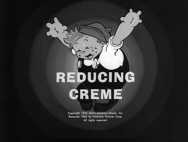
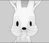
The Ub Iwerks’ Willie Whopper and Flip the Frog project continues!
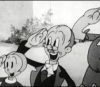
I really enjoyed seeing the animated clips from some of Leo’s other appearances over the years. We transferred some of the WIllie Whopper materials a few days back, so as promised here are some stills from the transfer session. (click thumbnails below to enlarge)


This is the first of what will be many sessions on the project, and I’m happy to see the first glimpse of what I’m going be working with. Commonwealth Films had some of these titles for many years, and it appears they often cut off the original titles on the camera negative, then made a new master positive to make the dupe negative off. On these particular prints, it’s hard to say when the original titles left, but they contain the 60’s distributor’s title cards. The master of ‘Spite Flight‘ even includes an explosion animation out of their new title matching into the opening shot of Willie saying ‘Hi!’
Happily, there are 16mm prints of most of the Willies that have their original MGM titles. These mostly older (40s) printdown materials (so far) have been quite nice, so I’m sure we’ll have good looking versions of the titles for the ones that no longer have the original title cards in 35mm.
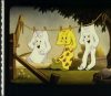
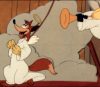
Here are what the usual original titles look like- from a 16mm print of ‘Good Scout’ (click each to enlarge):


I think of this project as being sort of similar to Van Beuren’s Cubby Bear in a way. The Cubbys had never been all gathered in one place, and it seems to be similar with the Willies. A group of the films were sold to another distributor many years back, and are just now all under the same ownership at Film Preservation associates, happily!
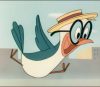
One of the films that was transferred was a 35mm Eastman Color print of ‘Davy Jones’ Locker‘ the cartoon from last week’s post. This print was faded red, and when we adjusted the color, it was clear that the 2-color materials were processed in a way that caused the reds to be bright red instead of the usual orange-ish Cinecolor look. I’ve adjusted the film a little more to get it looking closer to what it should look like.
We most likely won’t be using this particular print in the set since it’s missing it’s titles and end titles. Happily, original successive exposure negative (SEN) is available on this one. It was photographed with both the color records on the same piece of black and white film. If all goes well, we’ll transfer that original negative for the final set, along with Hell’s Fire.
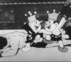
Mark Kausler noticed that this particular print has a sequence that isn’t in the Black and White print that circulates on this title. The short segment shows three Mermaids singing and hiccuping (after presumedly drinking Davy Jones’ booze). When it was edited out of the material isn’t clear- maybe it’s less about them drinking (since the scenes of Davy drinking are all intact on both versions).
Here’s a clip of Leo from the beginning and end of the cartoon, as well as the little clip of the mermaids. I’ve left the clips uncropped, as we do in transfer… so don’t mind the soundtrack to the left!
 Steve Stanchfield is an animator, educator and film archivist. He runs Thunderbean Animation, an animation studio in Ann Arbor, Michigan and has compiled over a dozen archival animation DVD collections devoted to such subjects at Private Snafu, The Little King and the infamous Cubby Bear. Steve is also a professor at the College for Creative Studies in Detroit.


This looks great, hope this will come out soon.
I’m guessing the mermaids were edited out because they are topless. They cover themselves, but if the cartoons were being marketed to children, somebody felt it was better to leave them out.
I’m sure the mermaids were excised due to Post Cost prudery.
Love those topless mermaids! Speaking of censored shots, I’m surprised you didn’t include a still from SPITE FLIGHT of Saint Peter giving the finger. That shot seems to have survived TV editing and pops up in the old 16mm print I still have… always gets a big laugh!
I was hoping to see that in all Hi-Def glory!
Simon Peter always was a bit of a hothead…
You’re doing god’s work, Steve! I love reading about these film restorations.
I personally can’t wait!
I love it! Will the cartoons have MGM logos?
Yes, I think we’ll be able to have the MGM logo for all of them…
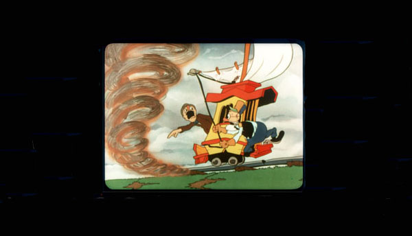
Looking forward to the restorations, Steve! STRATOS-FEAR is frequently the one cartoon I select to blow non-cartoon buffs away.
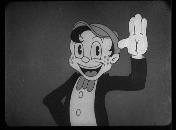
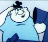
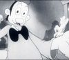
Leo the Lion appears to be modeled after the publicity drawings of Leo that M-G-M used in its advertising for many years.
Commonwealth Films had some of these titles for many years, and it appears they often cut off the original titles on the camera negative, then made a new master positive to make the dupe negative off.
I understand that these companies were often under contractual obligation to remove references to the original distributor or studio from their prints. Hal Roach licensees like Blackhawk Films were, for example, required to remove all references to M-G-M and Loew’s, Inc., as well as the roaring lion trademark, from their prints. Similarly, in a clipping I have in my files about UM&M’s purchase of the Paramount shorts library, there’s mention of how that company was required as part of the purchase to remove the Paramount logo from prints they distributed. There was even a time when the Technicolor company required that “Technicolor” be removed from prints made using a different color process (like Eastmancolor), even if the original was filmed in the Technicolor process.
What I’ve never understood is why these companies made their alterations on original negatives and fine grains rather than on the new duplicate materials they made up to service prints. It seems so agonizingly short-sighted to me. Which, I know, the film industry was. Their modus operandi back then was that the newest version became the official version. So when M-G-M made cuts or alterations to movies like “A Night at the Opera,” “Babes in Arms,” or “Gone with the Wind” for reissue purposes, they made whatever changes they made on the original negatives and threw out what they excised. (That’s why, I’ll guarantee you, that even if the original negatives to M-G-M’s Tex Avery cartoons had survived, they would have been altered to conform to the changes made for 1950s reissues.) Short subjects seem to have been hit particularly hard in this way, with main and end titles routinely altered by non-theatrical and television distributors. I know it’s just a fact of life, but it certainly is frustrating.
Leo the Lion appears to be modeled after the publicity drawings of Leo that M-G-M used in its advertising for many years.
Yeah this Leo isn’t too different from what was seen in print. More of just how Iwerks worked around animating this character.
I understand that these companies were often under contractual obligation to remove references to the original distributor or studio from their prints. Hal Roach licensees like Blackhawk Films were, for example, required to remove all references to M-G-M and Loew’s, Inc., as well as the roaring lion trademark, from their prints.
It did always seem sad when the opening titles were just white text over black. Of course for TV airings, we were stuck with these…
http://youtu.be/fqukIUtkO6Q?t=1m7s
Similarly, in a clipping I have in my files about UM&M’s purchase of the Paramount shorts library, there’s mention of how that company was required as part of the purchase to remove the Paramount logo from prints they distributed. There was even a time when the Technicolor company required that “Technicolor” be removed from prints made using a different color process (like Eastmancolor), even if the original was filmed in the Technicolor process.
Yeah that was pretty tight on their part. Wonder how long that lasted for?
What I’ve never understood is why these companies made their alterations on original negatives and fine grains rather than on the new duplicate materials they made up to service prints. It seems so agonizingly short-sighted to me. Which, I know, the film industry was.
It shouldn’t have cost more to make an extra print to dupe from, unless it did, I can see why they did it that way.
Their modus operandi back then was that the newest version became the official version. So when M-G-M made cuts or alterations to movies like “A Night at the Opera,” “Babes in Arms,” or “Gone with the Wind” for reissue purposes, they made whatever changes they made on the original negatives and threw out what they excised. (That’s why, I’ll guarantee you, that even if the original negatives to M-G-M’s Tex Avery cartoons had survived, they would have been altered to conform to the changes made for 1950s reissues.)
All those “Westrex Perspecta Sound” listings in the credits! Of course then they’d get the 60’s MGM logos at the start too!
Short subjects seem to have been hit particularly hard in this way, with main and end titles routinely altered by non-theatrical and television distributors. I know it’s just a fact of life, but it certainly is frustrating.
It’s a lot of short-term decision making at it’s finest. They really didn’t think of the next century here.
re: The Technicolor thing
That might explain a couple of 16mm Happy Harmonies prints I have that have an ugly black line running horizontally across the screen in the opening titles obscuring the Technicolor credit.
re: The Technicolor thing
That might explain a couple of 16mm Happy Harmonies prints I have that have an ugly black line running horizontally across the screen in the opening titles obscuring the Technicolor credit.
Many MGM Happy Harmonies seen on TV in the 60’s to the 80’s often had the Sharpie deal done to them (I recall “The Blitz Wolf” even having the final message about savings bonds being blacked out on every frame and the line just shifts constantly when played in motion. It’s really distracting and I’m only glad we no longer see that. Even the other MGM’s produced later on had the Technicolor statement blackened out like the NTA prints did to theirs.
“It did always seem sad when the opening titles were just white text over black. Of course for TV airings, we were stuck with these…
http://youtu.be/fqukIUtkO6Q?t=1m7s”
The King World prints I saw on WTOG in the 1970’s were even worse. Just plain white lettering against a background of what looked like gray satin cloth. (Same music as the one you linked to.)
Looking very nice so far. Of course, as a loyal customer, I’ll buy them all.
Question for Mr. Stanchfield: One thing isn’t clear to me. Do you plan to do the Comicolor cartoons, too? Or just the Flips and Willies?
Thank you… – Jim Roebuck
Those ComiColors look fine as they are on DVD, though it’d be nice to see an original print of LITTLE BLACK SAMBO…
I think we’ll need to see if the first two sets sell well; I haven’t made a deal for the Comi-Color series as of yet.
Steve: After you (hopefully) do a bluray disc of the Comi-Color series, here’s hoping that your next project would be a collection of all of the Iwerks-produced Columbia Color Rhapsodies.