

Halloween is here— and if you’re a grizzly, grizzly bear it’s followed within moments by winter— at least in the world of the Comi-Color cartoons!
Some Thunderbean News:
 We managed to get a ton of things shipped this past week, only to turn around start dubbing and packing another batch of things as October ends and November begins. The list starts to get shorter as more of the special sets get done, much to everyone’s delight. We’ve been concentrating on the details of the much more difficult work of getting some of the official sets across the finish line.
One of the biggest changes in our pipeline right now is the newer scanner’s abilities. The diffusion and accuracy of the lens on the newer scanners hides film abrasions better than anything I’ve ever seen- really to the point of almost unbelievable (to the eyes of someone that’s scanned a lot of film over these last 34 years). This ability has eliminated a lot of the cleanup work related to what looked like dust and dirt on the scan but was actually the scratches and abrasions on the base and emulsion sides of the films. With this better diffusion it makes most of these flaws in the material not seen at all in the digital scan. I’ve been floored at how nice things have been looking *before* we even scan them. The results make me want to pull the whole Flip the Frog project back to the beginning and start over at times, but I’m happy the set is as beautiful as it is. Many of the scans were done within the last year on a Laser Graphics and a Cintel 2, with great results. This improvement is significant for a small producer like us since it allows us to get the films cleaner much faster- and with an excellent scan to boot.

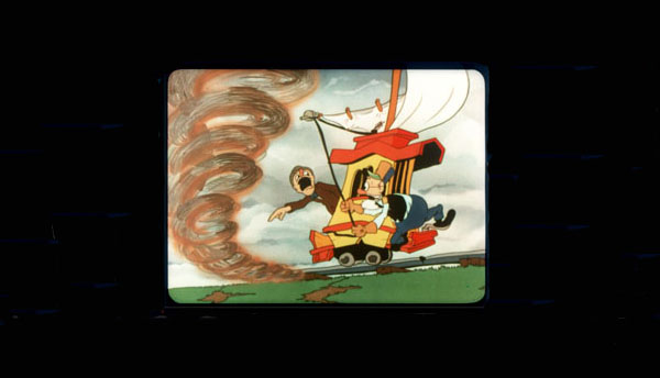
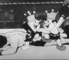
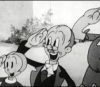
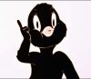
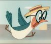
Case in point: A first sneak preview from the Comi-Color Cartoons collection, now scanning: here is Iwerk’s Jack Frost (1934), scanned from the original camera negs for the first time! This appears here as a little Halloween treat (and after some friendly prodding from our own Mark Kausler who I promised I’d show it to soon!)
Film historian and technical hero Jack Theakston was kind enough to show me some of the ways he combines separation negs in Premiere. I had been using Final Cut Pro and After Effects for these sorts of things, but I’m happy with many of the newer color correction tools in Premiere. While not a final version and uses a soundtrack from a previous scan, it gives you a pretty good idea of what these films will look like on the set. There is no cleanup on this film as of yet— it’s literally this clean from an excellent Lasergraphics scanner.
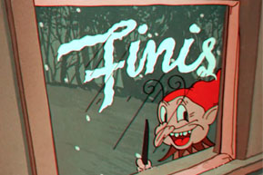 Jack Frost has been a favorite of mine since I first saw the film back in the early 80s. I think I bought a Blackhawk print of it back then if memory serves. For Blackhawk’s prints, they used a 35mm Cinecolor print as the master; I think this is the first time anyone has gone back to the negs for a release since the films were made. UCLA has done some restorations of a few of the films, and I imagine they went back to the negs to do some of those, but I haven’t seen any of them as of yet.
This cartoon is full of enjoyable animation and music. Jack Frost’s little theme is especially wonderful in the sequence where he paints the little bear’s window and onto the pumpkin patch- one my my favorite things in any film, ever. I think everyone can agree that the Cab-Calloway-esque scarecrow scene is one of the highlights of the whole Comi-Color series. What do you think about this cartoon?
Enjoy this Halloween treat, stay warm and don’t let Old Man Winter icicle you into a tree stump!
 Steve Stanchfield is an animator, educator and film archivist. He runs Thunderbean Animation, an animation studio in Ann Arbor, Michigan and has compiled over a dozen archival animation DVD collections devoted to such subjects at Private Snafu, The Little King and the infamous Cubby Bear. Steve is also a professor at the College for Creative Studies in Detroit.


“Jack Frost”, “Balloon Land” and “The Three Bears” are my favourite entries in the ComiColor series. I can watch them over and over again and never get tired of them. Many Ub Iwerks cartoons are flawed in terms of story, pacing, continuity, etc., but as far as I’m concerned “Jack Frost” is simply perfect from beginning to end.
I understand that this isn’t the final version, but I can’t help noticing that the brown, orange and golden hues are less vivid here than in other prints that I’ve seen. This is most noticeable in Jack’s palette, the pumpkins, the scarecrow, and the candy canes. Since these colours lend such a wonderful autumnal atmosphere to the cartoon, I hope the Premiere software can restore the same warmth and richness that they would have had in pristine prints of the film.
But what really impresses me here is the amazing clarity. I find myself noticing details that I had overlooked after many dozens of viewings: the “HOT NUTS” sign in the background, for example, and the spinning top that Frizzly Grizzly packs into his bindle. And then there are the beautiful female figures among the frozen trees that Reg Hartt pointed out in a previous post. To see “Jack Frost” in such excellent condition, looking like a brand new cartoon, just makes me want to kick up my heels and sing “Oh, scoodly hoogy leggy hoogy piggy maggy ho booten beeten batten scoodle boodle bay!”
I remember seeing an ad wich showed part of this film on a TV screen ( when the scarecrow becomes a snowman )
There is another old cartoon i’ve seen a on a commerical but i cant idenitfy it, it shows three lambs jumping over a fence, it looks very Disney like but it’s probably by another studio.
I agree that Jack Frost is a great cartoon. I have it on a large DVD Christmas collection that includes a few semi-Christmas or non-Christmas cartoons.
One of my favorite pairings is to watch this cartoon along with the Rankin/Bass special of the same name. Makes a nice Jack Frost double feature.
The focus and clarity of the image is stunning – though I would tend to say not historically accurate, as I believe it goes far beyond the technical capacities of the film processors of 1934.
The double-sided emulsion process used for Cinecolor, even on the best of nitrate positives I’ve seen at UCLA, led to a certain softness of focus, bordering in some instances on the feeling of seeing a double-image like watching am analglyph 3D film without glasses, depending on the printer’s alignment.
I own, among many other Iwerks films, two home movie editions pressed on genuine Cinecolor stock of Jack Frost, and thankfully, despite the years, the color values of the films haven’t faded a jot. Yet, to a degree they wreak havoc on my scanner’s abilities, as its lens tries to find a center of focus on two micro-thin emulsion strips at slightly different distances from the lens.
I can see where the only way to improve this focus would be to run separate scans from the respective separation negatives and combine the data. The presently circulating print on the internet, which I believe dates back to the Blackhawk video days (confidentially, their 8mm and 16mm copies were terrible – don’t settle for anything in home movie film stock other than the Castle Films original) is a reasonably accurate depiction of what a screening of UCLA’s 35mm positive looks like – which I’ve seen on the big screen twice. You can instantly tell the major difference in the focus level, illustrating the common Cinecolor problem.
So I guess you’re attempting to improve on history, which, at least for the sake of seeing the artwork as the camera did, is a noble cause.
However, while I praise your results on focus and density, I take serious issue with the color levels. Something is decidedly wrong in the balancing of information between the red and blue strips, throwing off entirely the hues I’ve seen on the nitrate positive and both home movie prints, all of which are virtually identical in color and saturation levels.
My first observation is that the blue is definitely amiss. For one thing, there are no true whites to your image. Original Cinecolor seemed to be capable of clearing away traces of the emulsion layers where a bright white was needed, without leaving a “tinted” look to the clear area. (If anything, if any cast of color presented itself in a white area, it was generally from the red strip, not the blue.) Your transfer shows a noticeable cast of blue over everything, which is something I’ve never seen in a Cinecolor print.
A second major issue is that the deepest blues showing on the print are not true blues at all – but bluegreen! It is as if the scan was set to process a 30’s era two-strip Technicolor film, rather than a Powers Cinecolor. These are the shades one might expect from a Warner cartoon o the period, bit not an Iwerks. Cinecolor blue on all prints I have seen, nitrate or home movie, is among the most deep blue in its raw form I have ever marveled at on the screen – often shown to full advantage in Castle Films’ own credit sequences, which capitalized upon using the raw blue in the background behind the company logo.
While the strip is capable of some green levels also, it is not as jarringly bent toward such levels as Technicolor – and a key spot to view the raw color in Jack Frost is on the water in the washbucket that the bear splashes into in the opening sequence. Compare the circulating video print on this versus your scan – your water is nowhere near as deep and dark a color. Also, compare the blue level on the scarecrow’s outfit – again, nowhere close to the deep tones of the original, which show up in stunning fashion even on my home movie prints.
The red strip presents a different problem altogether. It feels like the saturation level has been turned up to the full max, well past the levels of the original film. Frost’s outfit is much too “loud”, especially in the first shot in which he appears, which gives the shocking appearance of being all orange and hot red, when in all prior prints I’ve seen, a good mix of colors and more subtle shades were present. Frost’s Cinecolor rainbow has also lost its subtlety, originally exhibiting softened shades ro give a more realistic appearance to a spectrum lacking in green (avoiding the mistake of Columbia’s “Make Believe Revue” which showed too clearly and distinctly the limited number of paint choices the studio budget permitted in also trying to present a “rainbow), but now looking like it only present three or four colors.
The suspendered pants on the bear with which the little bear plays leap frog are also off, now looking like a fire engine red, while all previous prints have always shown them in a darker red tinged with a little brown (part of this problem may have arisen from the imbalance of the blue strip, which would likely have provided some of the brown overtone if the blue was of proper intensity).
Perhaps most disturbing of all is the disappearance of almost anything resembling green, or a true yellow. The skirt of Mama bear, which displayed the brightest yellow in the film, now looks peach-orange!.The doors of the tree houses as the bear tries to hide from old man winter, and some of the stripes of the candy canes, which each displayed the film’s best green, now look reddish or gray – again possible a combined effect of to much red and too little blue.
This same overall color imbalance problem appeared a few years back in UCLA’s attempt to present a “restored” print of “Balloonland”, which I believe appeared in the “Saved From the Flames” DVD set, with the same problems of the wrong shade of blue and disappearing yellows and greens. Someone in the technology department just doesn’t understand Cinecolor when processing from the negatives. I know you’re a stickler for getting things right – so I’d call this venture a “work in progress”. Please see if there’s some way to reprocess your data to true Cinecolor specs rather than Technicolor, so we can rise out of the disappointing levels of a Warner cartoon to what Iwerks really created.
The original Cinecolor camera negatives would be black-and-white, wouldn’t they? (Did they use a single-strip, successive-exposure method or bipack, as in Cinecolor live action photography?) That means that color would have to be added digitally to each pair of scanned exposures, then combined. The Cinecolor print-making process (as described in this page from the American Widescreen Museum: http://www.widescreenmuseum.com/oldcolor/cinecolor2.htm), of course, used dyes and chemicals and according to that AWM article also included a yellow dye layer. The challenge, it seems then, would be to come up with some way to emulate with digital methods the results that were originally produced chemically.
Hi Charles,
This is a first pass at the color correction- not final in any way at all. It’s a nice sneak peek at what the neg looks like combined, but far from corrected to the best balance. The two negs are black and white, so there’s lots of ability to play with the balance.
From looking at the original Cinecolor prints from the 30s at UCLA (there’s prints of almost all of them *and* the camera negs) it’s clear that the Castle Film prints are far from the original ‘look’ of the films. I love the Castle prints, but they are much, much bluer than the 35mm versions that tend to be a lot more balanced. Thanks for the notes though- I’m printing it and will have them here as we work forward!
Man oh man!
What a beautiful cartoon!
This has always been one of my favorites but to see it like this is like watching it for the first time.
Thanks very much.
I remember watching a VHS Tape with that Cartoon on it in Acting Class during my 2nd Year of Middle School along with Max Fleischer’s Rudolph the Red Nose Reindeer as well as the Live Action/Stop Motion Short known as Christmas Dream and I thought it was Both Freaky and Weird though my Point of View on it might change now that I’m an Adult
It just does not get any better than that. The best print I have ever seen of this cartoon. And Xmas is getting ever closer! Crisp and clear! Thanks, Steve.
BTW love that coda stereo music that plays with the tail leader of the film!
A question involving the negative itself. The shot of mama and papa bear “sawing wood” has always been a mystery to me, as there appears to be a very brief break in the music, and corresponding interruption of the animation cycle at the same time, as if a splice was made. There doesn’t seem to be any time for a censored gag to have been included during the brief missing beat, so I’d assumed that some negative damage occurred before the film went into home movie distribution, and continued in all subsequent prints. Did the negative show the splice? If it was already in the production negative from inception, any theories on the reason for the brief interruption?
Must be pre-code. Two bears sleeping in the same bed!
“Jack Frost” is one of my favorite cartoons. When I was a kid, my grandma had this on a VHS of Christmas cartoons that also included “The Christmas Dream,” the Mel-O-Toons cartoon “The Seasons” and a live action short of “The 12 Days of Christmas.” This version of “Jack Frost” is best version I’ve ever seen. The picture and color quality are excellent, but I have a question. Why do the blues look kind of green here?
A few notes about this film:
a) I have wrestled with this hypothesis for a while and I think it is accurate that the “Scat-crow” in the film is the work of Dick Bickenbach. There is a Christmas card drawn in the same fashion signed by “Bick” that has similar drawing traits. Even though the dancing is rotoscoped, or taken from live-action reference, it’s clear that Bickenbach put his own flourishes in the dancing. Bickenbach also seems to have animated the preceding scenes of Jack Frost, the little bear and the pumpkins. Mike Kazaleh once told me that Bick took cues from Irv Spence, who both worked alongside each other at Iwerks, so the two have things in common with their animation in the ComiColors.
b) Keith Scott told me that Iwerks hired a group called The Jones Boys (imitating the Mills Brothers) during the “Scat-crow” sequence.
c) The Hollywood Reporter stated that this film and another ComiColor, Sinbad the Sailor, were screened for the Academy committee as a consideration for Best Short Cartoon of 1935. Of course, both were not chosen for an Oscar nomination. The interesting thing about the committee: Roy Disney was a participant, so make of that what you will.
So would Bickenbach also have animated the dancing scarecrow in “Little Boy Blue”?
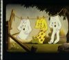
There’s a pan background in which the trees, covered with snow, form nude women.
Milton:
I’ve NEVER noticed that before, but of course, I’d expect you to INSTANTLY notice THAT!