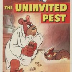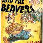
Man, these posters are ugly!
MGM made some of the best short cartoons ever, with brilliant directors like Tex Avery, Bill Hanna and Joseph Barbera – and perhaps the finest animation art staff, second only to Walt Disney. But MGM’s marketing department, located in New York I believe, apparently had one staff artist assigned to design and draw the posters for all the short subjects. Not only the cartoons, but the Robert Benchley, Pete Smith, Our Gang, etc.

MGM Pete Smith and Our Gang posters by the same mysterious artist
I do not know who this mysterious artist was, but he was able to keep his job for at least 15 years – and he was awful. It’s almost like he took one look at the cartoon and tried to draw the characters from memory – while drunk. Talk about “off-model”. Occasionally in the late 40s, the artwork comes close to the studio’s standard. The artists at the MGM cartoon department (or Quimby himself) must have insisted the poster artist draw more to the model sheets – after all, they were winning Academy Awards, and these posters were too embarrassing to even mount in the studio lobby.
• 5/14/14 UPDATE: Cole Johnson identifies the “artist” in the comments below.
• 12/29/23 UPDATE: Randy Skretvedt found the artist’s full name and his correct spelling: Bela Redly Rieger
Here’s a small sampling of the artists “best” – in other words, his worst (click thumbnails below to enlarge):


 Jerry Beck is a writer, animation producer, college professor and author of more than 15 books on animation history. He is a former studio exec with Nickelodeon Movies and Disney, and has written for The Hollywood Reporter and Variety. He has curated cartoons for DVD and Blu-ray compilations and has lent his expertise to dozens of bonus documentaries and audio commentaries on such. Beck is currently on the faculty of CalArts in Valencia, UCLA in Westwood and Woodbury University in Burbank – teaching animation history. More about Jerry Beck [


Blarg! I always wondered who created these atrocities. I guess we may never know. (Maybe it’s better we don’t?) Also, why is any of this NSFW? Is the ugliness too offensive for work?
NSFW??
Nat and Petykins – these posters are worse than pornography. In fact, they ARE pornography!
“Cruise Cat” has to be the first (and hopefully last) cartoon poster to show its star character feet (and butt) first! Might have made a little sense if the cartoon was in 3-D? Metro wasn’t the only studio to have bad cartoon posters, but they had to be the most consistently lousy. The Our Gang and Pete Smith posters go a long way to put this in context too.
You ain’t kidding! These are so ugly!
Another MGM cartoon poster that’s ugly is the one for “The Zoot Cat.”
Jon Cooke really needs to start the “Design an Ugly MGM Cartoon Poster” contest! He hasn’t done an Ugly PD Cover contest for about 4 years!
I had an opportunity to purchase some of these Avery one-sheets for 5 bucks apiece in 1980, and I passed, because they were so hideous I couldn’t stand to look at them. I’m sure I would have made back that ridiculously slight investment many times over, but even at age 17, I had principles!
These posters remind me of the art on the boxes of bargain cartoon collections you find in the dollar bin at Wal-Mart.
DIsney’s shorts posters weren’t any better.
Well, most of them weren’t as bad. There were some exceptions such as ones for “The Flying Squirrel” (1954), “Chip n’ Dale” (1947), and to a lesser extent, “Winter Storage” (1949) and “Grin and Bear It” (1954) which rival the MGM posters.
I’ve got a couple of these. And they are as baffling as they are hideous. How could someone be allowed to do that for one season, never mind 15 years?
Odder yet, is that there actually are elements of good illustration in these things: layout, atmosphere, perspective, color, lettering. But when it comes down to rendering the actual subject, this guy goes right in the toilet.
NSFW = Not Saleable For Warners
Odder yet, is that there actually are elements of good illustration in these things: layout, atmosphere, perspective, color, lettering. But when it comes down to rendering the actual subject, this guy goes right in the toilet.
The elements are certainly there, the execution however leaves a lot to be desired. This guy really should just have done preliminary sketches and sent the rest out to someone else for completion (at least someone who could competently do these justice but I highly doubt MGM’s NY office was that good about it).
The artist that you are talking about is my wife’s grandfather. Bela died before my wife was born. If you ever wanted to get rid of the art work she would love to have it.
Maybe that artist found work later in life drawing box art for all those public domain cartoon video tape collections!
Meanwhile, many of the MGM features and Hal Roach shorts had posters by Al Hirschfeld — some of the handsomest posters of the entire era. What a difference!
Ha! I’d wondered about the MGM posters before. Why did cartoons that look so good have such hideous posters? But this is the first time I’ve seen so many all at once. Yuk! Ugly posters seemed to be the way to advertise cartoons in the 40s. Even Disney, who you usually expect to have high standards and had beautiful posters produced right from the silent era and through the 30s, started making really yucky posters some time in the 40s. Chip an’ Dale could appear as big as Donald Duck while grotesque renderings of Goofy and Pluto often had skin that shone with a monstrous a green.
It does make the WB lobby cards look like masterpieces in their own right.
Again, they weren’t as bad. The drawings technically were mostley drawn well. It was the quesionable colors and heavy use of brush strokes that were the problem.
Beautiful cartoons, horrendous posters.
As per request by Jerry Beck, here’s an addition to the batch:
Funny story, a few years ago (2007 to be precise) we went to a old-fashioned country store in Vermont. There, they had a large selection of film posters, ranging from “The Wizard of Oz” to “Hey There, It’s Yogi Bear!”. It’s there where I found and bought that behemoth.
Whoever drew these posters, is probably too ashamed of himself to be named in any document. Because my wild guess is it that its someone that we might know since he keept his job for 15 years as you said Jerry.
Hello, Jerry—-The man responsible for most all of the artwork for MGM’s shorts was Bela Reiger. He did some of the promotional art for Pathe in New York in the mid-20’s, and was hired by MGM when they initiated their short subjects department in 1927. His initial efforts had a lot more work put into them,but still, poor composition, limited caricaturing skills, and shaky anatomy were the lifelong aspects of Reiger’s masterpieces. He did the advertising cuts for newspapers as well as the posters. These can get really hideous, remember the poster for the Pete Smith about the blind bowler? The cartoon posters, however, really take the cake.
Here is some of his earlier work for MGM:
Thank you Cole for identifying the artist, Bela Reiger. His is a name that will live in cartoon (and movie history) infamy!
I’m starting a Bela Reiger fan club. Anyone want to join? No one?
Do we get T-Shirts with Reiger designs?
Bela Reiger was my Grandpa , we lived in Oceanside, Long Island and he had an office in NYC
I found out that he worked for RKO too (at least in 1935).
“Yankee Doodle Mouse” is, by far, more horrendous!
Glad to see a historian finally point out the inexplicable ugliness of these MGM posters. 😉 Here’s my own addition to the bunch — quite possibly the most disturbing Tom and Jerry promotional art I’ve ever seen:
For the Sufferin’ Cats one it’s hard to tell which cat’s Tom.
Talking about a fluke and a jape at the same time. This man’s posters almost make the worst of early Newgrounds look like Bronson and Tetsuo Hara.
The only different I suppose is that this guy actually got paid to keep at it, and by a company who apparently turned a blind eye to his efforts simply because they couldn’t think to ask someone else for it. We can learn a lot from history I feel.
In the past this site has run several all-purpose cartoon posters — the ones that promote the studio with a mob of characters, perhaps with a white box to slap in a text title. Some of those are equally cringeworthy, either for bad original art or tone-deaf pasting up of stock merchandising poses.
Man, this man is literally incapable of drawing a good Jerry Mouse. Tom might occasionally look passable, but Jerry always ends up looking a mutant dwarf.
I’ve also noticed that he’s good at drawing feet, but most anything from the ankles up looks like complete ass.
Oh, merciful heavens, “Ye Olde Minstrels”.
As a child, I actually liked the MGM “Our Gangs”. This was primarily because, at the time, the Hal Roach “Our Gangs” were not easily accessible on TV, and TNT was running the MGM ones regularly (Sundays at 6 AM). I would even bring tapes of the old MGM “Our Gangs” along with me to various places _so that I could show them to other people_. “Ye Olde Minstrels” (blackface routine and all!) was one of them.
On behalf of the art, craft, and business of cinema, I would like to apologize for this childhood transgression. I’m beyond sorry.
More on subject, the, er, tenuous quality of the MGM shorts posters was never lost on me. I figured they didn’t care much what they looked like, since the MGM shorts were already presold via “block booking”, and after “block booking” went away, the artist was a longtime dedicated company man and they weren’t going to replace him.
My questions is why were popular series like “Tom & Jerry” billed only as “A Metro-Goldwyn-Mayer Cartoon” (Save for the “Sufferin’ Cats!” poster uploaded in the comments)? Also, is there any significance to the “Goldwyn” (for Samuel) in “Metro=Goldwyn-Mayer” being italicized in the logo or was it just designed that way?
“Goldwyn” was always italicized as far back as the silent days on that particular logo. It was just a stylistic choice to show the middle name in a different font, I don’t think it has any deeper significance.
I’m sure it’s all studio association Brandon (of course the end cards of T&J cartoons would have “an M-G-M Tom & Jerry Cartoon” as well. I can’t explain why “Goldwyn” was italicized other than a design motif since the name itself is derived from three separate companies that were merged together to become the MGM we know today.
You’ve nothing to apologize for Brandon. No wrongs are committed!
For the record, I believe the difference in the font for “Goldwyn” was a reflection of the logo used for Goldwyn’s studio before the merger that created MGM. Not unique, that sort of thing, though admittedly the only other example I know of is American-Standard, the toilet bowl and radiator company, which used the two different names in different typefaces for decades.
I was always intrigued why these posters were so off-model and downright ugly. I think “Nit-Witty Kitty” and “The Lonesome Mouse” are the worst, you couldn’t even recognise the charters.
I have picture of these, and some equally bad posters I can upload.
I know that WB had lobby cards, but did MGM too?
I’m not entirely joking but I wonder if someone at MGM sent the posters instead of any actual cartoons to Prague for the Gene Deitch-Czech made Tom and Jerry cartoons so the animators would have some sort of reference. The Jerry Mouse in the “Cruise Cat” poster looks like a model sheet for the Czech drawn Jerry. In fact, the poster looks like a still from “Calypso Cat”!
Is there a website dedicated to posters of classic cartoons? I’d love to see them.
I am looking for billboard posters by Hungarian artist, Bela Rieger of New York City who painted Hal Roach’s Spanky and Our Gang posters. do you have any?
Regards, Rosemary McCabe
I ‘ve got one, Spooky Hooky – Our Gang by Hal Roach
What do we know about this artist, Charles Mulholland? This reprint – sent to me by David Gerstein – comes from the May-June issue of MGM Shorts Story. Were there “special posters” for Harman-Ising cartoons? We know Hirschfeld did publicity art for The Good Little Monkeys – any others?
Thanks Cole!
That was my grandfather, and he drew as he was told. Watch the cartoons, they looked just like the posters. It was another time. Peace…
The characters may vaguely resemble their on screen counterparts, but the anatomy and proportions are all wrong and the characters’ poses are kind of strange and unusual looking. The posters have their own unique appeal because they are kind of off-model and a bit wonky. I kind of like them because they aren’t perfect. That’s the humor here. I highly doubt this post is meant to be taken seriously. It’s all in good fun 🙂
Reiger must have had something on Quimby or some executive in order to keep his job. Too bad the Roach studio did not have their own illustrator for their comedies.
I’m disappointed to read all the insensitively negative and even nasty remarks here. A real person worked hard to make these and several of his descendants have obviously read the post and comments and have posted here. Folks don’t have to like the art of these posters but there is no call to be mean about it. I actually like these posters a lot. They have real charm and are typical of the ways cartoons have been reinterpreted in other media, including toys, posters, ads, and the like–they are of their time, and that should not just be respected, but valued.
ehhh, these comments aren’t really being mean ( i’ve seen/hear a lot worse ) and they’re not attacking anyone ( wich you couldn’t say about certain political figures now…… but let’s not go get into that here…….. )