As I write this, I’m waiting for the first master to burn on Fleischer Rarities. Nearly every day has had a big chunk devoted to this particular project, so I’m very happy to have it standing on its own now. I hope everyone finds it as interesting as it was to work on the set in the first place.
In the meantime, I’ve been able to sit down a little and go through the first requests for scanning material on the Rainbow Parades. I looked at the material a while back now, so I was glad the notes were complete enough to make a call as to what to scan first. I still need to look at the last part of the series closer to figure out what to pull to scan.
“Cartoons to the Rescue”, one of the ‘Special’ sets, has started to go out this week. After visiting a friends house earlier in the week (and being offered a lend of some prints) I decided to do at least one more of these ’special’ sets. Details can be found on the IAD forum, here. Thanks to everyone that has supported these little sets.
One Last Special Set – CLICK HERE
I’ve been advised by friends to talk a little less about these projects as they’re happening, but, on some things, I’ve found that it’s been really helpful – not only in your feedback, but in helping to track down material at times. Posting the list of titles needed for the Rainbow Parades has now led to two rare prints being found that should be helpful for the project – not too bad! The new scanning should start in the next week or two on this project.
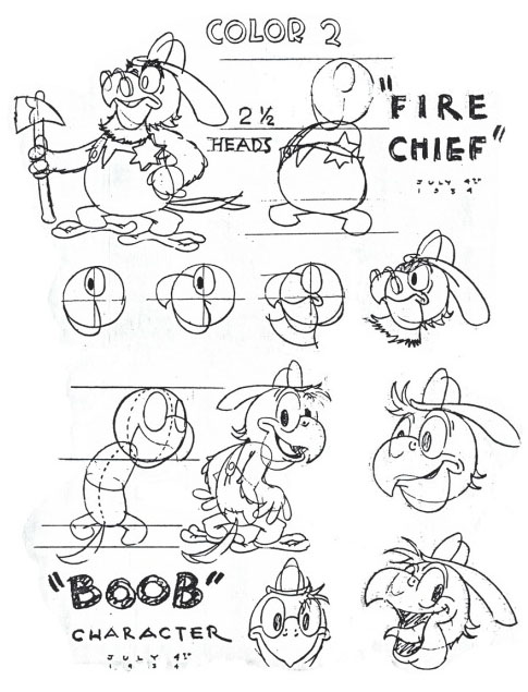
In the meantime, during another transfer session here (in just HD), we ran a ‘quick and dirty’ transfer of Parrotville Fire Department. I’ll eventually be doing a 4k on it, but it was nice to see what the print looked like — and here it is for you to see as well.

This cartoon was the second released in the Rainbow Parade series, and, to my eyes, it looks a lot closer to Van Beuren’s earlier efforts than the slicker Pastrytown Wedding, the first Rainbow Parade released. I had wondered if the Parrotvilles were intended to be black and white series originally. My thinking is that the ‘Toddle Tales ‘ series was going to be continued in black and white, and the fourth and fifth were already in production when the decision was made to release all Van Beuren cartoons in color. Perhaps that decision then relegated both A Picnic Panic and Spinning Mice to be produced under the Rainbow Parade title instead. Friends of mine suggested that the Parrotvilles were always going to be in color, and that a Parrot’s bright and varied colors were perhaps part of the decision. This is all speculation, but there may be some truth to that.
Mark Kausler made the suggestion to me a few days back that perhaps Gillette, who had recently left Disney, was trying to scoop his former studio’s idea, and get a ‘Fire Department’ picture out first.
From Mark:
“This cartoon resembles some of the gags in “Mickey’s Fire Brigade”, a Mickey Mouse cartoon from August 3, 1935. It’s significant that the Parrotville cartoon came out BEFORE “Mickey’s Fire Brigade”. I wonder if Burt Gillette worked on the story of the Mickey Mouse cartoon prior to his employment at Van Beuren, and thought he would “scoop” Disney by coming out with a fire house picture first? Especially striking in both cartoons are the little flames being personified with two legs, and able to change themselves into different shapes, like corkscrews. Gags are attempted that were better staged in the Mickey than in the Parrotville, such as the flames being cut off square with the windowsill by a stream of water cutting across the shot. The flames scatter all over the place and grow legs as the water hits them. Mickey uses a scissors to trim off the top of a tower of flame that he sees from the top of a ladder. The flames clearly end at a straight edge where Mickey cuts them off. The Mickey concept seems to play better and more simply than the Van Beuren one. Of course, the Mickey is in full Technicolor, while the Van Beuren had to limp along with the two color Cinecolor process.“
Although the color palette is limited, I think it’s important to note that balance of color on the 35mm Cinecolor prints has been especially nice, making a fine balance between the two colors to present as full of a color palette as possible. I especially love seeing the opening and closing credits on these films as well as hearing the full score.
So, here is the print. Make sure to watch it in HD if your computer can do so!


 Steve Stanchfield is an animator, educator and film archivist. He runs Thunderbean Animation, an animation studio in Ann Arbor, Michigan and has compiled over a dozen archival animation DVD collections devoted to such subjects at Private Snafu, The Little King and the infamous Cubby Bear. Steve is also a professor at the College for Creative Studies in Detroit.


Wow, that’s gotta be the nicest “yellow” I’ve ever seen in a 2-strip Cinecolor.
Thanx, Steve!
I was thinking the same. That yellow almost stands out as if it was another strip.
Oh, that oughta clean up nicely.
Still it’s kinda fun to see it this way with the entire frame exposed than to see a 4:3 matted look (you can see the unfinished edges of the smoke on that house for instance as well as the edit splices in places) that stuff of course wouldn’t be seen outside normal projection in full-frame.
Amusing little flick.
And yet, I noticed the ending joke was later used (perhaps to greater effect) in a Famous Studios’ Screen Song entry “The Big Flame Up”. Still as you say, this amusing.
My headphones are awful, but even so, I can definitely hear that the audio has pretty good fidelity.
Wow!
Lovely print and cartoon!! Thanks as always, Steve!
That print is gorgeous, can’t wait to see it cleaned up!
And with all due respect to your friends, I think I speak for many that say that we love hearing about how these projects are progressing!
I’ve got to say that that’s one cartoon from the classic era that I had never seen. Fun cartoon and in great shape!
You’ve been advised by friends to stop talking about your projects as they are being worked on??? Stop hanging around with those ‘friends’. One of the highlights of the week is Thunderbean Thursday, hearing about your progress, your challenges and how each set is moving. This is the key place to get this information and create excited as each set nears completion. Keep the info flowing and keep the good work moving forward!!
Compared to how patched together this was on your earlier Rainbow Parade DVD ( by necessity!) it’s really cool to see this as originally released. As you noted, not exactly as slick as Eshbaugh’s work, but showing some promise for what was to come.
I suppose talking too much about what you are working on can lead to monetary issues obtaining rare or even unique prints to transfer, but it can also lead you to better source material from collector’s who aren’t so mercenary. Kinda of a sword that has two edges. Keep up the excellent work Steve!
These sort of updates are good for hyping the public up for releases and getting materials for sure. For what is mostly viewed by the wider public as old junk ANY hype or explanation of the films is helpful in building actual excitement for casual or non fans of this sort of archival entertainment. Gotta get the word out, people are lazy and stupid. Updates are great! I think you should do more videos like the Nitrate Flip the Frog evaluations on your youtube. Great to see this print. Can’t wait for the disc.