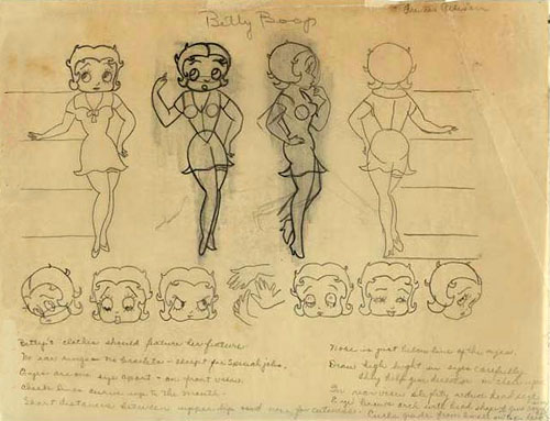
Today we’ll dig into one of those later Betty Boop cartoons – you know, the ones produced after the Production Code went into effect. No character was more affected than Fleischer’s Betty Boop. Still popular enough to warrant her own starring series, the Fleischer’s began saddling her with supporting characters – Pudgy the Dog, niece Buzzy Boop, Grampy, boyfriend Freddy, Sally Swing, comic strip icons Henry (“The Funniest Living American”), The Little King, Little Jimmy, and on and on…
They also had to remove the sexual element. Betty’s late-30s model chart (above) was altered to lengthen her dress, and her face rounded to create a more wholesome look. She became a progressive, modern woman – introducing audiences to new ideas (The New Deal Show), new fashions (Keep In Style) and promoting healthy habits (More Pep).
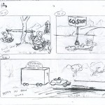
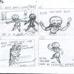
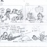
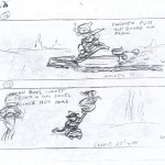
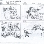
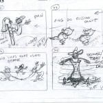
Below is what may (or may-not) be the storyboard for Be Up To Date (released 2/25/38), a typical entry in the series at this point. Is this the actual storyboard? Fleischer boards are very rare so it’s hard for me to be sure – this one seems more simplistic than the boards I’ve seen from other studios at the time. Maybe they were in a rush to move to Miami. That said, if you compare it to the finished film (below) its all there. Thirty-three scenes on 11 pages – with notes as to who animated which shot – Frank Enders, Hal Walker, Otto Feuer and Tom Johnson handle all the chores. Note the first scene is indicated as an “ad-lib” setback shot (animated car by Johnson).
Click thumbnails below to enlarge.






 Jerry Beck is a writer, animation producer, college professor and author of more than 15 books on animation history. He is a former studio exec with Nickelodeon Movies and Disney, and has written for The Hollywood Reporter and Variety. He has curated cartoons for DVD and Blu-ray compilations and has lent his expertise to dozens of bonus documentaries and audio commentaries on such. Beck is currently on the faculty of CalArts in Valencia, UCLA in Westwood and Woodbury University in Burbank – teaching animation history. More about Jerry Beck [





In its own way,it was entertaining,swinging away from the emphasis on Betty toward the everyday items used for other purposes method,influenced by Grampy.I do miss the earlier sexually charged Betty’s,but I still can find somthing amusing in the later entries like this one.
Given the release date in February, 1938, this likely would have been on of the cartoons put into production during the 1937 strike at Fleischers, which might explain the paired-down storyboard. I believe “Thrills and Chills” was the final NewYork-based Boop cartoon, and “My Friend the Monkey” was the first to have at least part of its production done in Miami.
Some of the later Betty cartoons, like this, “Riding the Rails” and “Sally Swing” really aren’t that bad, since either the music or the mechanical/technology linked gags were two things the studio did well under any circumstance. But Betty minus sex put her in the same position as other early-30s cartoon stars, who as the decade wore on were too bland to carry their own cartoons (and while Pudgy may be a wonderful 21st Century marketing tool for a variety of Boop-themed merchandise, outsider of “Rails” and a few shorts done by Tom Johnson, the Pudgy shorts were a main factor in killing off Betty’s series).,
,
This looks to me like the director’s rough layout for the short. I can’t tell who did the drawings…doesn’t look like Waldman to me but could be. Perhaps there’s someone else who has seen a few of these? My guess is that the boards had been completed by story at this point, and this is the director taking the rough boards, figuring out basic shot composition, labeling shots, noting action, then figuring out first steps of handout. Since he has to wait until the setback is build, he can’t get the shot composition for that. A lot of the basic technical has been worked out here, clearly done by one person. From here these notes would travel to layout, and after that animation. I think it’s unlikely that the production was done much differently than any of them had been since they were churning out 40 cartoons a year and had each department set up fairly well, even during the move.
Steve, Waldman wouldn’t be involved here because it’s a Johnson unit short. Tom was the most gag-oriented straight comedy head animator at the Fleeischer Studio — his Boops (even the Pudgys) tend to avoid the cloying cuteness of the Waldman unit Bettys, and are at least watchable on their own terms for the secondary characters and the gags, if not for the star.
The gags may, or may not be due to what the animators under the lead animator, who functioned as the Animation Director did with the material. It seems that the storyboard should have been the place to suggest these. The storyboard example we see here is pretty general and rough compared to today’s standards. But it was certainly enough for the animators to go with.
The later Boops are not so terrible, as noted above. But the element that does bug me is the character re-design. The more realistic proportions and too-refined facial features completely strip Betty of her classic cartoony-ness.
The sidekicks were also less inspired than their predecessors. Grampy, yes. Wiffle-Piffle, not so much.
I agree. Graham Place did not improve BETTY by doing this. She became more “awkward” in this form. As for the Post-code Betty, if there were no comparisons to her earlier persona no one would have known the difference. The major component in the post-code Boops is stories more closely tied to a song, keeping her a musical novelty character based largely on the talents of Mae Questel during this period. I think we can agree that the series was over in 1938. The 1939 cartoons seem so unrelated with the new character design and the return of Margie Hines as the voice after she was so established with Mae Questel.
Otto Feuer told me that Tom Johnson’s version of Betty Boop was his design. He liked it because it was more realistic than the design used by the other Fleischer units. Later in life, he created some unauthorized Boop “merchandize” utilizing his design.
Also, animator Lillian Friedman, who worked in Myron Waldman’s unit, felt that the pre-Code Betty’s were much superior to the later ones.
So the Fleischers were still utilizing the three-dimensional sets and post-production vocals this late in the studio’s timeline? Cool.
Basic premise of traveling department store in backwoods country was used again by Famous in Popeye’s “Silly Hillbilly” (1949).
And, although I can’t recall the title, there was an Edgar Kennedy two-reeler where he is a travelling salesman trying to sell things to a bunch of hillbillies.
To quote Bugs, “It stinks.” The 3-D set at the front is amazing but woozy camerawork ruins it effect. I hate everything about the Code. The ‘new’ Betty titles are so bland. Mae West and Betty, ruined by censorship.
Betty doesn’t even charge for anything — I was waiting for a closing shot of her counting money, finally paying off all those winks to the camera. Was a pretty girl in possession of cash too fraught with obscene implication?