The beginning of the school year as general business has me running around a lot these days- and finding time to even write a little between all the other commitments has been difficult. Our Blu-ray duplicator died last week, but happily it’s up and running again- and we’re finally getting the rest of the ‘Sneak Preview’ Flip the Frog sets out to everyone.

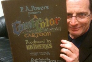
Jerry Beck examines the prop book used as the titles in many of the latter ComiColor cartoons (The book courtesy of, and photo shot by, Mike Van Eaton)
On the Flip the Frog Blu-ray project: next week, we’ll be launching a ‘Kickstarter’ campaign to help fund a special bonus feature on the Flip the Frog set- a tribute to the Iwerks’ Studio featuring Flip the Frog- a sort of ‘Animam’ featuring Flip dancing by all different animators. More on this next week as we launch.
The various adventures this month include the frustration of stalled negotiations on some things, the discovery of other things, and new deals to release various titles. The roughest moment in the last few months in relation to Thunderbean was learning that the Flip materials we thought were in color from one of the European archives turned out to be in back and white, tinted on a Kodak stock called “Sonochrome’ This stock has a black and white soundtrack but color tinted picture. It was a huge letdown after trying to gain access to the material for years, we were finally being able to move forward with the correct paperwork, only to find that sadly they were not in two-color.
I’ve been taking a momentary step back each night to evaluate the various possibilities right now in running this small company. Things have been so busy that we’ve barely thought about the expansion of the market into wider distribution, but it’s needed to start to do some of the things we’re working on. Funny enough, the thing I find myself most interested in at this point is working with the less-seen materials more than anything. Of course, some of the projects we’re doing are upgrades to things already available, with some of these quite nice- but still, presenting things that truly have been impossible to see are still the most exciting things to me.

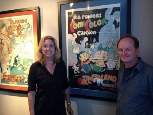
Leslie Iwerks and I pose in front of some of the amazing original ComicColor posters on display at her studio in L.A. (photo by Jerry Beck)
While I was out, I was also lucky enough to go with Jerry Beck to meet with Leslie Iwerks at her studio. The studio produces excellent documentary films. Several Comi-Color posters are proudly displayed there, and there’s nothing as nice as seeing these beautiful posters in their full size.
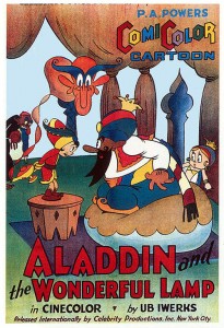
Since there is a lack of pictures on this actual material as of yet, we’ve used some posters from the series here. The Comi-Color posters are some of the nicest of any series in the 30s.
Most of those titles also have the original motion picture production code logos at the beginning, missing from all of the later releases. These logos rage from the standard blue background one that is often seen, while others have a colorful art deco background that was likely used by the Iwerks Studio only. Besides the color separations, these titles existed in Cinecolor on some nearly mint condition prints that were saved for backup masters. Others that were used for masters are missing these sequences. Some of them have music behind them as well.
A number of titles don’t have their original separations extant, but rather exist in just these above mentioned 35mm Cinecolor prints. More than one of these have a problem in dye seep-through, where the silver content of the sprocket line affects the color of the film above or below it as it was wound on the reel. If you look carefully, you can see this effect on this not-too-good youtube version of ‘the Three Bears’:
The most exciting finds in this process are the little extras that show up. I had a chance to look at some of the Van Beuren Rainbow Parades there as well. Several reels have clips of cartoons as well as title sequences that had been cut off some of the prints, with replacement titles taking their place.
Some things worth noting:
Balloonland (1935) looks to be in grand condtion in original seperation negs.
Little Black Sambo (1935) also has its original separation negs in remarkably perfect condition.
Happy Days (1936) has two different versions with two different titles.
Jack Frost (1934) has two very differently timed prints with very different looking color-one bluer, one much greener…
The Brave Tin Soldier has an MGM card on the leader; was there a deal that fell through here? The TV print that Commonwealth made for ’The Brave Tin Soldier’ (1934) eliminates the whole ending of the film!
German titles exist for at least one of the films, as do multiple language soundtracks for some.
The overall remarkable condition of this material at this moment in time shouldn’t be taken for granted completely. We are in no immediate danger of losing the series since there are many prints and videos made ofit- but, nitrate deterioration, although slow, does continue. These films are now around 80 years old, and little by little they do deteriorate. One of the titles has started to go recently, so it’s the first on the list to be scanned. I hope to be able to scan all of these in 4k by early next year if all goes well, so that a digital master that is the quality of the best original material continues to exist even if the nitrate doesn’t.

Have a good week everyone!


 Steve Stanchfield is an animator, educator and film archivist. He runs Thunderbean Animation, an animation studio in Ann Arbor, Michigan and has compiled over a dozen archival animation DVD collections devoted to such subjects at Private Snafu, The Little King and the infamous Cubby Bear. Steve is also a professor at the College for Creative Studies in Detroit.


Out of curiosity,when Balloonland was re-released (along being syndicated on tv like the other Golden Age cartoons) why was it renamed The Pin Cushion Man?
Balloonland seems to have been renamed by Castle Films for their non-theatrical rental and home movie sales versions. That’s the origin of those prints, and as far as I know the Castle titles are the only ones that say ‘The Pincushion Man’. Many prints were made over the years, so there’s a lot more prints with that title than the original!
I still have the 8mm black & white silent Castle Films version of “The Pincushion Man”. I’ve shared this one here. The inter titles looked weird in some other way, and the Pincushion Man’s character was black instead of blue. Take a look at this!
I recall Showtime or another premium channel once played the ComiColor shorts as filler between movies over 30 years ago, I suppose these were taken from Blackhawk’s prints or whatever they sent them.
I remember watching “The Pincushion Man” on the USA network’s “Night Flight” in the 1980’s, after they showed the infamous “Reefer Madness”.
A brief excerpt of ‘Pincushion man’ was used in the original HBO version of The Pee Wee Herman Show in the early 1980s.
So So SOOOOOO Amazing Steve. Mind Blown! Thanks for doing all this valuable work. I am still working on some stuff for what we were talking about buddy. Take care, Jason.
Damn, that’s sad to hear about the Flip the Frog prints! Will you try to search up the color Flip cartoons elsewhere? Speaking for myself, I can happily wait a little longer for the “Flip the Frog” set it fhat may potentially mean better master materials.
And please, do start scanning the Comicolor catoons as soon as you possibly can! You’re doing important preservation work here.
We’re still trying to hunt them down. I’ve only found reference to three being released in color in Britain- but not in the states at all. My guess is the reason that Fiddlesticks exists in color is that the print was used as master material by MGM to make a black and white negative, and that was used as the master neg. As for the others, who knows. I’m still hoping that at least ‘Flying Fists’ and ‘Little Orphan Willie’ will show up in color- cross your fingers!
Were you very sure that there were some FLIP THE FROG cartoons in two-strip Technicolor? I was only aware of one, and I can’t remember now which title it is. I was always vague on which titles were actually produced that way. What I’m saying is that, perhaps, the titles that you thought were produced in this process was actually in black and white, but hey, I wish you a lot of luck hunting down the FLIP prints.
This is a set that I’m really anxious to get my hands on, because I like the stuff that’s been available on the CARTOONS THAT TIME FORGOT laserdisks (I was not able to find all that material when it was issued on DVD). I’m holding off buying any of that stuff on disk until your volumes come out, because those will be well worth owning. In fact, once all the Iwerks and Van Buren cartoons are reissued in stunning quality, I may actually get rid of my laserdisks, although sometimes, it saddens me that laserdisc is phased out, along with the players. It was such a great format, and there was so much released in that format that still hasn’t seen proper transfer to DVD (HAPPY HARMONIES and major Tex Avery). Good luck as always with the good stuff coming here.
Any guesses as to who drew the posters? They capture the cartoons so well.
I’m really glad to see that so much exists in the original negatives, this is going to end up being a great set. It’s go to be great to own the entire Iwerks Studio output in HD. I really can’t wait!
Nice article. BTW, I do have the entire collection of ComiColor cartoons on 8mm and a few on 16mm and they were all silent, and it was distributed by Castle Films as a home movie distributor which was made around 1942 through 1945, but there several more ComiColor cartoons that are on 16mm sound by 1948 as a limited run, and these were hard to find. I did posted a whole bunch of them on YouTube, but these were the “Complete” editions, not the “Headline” edited versions, I have a few “Headline” editions and they were cut down to 3 minutes instead of 10 where it gives you some sort of highlights and monents from the actual cartoon.
Instead of all 15 ComiColor cartoons being in color, they were in black & white with alternate Castle Films opening and closing titles. In addition to those, the inter titles were included.
I hope you should do more on the ComiColor cartoons for the home movie market soon.
Steve – maybe including a black and white 50-foot Castle Films version (silent with inter titles) of THE PIN CUSHION MAN and a gallery of Castle films boxes for the ComiColor series would make good bonus material – and would help explain how many of us first saw these cartoons back in the 50s, 60s and 70s.
BTW, all 15 of the ComiColor cartoons that Castle distributed does have artwork on all 15 of these titles in boxes, and they are all illustrated by Terrytoons comic book illustrator and designer Art Bartsch. Bartsch has been with Terrytoons for years on doing comic strips when he did the artwork.
Since I have to go through all of these, here are a few cartoons that are in black & white as seen here in silent form.
Great post! Funny (as in peculiar, but perhaps ha-ha funny, too) story about LITTLE BLACK SAMBO: The NAACP asked Castle Films to withdraw the film from sale in 1949 because of its ethnic imagery. Castle readily agreed to take away the Technicolor prints, but it actually argued that the black-and-white prints were less objectionable just because they weren’t in color. The mind boggles.
I agreed with that, but I have “Little Black Sambo” on 8mm which is the “Complete” version, not the 3-minute “Headline” version, and this was also silent because of the inter titles were shown.
BTW, the other three black & white ComiColors that Castle distributed were “Don Quixote”, “Simple Simon” and “Jack and the Beanstalk” also had their alternate titles with the Castle Films opening and closing title in a sky background with the 1945 copyright was shown at the bottom. These were probably rare and it was never appeared on DVD or VHS in the “Cartoons That Time Forget” set. I’all have to go through these and see what it looks like.
The title cards on the Castle prints credited the cartoons to “U.B. Iwerks.”
I recall that in Helen Bannerman’s story, Sambo was Indian, not African (and he encounters a tiger, an animal more common in India than in Africa).
I always loved the posters to the ComiColor cartoons. I’ll never understand why MGM didn’t want them, the ComiColor cartoons were so surreal and entertaining, can’t wait to see how great they will look when you get done with them!
Like you’ve said, the ComiColor cartoons are more surreal than the one that Castle Films distributed at the time which was silent with annoying inter titles, and it was all made in black & white instead of Cinecolor. I’ll go through those screen grabs to see if it looks familiar. I’ve been seen enough Castle Films versions of ComiColor cartoons in silent black & white form for nearly a year now. I’ll have to go back and check and rewatch them.
I’m looking forward to the “Sneak Preview Flip the Frog”. The ComiColor materials look great!
@RNIGMA
That is true. Recall the old Sambo’s restaurants? The had a mural retelling the Sambo story using a young “light skinned” Indian boy wearing a turban and pointed shoes. Note that the restaurant wasn’t named after the character from the story but for the name of the co-owners named Sam and Bo. By the mid 1970’s they fazed out the young “light skinned” Indian boy and replace him with a group of cubs named The Tiger Kids. By around the 1980’s When Sambo’s was getting heat by the NAACP and other groups for the use of the name Sambo’s decided to change the mascot and into a chef and named him Sam (who Arnold Stang was the voice in the commercials for Sambo’s) by the 1990’s all but one (located in Santa Barbara California) of the Sambo’s locations closed.
Yes, I do remember; some of the Sambo’s restaurants in the south changed their name to Seasons before the chain disappeared.
Castle made Cinecolor prints of all fifteen Comicolor titles in their catalog, even the last three that were issued in 1946. I’ve projected an original Castle Cinecolor 16mm sound print of DON QUIXOTE and it’s beautiful!
I’ve long had an interest in both Castle and Cinecolor. You might enjoy this new page on our website: http://www.3dfilmarchive.com/castle-films-cinecolor
Bob Furmanek
Will the Cartoons be released on bluray?
Always wanted to know what that song that was used in The Three Bears (1935), because the only other time I heard it was from in Two-Gun Mickey during the chase sequence.
I believe that song was used for another chase sequence in said 1935 short at Iwerks with the bears chasing Goldilocks.