




As I was looking at a lot of film today, I thought about all the knowledge we end up with from viewing the versions of cartoons we see. That information was passed around from collector to collector for many years, mostly from personal experience, with some more available publicly, some not. In my own experience over the years of collecting film, then video, then working with archives and even more collectors personally a lot of missing pieces were filled in and continue to be.
 So, here’s some more information on versions of films, why they’re that way technically or why something was changed over the years.
While some of this will for sure be repeat information to some folks here, my thought is to collect some of these things together. Here we go.
1. Single negative print quality (black and white and single color negative basics):
Some of these things are pretty basic. Classic “cel” animated films were shot, for the most part, on an animation stand. A film negative was made, usually on 35mm film. In the early days, the process would involve carefully handling the negative and cutting while editing. By the late 20s, a print started to be made from each negative and then cut. Numbers on the side of the film called ‘edge code’ would allow the edit to be done later, carefully, in a clean room. In the early days, often that negative was used to make all the prints, with a ‘protection print’ or two made of that original version in case it was damaged. As Kodak especially improved their stocks, a lower exposure ‘fine grain’ stock was developed that could be used to make a printing negative from. The stock was tinted a slight lavender color to allow easy identification. In the early days these were always referred to as ‘lavenders’. Eventually they would come to be known as fine grains. From there, a ‘duplicate’ or ‘dupe neg’ would be made to make prints from, in 35mm.
Sometimes a print would be struck directly from the camera negative, especially for premiere showings and special events. These ‘Show prints’ were often one-offs just for that particular event, preview, or the like. Show prints were made into the 90s until digital production and imaging eliminated the need for the most part. The show prints of films looked better than the general release prints because they were a few generations up.
 After the original theatrical releases, it was rare to see many of these animated films theatrically again. There were reissues of some of course, but for the most part, the films would now circulate in 16mm prints. A 16mm film frame is about a quarter of the size of a 35mm one, so, naturally, the quality isn’t as good. Since the technical pipeline of 16mm prints varies a *lot* more than the 35mm one, the quality can vary a lot more too.
The oldest 16mm prints were ‘print downs’. For each 16mm print made, a 35mm negative was loaded onto the printer, and projected down to the 16mm print frame by frame. The stock in these older prints often had more silver as well, so you have a denser picture. The soundtracks were usually done the same way.
The newer method that became popular in the later 50s into the 60s was to strike a 16mm negative, then make a ‘contact print’ where the actual negative in sandwiched with the new stock in the printer, with light coming from underneath exposing the stock. If that 16mm negative was very well made and the stock it was made on was good, the print quality can be very good, but up until later 60s, it would never match the quality of a print down.
Then there’s dupes: a dupe, at least in the collector’s world of 16mm, refers to a print made from another 16mm print, with a new negative made off that print, then a print made from that negative. As you can imagine, dupes can really, really vary, depending on the quality of the original print. Cartoons were really, really popular to dupe since they were short and often would dupe better than a feature or live action film.
2. Color stock!
Color is where it all gets complicated- but here’s a few basics:
 Technicolor and Cinecolor (and other processes that involved dye transfer) required a raised negative that acted like a stamp- or, more accurately, were like a silkscreen. Each color would have its own strip of film and, depending on the system, the dyes would be attached to the film using pressure and heat, dried, and other layer added. Stocks that could be exposed without having a dye transfer process were much easier, but didn’t allow the same level of color quality as the due transfer processes until the early 50s.
Kodachrome was a single color stock that was made as a reversal stock. There was no negative at all, so whatever you put on the film was a positive image. It was intended for home movie use at first, but ended up becoming a popular stock for making documentaries or bringing film to more difficult locations. Kodachrome prints of films, since they’re made from another Kodachrome print, tend to be grainy or softer.
Anscocolor was a cheaper version of Kodachrome, and had some of the same properties. Originally developed in Europe during the war, it was ported over to the states and became a cheap option for photos and home movies. Several features were shot in the process as well, but not many.
Eastman color (and other single negative color processes) improved on the image quality compared to these earlier stocks, but often didn’t last as long, having color fade over time. The earlier stocks from the 50s are especially bad in this regard.
3. Title cards and edits in animated films:
Over the decades, credits and title cards were often changed on many films, with edits sometimes being done as well. As you can imagine, this is why the fine grains or protection prints become so valuable in preservation.
 Ok- so now, let’s apply some of this to classic animated films:
Disney:
Most of the early Disney material’s original negatives are on Eastman Kodak nitrate film stock. The nitrate master material has held up remarkably well over the decades, and has, for the most part, been taken good care of.
What *hasn’t* been taken into account as much was original titles on the films. Over the decades (even into the 90s!) fine grain materials were not checked to see what title or edits they contained, leading to the discarding of much of this original material. That’s a huge shame of course.
These days, the master material for the Disney films on nitrate are stored at the Library of Congress, with special Disney staff to maintain them.
 This leaves archives and collector’s prints as the main source for original titles on many of the studio’s films. Since Disney made Technicolor prints in 16mm through the early 70s, a lot of Technicolor still exists on their shorts in both 35mm and 16mm.
After 1973, Disney, like all other studios, printed on 16mm Eastmancolor stock, and those prints have faded. Some early prints of Disney cartoons are edited down for home movie use, by Hollywood Film Enterprises. Those 16mm prints are usually pretty nice quality, made from a 35mm dupe negative of the films and made as print downs.
Bootlegs of Disney shorts and features were popular with collectors in the later 60s into the 80s. There’s lots of dupes of Disney shorts, and dupes and reduction prints (made from 35mm) on many of the Disney features. Those print vary wildly in quality, from great to terrible.

Original title card from a Bray Inkwell short, unseen this way by the public since the 1920s. From extremely rare 28mm print in the Stathes Collection.
The early silent Fleischer materials have very few original camera negatives in existence. There are, however, many still in existence in 35mm prints, and often those prints were struck directly from the original camera negative. Tommy Stathes is the big champion of that material, having put considerable effort into restoring many of these early films from multiple prints to make the best version.
The late silent materials from the studio, starting with ‘Inkwell Imps’ have a hit and miss record in terms of the materials survival, but a good amount exists in original negatives. Fleischer materials have had all sorts of changes in ownership over the years, with series split to different owners and materials scattered a little. The good news is that a majority of that material remains in decent shape, and thanks to recent efforts by the Fabulous Fleischer Cartoons restored team, we’re seeing many of these films restored from original negatives (OCN). Thad Komorowski’s efforts have to be especially noted, setting a high standard for making these films look as good as possible.
 UM&M, the company that purchased a good amount of the Fleischer Library, lobbed off the titles and end titles of the cartoons not eh original camera negatives. Fine grains on many of the shorts no longer seem to exist either. Once in a while a vault print will show up, and sometimes the titles have been rolled in the can with the original material.
AAP did the same to the Popeyes, sometimes to the fine grains, sometimes to the camera negatives. What exists varies and were often rolled tight on small cores on these films. If you look at Warner’s materials on the Popeyes, you can often see the results of those titles being so tightly rolled on those tiny cores. They recreated title sequences that were in too bad to scan condition when Warners did the Popeye DVD sets. These days, scanners are better than they were, and a better steady quality picture could be made from that material.
Fleischer cartoons were widely duped in 16mm int he late 60s into the 80s. There’s tons of prints of a group of Betty Boop shorts especially and some Popeyes. The public domain ones are especially duped.
The Superman Cartoon prints in 16mm were made from a 35mm print rather than negatives. They were often duped as well, and the majority of the masters made onto 16mm neg were contrasty at best. It’s hard to find a really good superman print in 16mm.
 Lantz:
The early Lantz material, at Bray, like many other silent films, doesn’t have a main archive. Some materials were part of the Bray collection, but many only survived in 16mm masters there. Prints of many of them do exist in both 16mm and 35mm. I’m helping with Tom Stathes’ Dinky Doodle set right now – and I’m happy that at least most of these films exist in very nice versions.
Lantz’s sound films, for the most part, have master material at Universal. A handful of films are missing, but fortunately, when 16mm materials were made, the original titles were kept intact on the master material.
Castle Films distributed a lot of Lantz material over the decades. Their masters were often fine grains from the 35mm neg, and they would edit the fine grain with their new titles and make a duper 35mm neg to do printdowns.
 In the early 40s, Castle made Kodachrome prints of some of the early color Lantz cartoons. Technicolor prints are advertised on some of the early shorts, although I’ve never seen an actual Technicolor print in 16mm of a Lantz from that era.
Lantz’s color materials were printed on 16mm in blue track Technicolor prints in the late 40s into the early 50s. These prints are treasured by collectors since they all have original titles and look beautiful, although they’ve often a little soft in focus and have a strange smell to them (Professor and artist Stewart McKissick described the smell as ‘Banana Baby Vomit’). In addition, many of these prints are now suffering from Vinegar Syndrome, or acetate deterioration.
In the early 50s, Castle started using Ansco Color to make color prints of the Lantz cartoons. The masters were a print down Ansco color print. They really vary in quality, but mostly not great. In the later 50s Castle made some prints in Kodachrome.
That concludes part one. Part 2 next week!
 Steve Stanchfield is an animator, educator and film archivist. He runs Thunderbean Animation, an animation studio in Ann Arbor, Michigan and has compiled over a dozen archival animation DVD collections devoted to such subjects at Private Snafu, The Little King and the infamous Cubby Bear. Steve is also a professor at the College for Creative Studies in Detroit.








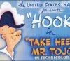

For some unknown reason, the vast majority of the 16- and 35-mm prints from the Dinky Doodle series that have been found are French copies, and none of the prints appear to come from the United States. This situation is quite strange, as there is no particular reason why a film print would survive deterioration better abroad than in its country of origin.
However, just looking at the quality of these copies, it’s truly impressive to see them so well-preserved even though they haven’t even been restored:
https://classiccartoons.blogspot.com/2007/08/silent-cartoons-dinky-doodle-in-peter.html?m=1
I suppose the popularity in France of animator Clyde Geronimi—who collaborated on the series with Lantz—has something to do with it.
https://www.chroniquedisney.fr/perso/1901-clyde-geronimi.htm
For me, this story (and presumably the rest of the series) belongs in the top handful of best articles that I have read on Cartoon Research.
Thanks Steve for filling in gaps in my chronological understanding.
Thank you for this information. I can tell a good print from a bad one, but, never having collected film or worked in the field, I seldom know the reasons behind it.
So why are old NTA prints always so red?
According to Leslie Cabarga’s book on the Fleischer, referring to prints of “Gulliver’s Travels,” “most of what is available are 16mm prints originally made for television, in which the red was accentuated in the printing to ‘read’ on the black and white [TV] screen.” Sounds like this was a common practice for firms like NTA, whose principal market was television sales.
Steven Maines told Leslie Cabarga a justification for the red shift (magenta) of their color prints that short-cut the processing, skipping the fix bath. Accenting the red would not. have been the case since low contrast prints were preferred because contrast was gained in transmition. Oversaturating a primary color like red would have had a canceling affect on the color balance. But 16mm prints I saw in rental reels seemed to have normal contrast. So there may not have been low contrast prints made for TV since they were originally broadcast in black and white. They were broadcast in color in the mid 1960s though. We did not have a color television thrn, so I can’t comment on how they looked. But the old analogy NTSC system, otherwise known as “never the same color” had so many variables based on individual station engineering and the quality of film prints.
I must admit I heard the Blue Track smell term from somebody else, and sadly I no longer remember who!
Eric Spilker maybe?!!?
As you say. all this arcane stuff was passed from collector to collector over the years…
Thank you for this great information, Steve.
Can we say — generically — that dupes do not usually contain the *entire* width and *entire* height of the source image?
That is, a dupe of a dupe, etc., will inevitably have lost some of the image edges?
Even as a child watching old cartoons on TV, I was aware of tops of heads often being cut off, or title cards not “fitting” into the TV screen, etc.
Was I imagining things? 🙂
Great overview, Steve.
One thing I’d like to make known (though I’ve written about this before, it’s worth mentioning here, as these posts will be referenced and re-read in the future): why some rare prints (or original prints with original titles) only seem to exist in 16mm.
I learned this when I worked for the home office of United Artists, beginning in 1978, at their New York headquarters at 729 7th Ave. This was before home video exploded, before we all had a VHS recorder – and way before cable TV had TCM, way before DVD and blu ray, before the internet was common, before You Tube and today’s streaming services. In other words: ancient history.
It was common practice at that time (and for decades, I’d learned) to strike a 16mm print of EVERY feature and short at the time of release – for a variety of purposes: for use on Military bases, for theaters that only played 16mm (believe it or not, that was a thing in rural communities)… but mainly so studio executives, producers, filmmakers, movie stars, studio employees – even licensing and merchandisers and studio “friends” could borrow the films to watch at home – either as a courtesy or as a favor; it as part of the job. Same as if you worked for Coca-Cola – you were required to “sample” the product.
At UA they had a film room – with a man at the door for whom you would sign a form to borrow a print for a night or two. If you needed a projector, they would give you one (on loan)! They seemed to have any and all of the releases of the last year or so. When I was there, they had the latest Pink Panther cartoons to look at.
Years later I found this was the norm at all the studios. 16mm was the VHS/DVD of its day. A convenient way to borrow the film if you couldn’t get to a screening in advance. When I worked for Harvey Entertainment in the 1990s, they had Alfred Harvey’s personal library in a storage room… in it were several Technicolor prints (and a few struck in black and white) acquired from Paramount at the time of their release – sent to him for reference – of Famous Studios Casper, Baby Huey, etc cartoons with their beautiful original titles.
Throughout the years we’ve found 30s and 40s Terrytoons, Screen Gems, even MGM rareties and others, with original opens that seem (as of this writing) to no longer exist in the vaults. That’s why they exist… because they were routinely struck back in the day they were made. That explains the existence of “It’s A Grand Old Nag” and “The Lady Says No”. Years later, many have found their way to the collectors market.
16mm prints were not mass produced. In a way, they are “limited editions”. Owning a film print back then was illegal (unless it was sold (and usually edited) by one of the licensed “home movie” distributors). They were not your property. Today, for some of us, they are sacred materials. Preserving the films, moreso preserving the images and sound, is of utmost importance. Knowing what was produced, as well as how and why, is important to preserving our cultural history. Thank you Steve (and Tommy and others) for what you do.
When I interviewed Dick Huemer in 1968, he was able to get 16mm prints of Disney features from the studio for me to screen — except for FANTASIA — that was NOT available in 1968 (it would become VERY available in theaters the next year– )
This is essential reading for a novice 16mm film collector like me. Thanks for breaking all of this down in an easy to comprehend manner, Steve! I learned some new things!
I’m a neophyte compared to so many in this group, but I’ve loved film since I was a boy, and made it a point when I worked at the Library of Congress to meet occasionally and talk to the folks in Culpepper. I was an AV geek starting in elementary school who projected God knows how many features and educational films over the years both in school as well as church. I saw, when I worked in a TV station, 16mm film prints come and go (including the not so always careful way the prints were treated). I always wondered, even as a kid, about the abrupt titling of so many cartoons and old shorts on TV. This piece really filled in a lot of gaps in my knowledge. I enjoyed reading it.
Fantastic article, Steve, looking forward to part 2!
A couple of typos of no consequence, but this one makes the intended meaning unclear, so I would appreciate a clarification:
“lobbed off the titles and end titles of the cartoons not eh original camera negatives”
Lobbed off the titles and end titles on the original camera negatives. Sorry about that!
Thanks!
Magenta shift is a result of the dye colors used for processing (magenta, yellow and cyan dyes) fading out at different rates – magenta dye takes the longest to fade. Poor storage conditions including exposure to heat speed the dye fading process. Sloppy processing can add to the problem by companies developing/processing film not following the development process steps exactly (not rinsing the film thoroughly between the multiple processing steps employed to remove the chemicals used is a common issue), chemicals becoming contaminated due to aging out, improper storage or not being mixed in proper ratios is another cause of magenta shift. Ektachrome is the primary culprit as far as magenta shift goes, Anscochrome is another film stock guilty of magenta shift. – you see those names on film stock for the bulk of film prints made from the 50s on.
Cost played a major factor in the change from additive to subtractive film processing starting in the 50s when Ektachrome and Anscochrome became available, Simplified, there are 2 different ways to process color film stock – additive film processing adds different colored dyes to the film stock during processing to achieve color prints (expensive to do, but resulting in much longer lasting/far more stable color films over time), while subtractive color processing used for developing Ektachrome and Anscochrome film stock had dye colors already applied to the film stock – multi-step chemical baths during processing removed differing levels of the dyes used – much, much cheaper to process Ektachrome and Anscochrome when those film stocks were made available than the cost for additive film stock processing.
Cheaper processing costs drove the move to subtractive film stock and processing – long term, the penny pinching led to many film prints becoming victims of magenta shift. When the big studios started selling off color film back catalogs in the 1950s to companies who became ditributors to the tv industry (NTA, AAP), the films sent out were processed using Ektachrome and Anscochrome stock and developing. The studios who sold the rights to films (Paramount, Warner Bros) had their names removed since they didn’t want to be directly associated with television at that time. Logos were removed completely (Warner films to A.A.P, Paramount titles to NTA, Paramount shorts sold to Harvey had the Paramount mountain removed and the Paramount name blocked out out at the bottom of the titles and Harvey’s name inserted), The new owners’ names being added caused the loss of many beginning and end titles – an extra whammy added to restoration projects today. Throw in the cost savings made by making 16 mm prints of films instead of distributing 35 mm prints makes the preservation and restoration processes of today an even bigger challenge when striving for the sharpest/brightest/best looking results for future generations to enjoy.
I agree… this is a _very_ good post, and the responses are very informative. Geez, whatta mess you folks who try to restore cartoons and films have to put up with.
Then, of course, there is intentional destruction. I will never forget, or forgive, Hallmark for trying to _intentionally_ destroy the Laurel & Hardy films about 15-20 years ago.
Where is rainbow parades volume 2?????????
Absolutely! One of the most interesting essays I’ve ever read on CR. Thanks to Steve, and Jerry.
I really hope part 2 includes what is my main interest: Warners.
Rex Miller’s Supermantiques shop, frequent advertiser in CBG (and budding novelist), sold VHS tapes of the Fleischer Superman cartoons, from 16mm sources in both color and black & white. (When another CBG advertiser offered all-color tapes of the cartoons, Miller responded with an ad claiming that the color cartoons on his tapes were richer looking.) A friend had those tapes, and I noticed that the color prints had the titles mostly intact, but on the B&W prints, the titles were re-filmed to remove Siegel and Shuster’s names.