

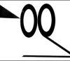
The animated opening logos from Columbia’s CAT BALLOU (1965) at left; and THE MAN CALLED FLINTSTONE (1966) on the right. Bits from the CAT BALLOU logo are incorporated into the SPIDER-MAN opening.
I don’t usually discuss current animation here on Cartoon Research, but I felt the idea for this post was more suited for my history blog – and since this is our last post for 2018, I’d try something a little different.
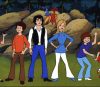
I am currently jumping for joy over the new Sony feature, Spider-Man: Into The Spiderverse. Without going into a full-length review of the film, I do think the style of the film – artistically, directorially, the writing, the voice acting, the character animation and design – everything about it feels new and different. And I like it.
The film’s plot has to do with an opening in the “multi-verse” (parallel dimensions that exist in different timelines) that brings several Spider-men, Spider-women and one cartoony Spider-Ham together on one common Earth. At various times, those characters (and several New York landmarks) crackle for several seconds of multi-verse morphing. The whole thing looks cool… if you’ve seen the film you know what I’m talking about – if you haven’t seen this film yet, please do. You might enjoy my little gallery below a lot more after you see it.
The first thing that blew my mind is the first thing you see in the film: the Columbia Pictures logo. Though it’s becoming more common for filmmakers to goof with the studio logo – it happened only rarely at Columbia over the last 85 years. Two most famous examples: the Wilma Flintstone bit at the start of The Man Called Flintstone (1966), and the animated cowgirl on the logo of Cat Ballou (1965).
The studio logo at the start of Spiderverse is our first exposure to the inter-dimensional “crackle” that is part of the plot. The Columbia “proud lady” is morphed in a split second montage of various Columbia logos from other dimensions (those other dimensions are mainly Columbia logos from the past, mixed with graffiti and collage graphics).
I had a chance recently to study the frames in the montage and I thought I would share. Here are 24 random successive frames from the opening – these fly by so fast you can’t see them otherwise. None of them are visible for more than 1/24th or 1/12th of a second on screen – but as you can see, each one is its own work of art.
That’s it for 2018. See you all here tomorrow to start 2019. Happy New Year, everyone!
 Jerry Beck is a writer, animation producer, college professor and author of more than 15 books on animation history. He is a former studio exec with Nickelodeon Movies and Disney, and has written for The Hollywood Reporter and Variety. He has curated cartoons for DVD and blu-ray compilations and has lent his expertise to dozens of bonus documentaries and audio commentaries on such. Beck is currently on the faculty of Cal Arts in Valencia, UCLA in Westwood and Woodbury University in Burbank – teaching animation history. More about Jerry Beck [


A live-action twist (preceding an animated title)
http://www.artofthetitle.com/title/the-mouse-that-roared/
Now I’m wondering which animation studio Columbia hired for those opening titles. If you ask me, it looks like something out of Terrytoons.
THANK GOD IT’S FRIDAY (1978) also had an animated Columbia logo:
https://www.youtube.com/watch?v=Qd6-1zbo1VA
While I did like the Columbia logo a lot, the whole time I was like- “My friends will love this more than me” and “The comic book villain who was once voiced by the guy who did the Power of Cheese commercials”, and’ “Nice surprises and animation, Sony Pictures Animation made a surprise hit after the Emoji Movie disaster and Hotel Transylvania sequels (no offense to those who love them)!”
Speaking of logos, if Nickelodeon Movies lets me run loose with a new Paramount Animation movie one of things I’m going to do is use the old 1940s Paramount cartoon logo from Famous Studios, red mountain with blue sky. The Viacom byline will be in the “In Technicolor” font.
I haven’t seen the Wilma torch lady opening to A MAN CALLED FLINTSTONE since the film opened theatrically! [I’ve sometimes wondered whether I imagined it.]
My 16mm print of The Man Called Flintstone still has Wilma opening Logo!
https://www.youtube.com/watch?v=e-3nBGY6BpM
There’s also “Zotz!” with William Castle conversing with the Proud Lady, and “Age of Consent” with the logo dissolving into a nude statue.
I recall one of my friends telling me that for a Hitchcock movie (which I doubt it was) about an axe murderer, Columbia’s head was chopped off. Anyone??
Hitchcock never worked at Columbia,,,
Also, William Castle’s “Strait Jacket” (1964), starring Joan Crawford, ends with a headless Proud Lady…with the head lying at her feet.
Columbia, more than any other studio, would have fun with its logo over the years. The first time was THE MOUSE THAT ROARED (1955) had the gem of the ocean (Columbia) her running from her pedestal because of a mouse running across the set, and ran the same shot backwards at the end. THE THREE STOOGES MEET HERCULES (1962) was next, Followed by ZOTZ, as mentioned in this thread. BYE BYE BIRDIE (1963) had animated hearts come out of her flaming torch to spell out the title, THE TROUBLE WITH ANGELS (1966) had a cartoon angel coming out of the right side of the lettering.
Over the years her draped fabric varied, originating as the Stars and Stripes, the US flag, and changing to solid colors and back over the years.
-Matias Bombal’s Hollywood.
THE THREE STOOGES IN ORBIT launched Columbia into outer space with rocket exhaust blasting out of her pedestal. William Castle’s STRAIT-JACKET was the picture that chopped her head off for the end title. (They neatly placed it between her feet…) Her drape changed from an American flag to plain white in 1942 due to the adoption of a Federal law banning use of the Stars and Stripes in advertising; NOT, as internet trolls would have you believe, “‘cuz of them goddang Hollywood libruls”… https://www.adweek.com/agencyspy/is-advertising-and-marketing-with-the-u-s-flag-unethical/69240
Note that the spoof versions of the Columbia logo didn’t occur till after Harry Cohn’s death.
After the Torch Lady got a makeover around 1993 or so, around the time Sony bought Columbia, there were rumors that she was modeled on Annette Bening. Roger Ebert spoke to Michael Deas, the artist who revamped the logo (he also painted the movie-star stamps for the Postal Service). Deas said he had enlisted his neighbor, one Jenny Joseph, to pose for him, and showed Ebert a photo of Jenny draped in a bedsheet and holding aloft a table lamp.
The Coca-Cola years: https://www.youtube.com/watch?v=VSt4udoAH1c
Remastered versions of that logo on shows such as FANTASY ISLAND and T.J. HOOKER seem to have omitted the Coca-Cola byline.
Because Warner Bros. owns the Flintstones, you will not see the Wilma torch lady on new copies of Man Called Flintstone. Kind of like how they omitted the Screen Gems TV logos of the time from their cartoons.