

Hi Everyone,
This week we lost a giant of film preservation, exhibition and all things vintage film. Dr. Dennis Atkinson was a long-time collector, writer, editor, film documentary producer, preservationist and show organizer. He ran the The Great Lakes Cinephile Society for many years. During his career, he saved an untold amount of film through collecting and making sure many things were preserved, both personally and by giving and lending material to AFI and the Library of Congress. He remains the biggest single donor of materials to LOC, and was a colorful presence in the film collector and preservation world. I knew Dennis a little through the years from the film shows as well as attending ‘Cinesation’, the convention/ festival Dennis ran for many, many years.
I’m thankful that I got to know him a little bit. He was helpful in lending films for what became the More Stop Motion Marvels set as well as selling me some really cool 35mm things. I produced a Blu-ray set for him of the ‘Poetic Gems’ films from the early 30s based on the poetry of Edgar Guest. While not long the lines of what I’d usually produce, I think he liked the set!
Dennis was also a great lover of frogs, and lent some other really cool things to scan besides the stop motion reels. His little ‘Cinema-Paradiso’ reel of cartoon clips included part of the lost segment from the Warners Cartoons Hollywood Steps Out.
Thanks for everything you did, Dennis. History is much more complete thanks to your efforts.
In Thunderbean News:
Things have really been wrapping up for Rainbow Parades, volume 1, in progress since 2017. I’m really liking the project and am happy to be letting it go, although that’s been hard to do on this one! Working with all the different materials and all the challenges of cleaning these films up has been interesting, frustrating and overall rewarding in the end. Seeing them looking the best they can makes me really happy, and I hope it will make you happy too.
Here is the cover for the set, just finished, by Shawn Dickinson.
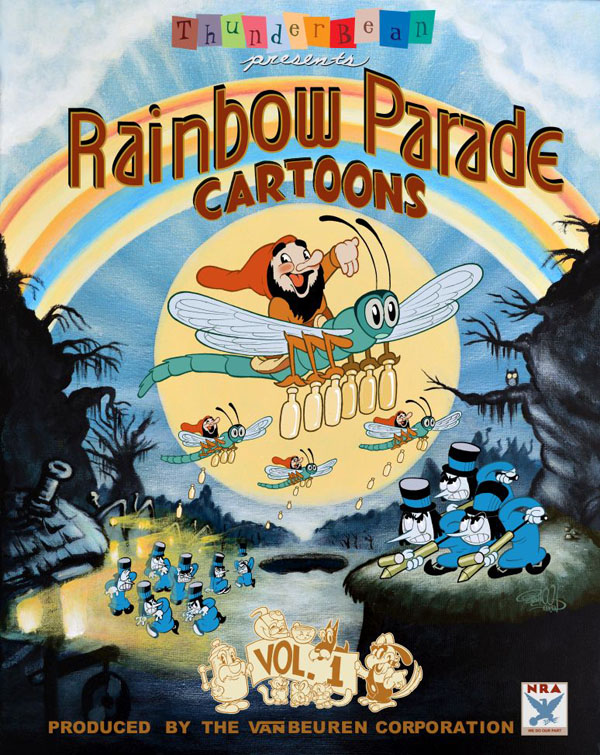
Now– in your opinion, would you leave the National Recovery Administration logo, or should I worry that it would be mistaken for the ‘other’ NRA? Would love some feedback on this heretofore internally debated subject!
We wanted to do something special and different for this set, and one of those unusual things was and finished this weekend. This is the main menu of the Rainbow Parades V1 set- an animated menu featuring many of the characters from the films. A bunch of people worked on the sequence, so I thought I’d share it this week as a little sneak peak. Artists Kat Huff and Sarah Mazurek did a wonderful job illustrating and animating the clouds and Rainbow title.
Animator and designer Sarah Yagley did a great job in color design for the scene. The animation, clean up color crew includes Mike Kazaleh, Ken Preibe, Alyssa Hollingsworth, Gabrielle Lafuente, Mel McCann, Bob Jaques, Aria Huges, Chloe Fedewa, Michael Azar, Jordan Falk, Mat Gorski, Rick Farmiloe, Melanie Mrozek, Elyse Mcleod, Alec Giles and Jesse Oliver- and myself. I think it’s a fun little tribute to the films on the set. Watch it even LARGER on You Tube!
I hope to have the set sent off to replication this week, so it should be back within this month.
Have a good week everyone!
 Steve Stanchfield is an animator, educator and film archivist. He runs Thunderbean Animation, an animation studio in Ann Arbor, Michigan and has compiled over a dozen archival animation DVD collections devoted to such subjects at Private Snafu, The Little King and the infamous Cubby Bear. Steve is also a professor at the College for Creative Studies in Detroit.


Love the cover, no logo necessary, a distraction
It’s always sad to lose someone so dedicated to preserving the past, and I’m sorry for your personal loss as well, Steve; even if you weren’t close, it’s clear he played a significant role in your film collecting/preserving life.
As much as I love the NRA logo being on the cover, I do think the risk of people assuming it refers to the National Rifle Association is too great to leave it. Perhaps it could find a home on the booklet inside the case, assuming one is included?
And if you want suggestions as to what it should be replaced with, well, there’s a certain bovine making her debut in a cartoon in this set who’s not yet on the cover… 😉
Definitely leave the logo, part of film history! Can’t wait for this collection!!!
I say keep the NRA logo. That blue eagle appeared in a lot of cartoons in the years when the act was in effect, coinciding with the beginnings of the Rainbow Parade. It even rescued Willie Whopper once. The National Rifle Association’s logo also has an eagle on it, but it’s not blue, and there are a couple of rifles as well. You can’t anticipate every single wrong conclusion somebody might possibly jump to. I remember when Jewish Monthly magazine ran print ads for Krups kitchen appliances, and some readers were outraged because they confused the company with Krupp, the German arms manufacturer convicted of crimes against humanity at the Nuremberg trials. The editorial response was a model of clarity and restraint, and the magazine went on advertising Krups products as before. So keep the blue eagle as an emblem of the Rainbow Parade’s place in history. You might have a bit of ‘splainin’ to do, now and then, but probably not all that much.
The kind of person who would buy a set such as this is the kind of person who would know perfectly well that this NRA was a New Deal entity. Leave it in.
Are you so sure about it ? I’m the kind of people who would buy this set but I’m a foreigner and it startled me a bit until I’ve read Steve’s commentary. I did not know about the National Recovery Administration. Sadly, the other NRA is worldwide famous. Since I’ve been confused, I have the weakness to believe others may be as well. It took me no more than a few seconds to get information to make it clear, but I’m not sure everyone would do the same. I’m not saying that it should be removed – just that this question is worth thinking about it.
By the way, those menu animations are looking great ! Congrats to the whole team who worked on it.
I just watched the lost segment from Hollywood steps out. The bit about Clark Gable saying “I’m a bad boy!”
Rest in peace Mr. Atkinson.
It probably won’t cause too many problems, but I’d say leave out the cover logo – as I wouldn’t want to give the other NRA even the slightest encouragement.
I generally don’t like moving home media menus (the BBC – non-animated – ones for the classic 1960s – ’80s Dr Who series DVDs were particularly bad as they functioned as trailers showing the most dramatic parts of the story you were about to watch, unless you quickly selected the episodes sub-menu!).
I also generally don’t like audio on the menus.
Having said all that, the animated menu here for Rainbow Parades V1 looks very charming and appropriate to the set, so in this case I’ll say hooray & look forward to seeing it again when the set is released!
Will all the shootings going on, nobody wants to associate themselves with the NRA. People will see that logo and want to boycott. Let’s all have common sense please! We need to make sure Steve’s work get bought by EVERYONE not just animation die hards.
Spectacular package art! Best T-Bean ever!
NRA… I’d say leave it on (with a little reluctance). As noted above, your audience here is film and animation history enthusiasts and not the general public. Little chance for a controversy therein.
All of us here are sticklers for preserving original footage – especially titles.
Heck, I’ve gone out of my way to keep copies of the Censored Eleven. I wouldn’t show them to anyone or claim they’re essential. But they are part of the overall story.
But the goal is to get NEW fans and today’s younger generation wants nothing to do with the NRA. They don’t understand context and they won’t take the time to listen. They’ll just see the logo and immediately not buy. Place the logo in the booklet with context but don’t scare of potential new fans over an expired agency that has a new meaning today.
my only issue with the NRA logo on the cover is that it’s more or less just a distracting blemish from the focal point – and the fact the NRA has no significance anymore. they were a part of films in the day, but to remove it from the cover is harmless and different from removing it from the cartoons itself.
If you want to make sure this set gets a wider audience of fans and potentially more sales, PLEASE remove the NRA logo from the front. If you want to give it context then include it inside the booklet but having it on the front will bring you a lot of unnecessary drama and will push people away from buying it. The goal is to get a bigger reach of new fans so best not to associate with the NRA. Especially in today’s world.
I’d say leave the NRA image where it is on the cover. Any controversy it may cause just might make somebody pick it up and decide to buy it! It’s a part of film history, after all! Good job Steve and Co., on this! I’m gonna have to get a copy at CINEVENT from you – is is on for this year?
I don’t really see a good reason to keep the N.R.A. eagle on the cover. The films themselves have it because they are artifacts of the time the N.R.A. existed and companies who were N.R.A. members often used the logo on their products during that period. It doesn’t really have a meaningful purpose being used today on a (splendid-looking) home video cover that isn’t even trying to replicate the films’ actual original titles all that closely, and has potential to cause confusion among the uninitiated as noted above. Sort of like if the cover used “RKO-Radio Pictures presents” instead of “Thunderbean presents”. Hey, I like the logo and artifacts featuring it as much as the next guy, but if I was designing the cover, using the logo is something I wouldn’t have even thought of.
The animated menu intro is fun, although I hope it will be skippable as it would get old having to sit through a 1-1/2 minute intro every time one wanted to pull up the set to view something. Could you break down in more detail who did what animation and clean-up?
…though on second thought, I suspect I misunderstood what this is and it’s actually going to be the background of the main menu with the options overlaid.
I think the NRA symbol would be bait for the ignorant ranters out there. It’s historically relevant in the opening titles of the cartoons themselves, but not really so on contemporary promotional art, which is what a disc case cover essentially is.
Also, I’m saddened to hear of the passing of another vital, longtime figure in film preservation. My condolences to those who knew him.
I’m not seeing a reason for having it either, the NRA eagle was not on all cartoons released by VB during this release season, at least as I recollect. I’d suggest putting your little “Thunderbeanie” icon character in the box instead. Get your trademark out there man, you got a lot of bigger projects on the horizon!
Hi Steve,
The new animation of the old Van Beuren characters looked very good for the most part. My favorites were Captain Parrott and the gag with the Gloom being hit with a milk bottle thrown by one of the Joy elves. An overall crit is that sometimes the lack of a black ink line made the action a little hard to read, like the coffee pot pouring hot coffee into a white cup against white clouds. What is the last gag about? I couldn’t read what the little white character was or why he was turned in to something red? Otherwise, it’s a very good effort!
I agree with Mark that although the animation is very nice I too couldn’t work out, despite watching 3 times, what, near the end of the animation, the little white character is & why it gets turned red.
I support Mauricio’s idea: remove the NRA logo from the cover and put it in the booklet instead. That way, you can provide more context around the logo and you can avoid any unnecessary controversy. Also, purely on an aesthetic level, I think the cover looks better without it.
Very sad to learn of the death of Dennis Atkinson. He was a huge contributor to my documentary on Chicago’s Riverview Amusement Park, and we used to correspond a lot via email. I suspected he was seriously ill, as one of his last emails to me mentioned increasing health problems and he was no longer responding to my emails. My prayers go out to his family.
Cover’s pretty atypical looking for Shawn Dickinson…
HI Steve,
I was originally going to comment that the NRA “bug” should stay. But after reading other considered opinions and conceding that its placement in the cover layout gives it utmost prominence, I say leave it off.
Not necessary for any reason.
-Lip
Move the NRA logo to the booklet, and add an explanation on what it stood for. It can be a teaching moment.
Please keep the NRA logo. I’ve not known it to be used before on a cover so this would be a first.
The logo is s cute touch, but unnecessary and distracting. It also is not really Van Beuren-specific. I say don’t bother with it.
So sorry to hear of the death of Dennis Atkinson. I didn’t know him personally, but anyone who collected as he did surely must be one of us. I’m sure he liked all kinds of cartoons for all kinds of reasons.
Regarding the menus, movable or otherwise, please, please keep ’em simple! You know I like to get to everything on a given disk, whether it is something from Thunderbean or part of the “PUPPETOONS” project. A “PLAY ALL” would be sufficient. I look forward to the RAINBOW PARADE disk. Please let us know when and where we can pre-order it.
Congratulations on what looks like an amazing release !!
Regarding the NRA issue: I have two NRA posters displayed – one at the studio, one at home. We have a plethora of sophisticated, intelligent, and even historically conscious folks visiting all the time. I’d say 75% of them think it’s touting the National Rifle Association. I can always tell when someone has misidentified the graphic. It usually starts with a, “That poster…. what’s that poster for…?”
Personally I’d use the logo on the case, but I’d add an easily visible description/disclaimer….
I’m all for cancelling the National Rifle Association – but we can’t cancel history. The National Recovery Act was something to be proud of.
All that said, I understand the controversy over this, and I’ve evolved my thinking on whether Steve should use that NRA logo on his new blu-ray package art. I was originally for it – but Steve should probably remove it. If this were an authentic RKO Rainbow Parade movie poster (which it’s trying to look like) I would fight for it being there – but as a new piece of art, as a commercial product we are trying to sell today, and for all the ill will the current NRA represents, I would vote to take it off the package.
I say, from a design standpoint, the NRA logo should be moved (or removed) and “PRODUCED BY THE VAN BEUREN CORPORATION” should be centered underneath the “VOL. 1” graphic.
We’re gonna miss you so much, Dennis Atkinson.😢
cover and menu animation look fantastic! great Job!
Packages are to catch the eye and *sell*. Extraneous details are better avoided. I read it in old manuals.
Also, the bulk of the PARADES were made in ’35 and ’36 when the NRA wasn’t as hot.
If you are too stupid to know what the NRA logo is you are too stupid for this set. If its a worry about people thinking its pro gun…..why is that bad? The NRA was a communist program. Didn’t they shut it down because it was unconstitutional? lol. The right to own guns IS. I think the true meaning of the logo is a LOT more offensive and I still want it on!
Sounds like you’d rather have the other NRA logo on this cover ! XD
By the way, I think Mr. Beck is right; I;m pretty sure it was the National Recovery _Act_, not the National Recovery Administration.
“We Do Our Part”
I think maybe either replace the NRA logo with the Thunderbean Logo on the cover or just drop it completely.
I, personally, would leave the NRA logo off. If there’s any chance of controversy stemming from it, don’t put it on there. And honestly, it’s placement on the cover seems pretty pointless anyhow.
Eeeeeeeeep…
I need to change my vote too. Probably pre-coffee, but I completely missed seeing that the NRA logo was on the package art!
Not needed there at all. Actually looks out of place regardless of context.
Ditch it.
Keep everywhere else though. Especially on the films themselves.
I knew Dennis Atkinson MANY MANY years ago when he was operating Standard Film Service on Michigan Avenue in Dearborn, Michigan. He was a great source when I first started my film collection. He seemed to have an unusual connection to sources and was quite knowledgeable in certain areas. His confidence may have come off as a bit intimidating, “lofty,” and arrogant, but he was cordial with me. Considering his place in the Collector’s Circle, I considered myself fortunate that he took time to include me in his group.
While I had not seen him in many years, I was aware of his continued activities until recently. Dennis Atkinson was a unique individual who will be hard to replace.
Apparently, the “Act” created the “Administration.” In this case, NRA stands for “National Recovery Administration.”
If it was me, I’d leave it on there. It’s part of history. To always worry about what other people might think (out of ignorance) is a slippery slope. All you can do is present it clearly. To that end, I’d keep the logo, along with very tiny letters underneath that read:
National Recovery Admin (1933 – 1935)
That way, you have your logo, and people shouldn’t be confusing it with the other NRA.
The Rainbow Parades V1 set is looking great! It’s going to be more than worth the money I sent you back in 2017 !!
That “other” NRA is on the rocks anyway; the original NRA is a fact of history. Surely people realize that initials can stand for more than one thing.
Just bought Rainbow Parade volume 1, and am very excited to receive it! Thanks for all your hard work!