

There is a lot to say about Olive Films’ Betty Boop: The Essential Collection Vol. 1. From just a cursory glance, the selection of films is something you’d expect to see at a volume four or five rather than the initial release, whereas the selection announced for the second volume actually is more or less “essential”.
Scanned from the original negatives, all of the cartoons have their U.M.&M. titles (the original Paramount credits were spliced off for television). That’s to be expected, and probably for the best. Unlike with the Popeye cartoons sold to A.A.P., the copyright notices were actually removed from the U.M.&M./NTA versions, so recreations wouldn’t have come easy and a worldwide scavenger hunt for original prints would’ve been time-consuming and costly. It might have made for better sales in the long run, but better TV titles than no cartoons at all.
 Jerry Beck covered the quality of the scans themselves well – those are fine, if not perfect. The bigger concern here, though, is Olive’s handling of the cartoons’ aspect ratio. I’ve been hearing for a while that the Fleischers shot their cartoons in the Movietone ratio (about eight percent taller than Academy standard) prior to 1934, and the transfers Olive did prove that. But, were the cartoons intended to be shown that way?
The January 1930 edition of the Journal of the Society of Motion Picture Engineers writes at length about the dilemma projectionists faced in the early sound era. For most of 1929, each of the studios had their own aperture practice. Paramount was shooting at a 0.825” x 0.623” aperture; MGM was shooting at 0.835” x 0.723”; United Artists at 0.920” x 0.700”. Etc.
By September 1929, at the insistence of SMPE and three other societies, ten of the major studios agreed to an SMPE sound specification standard of 0.800” x .600” (the Academy ratio, 0.825” x 0.600”, was introduced in 1932), taking effect by the end of November of that year. Paramount was one of them.
Now the conundrum is made even more confusing, because none of these figures are the dimensions of Movietone ratio, which can be anywhere from 0.800 to 0.825″ wide by about .6796″. There is zero documentation that supports the idea that Movietone was being widely used by any of the major theater chains deep into the sound era (the time these Fleischer shorts were made) – not even by Fox who introduced it. Theaters may have screened in Movietone ratio earlier, but a survey conducted in mid-1929 before the SMPE standard was implemented indicates the major theater chains were not even using it at that point.
Suffice to say, it’s extremely unlikely it was intended these cartoons be projected in Movietone. Even if they fill up that ratio, theaters never ran the films in that ratio in their original releases.
I was asked to make comparison frame grabs, but it’s a bit trickier than that. As Jerry has implied, the previous releases of the Fleischer cartoons can’t really count for much of anything. DVNR aside, those 20-30 year-old transfers use no sort of alignment standard whatsoever.
The Olive Films release handles the aspect ratio issue oddly, and all I can gather is that someone in post goofed. They did a Movietone transfer of the cartoons, but someone gave the order, for the rendering and pressing, to squash the picture vertically by around eight percent to fit Academy ratio, rather than “pillar-box” the films to preserve Movietone ratio. Below are my ‘fixes’, done quickly in Photoshop. Left is what’s on the Olive collection; right isn’t exactly what it should be, but close enough.

(click thumbnails to enlarge)
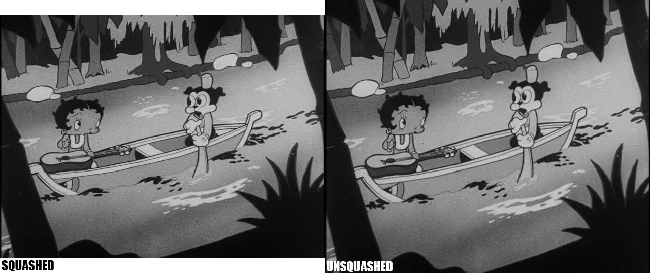


The squashing is likely to go unnoticed by most viewers. Jerry said he didn’t. For films that depend so much on movement and energy, I thought the squashing made these copies mildly irritating to watch and it’s a serious problem.
This really wasn’t necessary for Olive to do in the first place, given that all of this jazz about Movietone began mostly as conjecture, but presenting them as pillar-boxed probably would be the best solution. These are cartoons that injected life into every inch of the frame, whether it was intended to be seen or not. The presentation on Vol. 1 is simply a technical error, not a case of a history crime as with the “widescreen” Looney Tunes (or hell, even the Republic DVNR’ed copies of the Boops).
For a release many (including myself) initially decried for not having historian or consultant involvement, Olive did well enough. This isn’t the way I’d program or design a Betty Boop collection, but at this point, it’s the cartoons alone that matter. And the squashing issue indicates what happens when you don’t have someone who knows the films in quality control. I realize it’s probably too late to do anything about the second volume, but I’d urge Olive to get a Fleischer expert involved to nudge them towards perfection. Maybe the third time’s a charm?
(Thanks to David Gerstein and especially Jack Theakston for their assistance and research.)
August 30th Update: For those who still aren’t seeing anything wrong, be sure to read the relevant post on Uncle John’s Crazy Town, specifically the following comparison between an original drawing from Betty Boop’s May Party and the Olive Films disc.

Suffice to say, Uncle John explains the difference well: “An inker (or clean-up artist) would never mess with the volume like that (unless they wanted their scene thrown back).”
 THAD KOMOROWSKI is a writer, journalist, film restorationist and author of the acclaimed (and recently revised) Sick Little Monkeys: The Unauthorized Ren & Stimpy Story. He blogs at


Question … I notice the first comparison uses an UM&M title frame. Would THOSE have been Movietone ratio? How?
That’s interesting. To me, all the “squashed” blowups actually look better; the “unsquashed” ones look unnaturally stretched. To each his own, I guess.
The biggest problem with the releases are the cartoons Olive isn’t going to release (MYSTERIOUS MOSE, BARNACLE BILL and other noteworthy Talkartoons that Feature Betty) . Jerry, David and others were instrumental on getting them included on the laserdisc and now Olive is using the same outdated lists that almost got them excluded the first time around.
This is not unlike Warner Bros.’ unpopular decision to issue a Tom and Jerry blu-ray sans MOUSE CLEANING or CASANOVA CAT.
I may be suffering from the power of suggestion, but to me the unsquashed pictures look a little better. It’s actually more noticable on the title card, where the fonts look more proportional. However, had I not read about the issue, I don’t think it would have occurred to me.
First off – I am the guy who comes over to your house and pronounces your TV image squashed, then ruins the rest of your evening trying to learn your remote and fix the problem which you have never noticed. That being said, you have stumped me on this one – I’ve tried looking at your frames at all kinds of angles, but still can’t tell the difference. My instinct is that you are trying some sort of psychological experiment with us, but if not, I have failed to notice the squash!
I’m wondering what anyone at Olive would have against pillarboxing in the first place. Since a good chunk of viewers by now have 16X9 monitors (those with bluray players, at any rate), there are going to be black bars on either side anyway. What’s another inch or two?
Then there are those who are going to just hit the ZOOM button anyway, but we don’t talk to them.
Lord knows I come from a “stretch” family already
The fact that the Fleischers’ attitude in the early 1930s was “Let a Thousand Layout Designs Bloom” probably doesn’t help in determining the difference between normal and squash (or normal and stretch), because you really have to get to the post-code Boop period where there’s all that much standardization on what Betty should look like from unit to unit (or even from scene to scene within the units).
Because of the lack of uniformity, size aspect adjustments would likely be more noticeable in the live-action sections, but even there 8 percent is low enough where you have to look hard to see it (i.e. — the Samoan dancer neither looks like a Munchkin Land greeter nor a WNBA escapee, as can be the case with how some self-adjusting HDTVs handle stretching older films/TV shows, or when someone goofs on posting a YouTube video) and crushes it in the middle of the screen.
Re: Title layout
Something isn’t “right” here, because UM&M would have laid text out for a TV safe 1.33-1. I would be interested in seeing the whole frame (with soundtrack and sprockets).
At this point i’m sure we all would (and what film stock the U.M. & M. titles were printed on personally but that’s a geeky issue nobody cares about).
The U.M.&M. titles were most probably shot on safety film, since nitrate film had been discontinued for a few years by the time Paramount sold their shorts to U.M.&M.
The U.M.&M. copyright notice alterations were clearly done by blowing up a single frame of the original title, blurring or painting out the Paramount copyright notice and adding a new U.M.&M. copyright notice. It’s possible that they didn’t make sure that all the information on the modified titles could be seen when cropped. There are copies around of Chess-nuts (one of the cartoons shown in Thad’s comparison images above) where the “All Rights Reserved” part of the U.M.&M. copyright notice is cropped out…and the titles in those copies don’t look squashed like they do on the Olive Films release.
>UM&M would have laid text out for a TV safe 1.33-1
I think they did so by cropping the image. I remember an old post on Animation Archive (site is apparently dysfunct now but archive.org preserves it):
http://web.archive.org/web/20060527182630/http://www.animationarchive.org/2005/11/filmography-betty-boop-in-snow-white.html
Import them into your computer. Then you can play with the aspect ratio to get them right.
Looks like this is one of those things that the human brain, in all its wonderful complexity, causes different people to see things differently, or at least makes what they see register differently. Not a good/bad or a more/less perceptive issue, just a difference. And in my experience, these kinds of differences can vary for the same individual. It’s not uncommon for the color of a video or the sound quality of a recording to initially strike me as less than satisfactory then have that sense evaporate within minutes. Kind of like your eyes adjusting to the dark. So it’s not unusual, nor is it a reason to get judgmental about these differing reactions. Should Olive (or whoever) have done this? Absolutely not. For me, it’ll be interesting to se how they strike me after more in-depth viewing. The basic image quality in terms of sharpness and detail is a wonder to behold, for sure.
It would be wonderful to have all our golden age cartoons released on DVD so that every inch of what the artists created could be seen. And those who want a full screen could do so with their HDTV control. Someday….
Moving past the CRT era, it has changed us quite a lot with what we expect to see that use to be obstructed by all means of boundaries present in television’s original limitations?
Looking at the human chess players, I think they look better in the “squashed” photo. The stretched photo looks very out of proportion unless both of them had wildly elongated skulls!
A lot of people (including me) are implying it, but now I’m going to come right out and say it:
I have not been convinced by the evidence presented that the Olive transfers are, in fact, squashed.
Are we *sure* they’re not just framed differently from previous releases? In the comparison shot yesterday, Definitive Collection had significantly more visible image at the top and left of the frame than the Blu Ray did. How is that possible if Olive used the entire top-to-bottom Movietone frame from the negative?
And why would UM&M have conformed their new logo and titles – made specifically for television – to the outdated and unprojectable ratio? Makes no sense.
I readily acknowledge the vastly superior expertise of those making the claim relative to myself, who has never even seen a 35mm projector in action up close. But I’m one of those skeptical, questioning types. I sure wish someone would post some independent evidence that we aren’t just comparing one bad transfer to another. A reflective scan of a couple frames of a 35mm print, perhaps? An original title card or cel that can be compared with the Blu Ray? A notarized letter from Uncle Max saying that those Os in “Boop” really are supposed to be round and not oval? Anything?
(Side note – I went off in search of that MPPDA logo on the Googles, and of course I found specimens of it in every ratio from skinny football to perfectly circular. So that was no help.)
In the comparison you referred to in Jerry’s first article, it’s not a matter of there being more information on the left side of the frame of the laserdisc but rather that the Blu-Ray is shifted more to the right, showing more info than the laser on that side of the frame. Also, the laser has a tiny bit more at the top, but the Blu much more at the bottom. Bottom line is that the Blu captures more of the original frame than the laser. The laser achieved the 1:1.33 or 1:1.37 ratio by cropping at the bottom. As the Blu didn’t, the only way to achieve the ratio was by a horizontal stretch. Not much, but it is noticable, at least to me.
Obviously the LD lost a lot at the bottom, as well as a bit on the right. But my point is, the LD proves that the Olive version is cropped.
Which means it CAN’T be the full Movietone-ratio frame.
And you’re assuming that the laserdisc got the AR correct, which, given its other glaring and well-documented flaws, I don’t believe is a valid assumption.
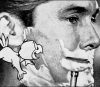
Right now, the best evidence I’ve seen is the live-action shot of the two guys playing chess above, since it exists outside any vagaries of the Fleischer artwork. And on that, the allegedly “squashed” 4×3 looks more accurate.
Thanks for the update to the article. The direct comparison with the animation drawing was exactly the convincing I needed.
“And the squashing issue indicates what happens when you don’t have someone who knows the films in quality control.”
Uhh DVNR and over saturation issues plagued the the Looney Tunes Golden collection and Jerry was on that. I think we all know that in some ways it does not matter who is on these things. Until the companies that do these releases start viewing these cartoons as classic films we will always be a victim of “lets do it the fast and cheap way”
At least this is not starting out as a 5 dollar bin Betty Boop DVD.
I should have clarified. Those examples you listed are indeed also instances where someone who wasn’t knowledgable about the films was in charge of the transfer/mastering. The problem, really, is that someone like Jerry is not allowed to supervise QC on-site. At the present, all he and others can do is tell them to “Listen, this is what you need to look out for,” and pray that they don’t screw it up. Not a lovely situation, but that’s how it works with these big companies. In “some” cases (as in, most of the LT collections, the UPA set, most of the Disney Treasures), it’s yielded what I’d call “okay” results. It’s at least sobering to know Jerry Beck can’t be blamed for this problem at any rate.
Honestly, without the “Squashed’ / “Unsqaushed” titles, I would look at both and say that niether one looks worse than the other. Just a little different (and only when comparing them back to back). This is just from looking at the photo examples in this post. Don’t know if I will feel different when I watch the actual disc on my TV (waiting for my copy to arrive)…..But I am kinda doubting that I will.
It should come as no surprise that I might know a couple of things related to this subject. But I think that a lot of the debate could be settled by hearing from the people at Olive and those who were in charge of the transfers to get the real story of what happened.
FWIW, there’s an interview with Frank Tarzi (the ONLY contact anyone’s had with anyone working at Olive) that insists that they mostly make their own HD transfers for their releases (THE QUIET MAN, for example, was Olive scanning from the neg).
The Betty Boop cartoons might be in the minority of films for which HD masters already exist. Who knows?
After months of reading and hearing speculation about this and other Olive releases, I’d like to know why? What kind of Wonka-factory secret corporate culture exists there? Why such a big divide between Olive and the historians and fans? Why has it deliberately NOT courted the fans like any other publicity-minded distributor?
The dancers did it for me. There’s also an image of Betty in profile at another blu-ray review site, (see below), that just looks wrong. I know she doesn’t have the best profile in the world, but…
http://www.blu-ray.com/movies/screenshot.php?movieid=74378&position=5
I really want to buy these, but I also really want them to be done right. Should a letter campaign get started? Would Olive be willing to replace the discs if we bought them now. I want to give them my money, I really, really do, but if the product’s faulty then I won’t be doing that. It bums me out.
I think if I cared that much I could pretty easily rip these and force the A/R back to what I think it should be with virtually no perceptible difference to having left it intact in the first place.
Could be better, but overall delighted with these sets. Volume 2 is even better.
I believe only some of them are squashed. For instance, “Chess Nuts” is almost perfect as it is. I am judging by the “iris” opening and closing. The circle gives it away. Also, compare “Bamboo Isle” to the same sequence in “Rise to Fame”. In Bamboo Isle, you need to pillar box it. But in Rise to Fame, only a slight adjustment is necessary. And Rise to Fame shows more frame on the left and right edges.
I have yet to buy any of these and am curious if Olive continued the forced 1:33 aspect ratio for volume 3. Comments?
Vol. 3 had the issue corrected, yes, though now there is some minor cropping (the kind of cropping you’d see if you watched these cartoons in a movie theater).
Would it be possible to get an update article on this issue? Did Olive Films reissue the first two discs with the corrected, (and supposedly cropped) aspect ratios? I’ve been holding off on buying any of these, and feel bad because I’d really like to support these releases.
Thad posted an update on his own blog: http://www.whataboutthad.com/2014/04/29/positively-booped-out/
Fantastic, thanks (:
That Screenshot of Betty with a thought bubble of a boy hunter (or it is Betty as a girl?) looks interesting, I don’t think I ever watched that one. Which one is it?