

Paramount’s Famous Studios in 1943 was a studio in transition. Paramount ousted the Fleischer brothers and began moving the operation back to New York. Popeye was the prize. The series was so popular, Paramount decided it could make more money with the property without the middlemen (the Fleischers). With the war at its height, and it’s cartoon superstar a natural military man – the series couldn’t be more successful.
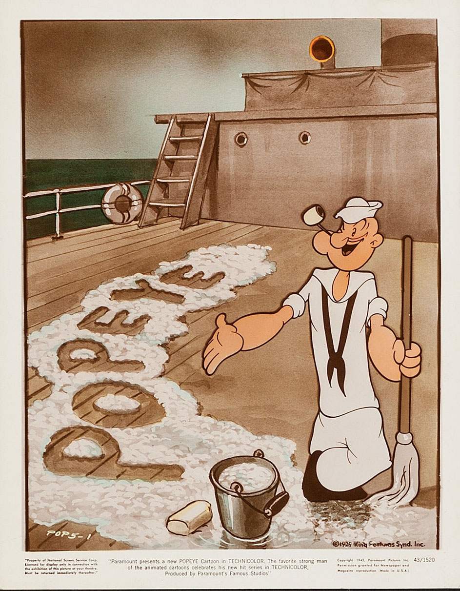
Heritage Galleries is currently offering these rare 1943 publicity stills for sale. The bidding is already way over $100., too rich for my blood, so a grabbed the images off their site and hence this post. You’ll note in the fine print that these photographs are to publicize the 1943-44 season when the Popeye cartoons went from black and white to color.
The images themselves were created in black & white and colorized (a common practice for publicity art back then), and look in line with the Dan Gordon designs in his black and white propaganda cartoons like You’re A Sap Mr. Jap and Seein’ Red White and Blue (see below). Odd that in two of these publicity shots, it was decided the gag was more important that seeing Popeye’s face. The hand-written numbers on the lower corners indicate that these are three pictures from a set of five. Would love to see the other two (UPDATE: I found printed images of the other two in my files. See the comments below) . Click the images below to enlarge.


Below is a great 1943 Popeye, directed by Dan Gordon. Gordon was briefly a partner in Famous Studios, but left to pursue much work in comic books – and later became a valued member of Hanna Barbera’s staff when they started doing television cartoons. This cartoon features some great animation by Jim Tyer. Check out the scene from 5:23 to 5:43.
A 1943 stock one sheet for Paramount’s Popeye cartoons:

 Jerry Beck is a writer, animation producer, college professor and author of more than 15 books on animation history. He is a former studio exec with Nickelodeon Movies and Disney, and has written for The Hollywood Reporter and Variety. He has curated cartoons for DVD and blu-ray compilations and has lent his expertise to dozens of bonus documentaries and audio commentaries on such. Beck is currently on the faculty of Cal Arts in Valencia, UCLA in Westwood and Woodbury University in Burbank – teaching animation history. More about Jerry Beck [


Really, going from the final year of the Fleischer productions, the Popeye WWII cartoons were just about as fast and as well-timed as anything being done on the west coast in the 1942-43 period, with the possible exception of the Avery and Clampett units (and you can really see the Avery influence in the early Famous shorts like “The Hungry Goat” and “Cartoons Ain’t Human”).
That’s why what happened at Famous by the end of the decade was so frustrating, because it’s not as if they didn’t know how to make cartoons as fast and funny as their west coast counterparts — they did it for several years, and then for whatever reason, they just stopped doing it.
Yes, people have been too hasty to dismiss the early Famous years, seeing them only in the light of their post WWII product, which fell into a marginalized routine for about three years. The first Noveltoon, NO MUTTON FOR NUTTIN’ is an outstanding cartoon equal to any Tex Avery or Warners’ cartoon of the time. A real eye-opener indicating that the potential was there. The challenges of producing “outstanding” cartoons are many. It should be remembered that these were first, and foremost a “commercial product” made for light entertainment used as the “warm-up act” for the main attraction, the feature film. The cartoons can be only as good as 1) the dynamics of the character, 2) the story material, 3) the skills of the Director, 4) the allotted time to produce the cartoon. Many times ordinary cartoons were produced in order to fulfill a release schedule. So long as a new release came to theaters each week, the audience was not as discerning or “critical,” not having the luxury of viewing the cartoons in continuity as we can today. If some cartoons lacked the content of more successful ones, they could still be appreciated due to their production values, which made them attractive to view. So long as the films were delivered on time and on budget, the film companies were happy, and audiences seemed to appreciate them without a great deal of analysis.
Always enjoy the World War II Popeyes,especially since they restored the original titlesThe prints,at least this one, are amazingly clean and clear.Thank goodness whoever did the restoration had the common sense to keep all the content intact and NOT resort to P.C’ing the material.Keeping the content as it was is naturally the whole point of restoration.Great restoring job!
Or having to watch sub-standard nth-gen VHS copies of someone’s 16mm prints of the same thing and learning to enjoy it despite the setbacks and frustrations of the limitations inherent!
But there’s one thing about Warner Bros.’ restorations of the black and white Popeye cartoons that makes one wonder if they could have done better. WB used great nitrate elements from Paramount, which have great frame registration, to restore the original titles to many of the Popeye cartoons, but they sourced the elements that A.A.P. spliced their titles into for the bodies of the cartoons in most cases, which are full of vertical wobble. A perfect example is Shiver Me Timbers on Volume 1, where the restored original titles are in pristine shape but the body of the cartoon is taken from the well-worn element A.A.P. had with vertical wobble and scratches. The bodies of some of the cartoons on the Popeye sets were sourced from superior elements that don’t have all the vertical wobble of the A.A.P. elements, such as Protek the Weakerist, Learn Polikeness, Leave Well Enough Alone, Wotta Nightmare, Ghosks is the Bunk, and It’s the Natural Thing to Do, but the majority of the cartoons still have the vertical wobble during the body of the cartoon.
The Popeye sets are still awesome for containing as many previously very rare original titles to the cartoons as they do, but the vertical wobble of the elements A.A.P. had is a bit distracting, and if WB could have used superior elements without all the wobble when restoring most of the black-and-white Popeye cartoons and didn’t, then that’s a shame. I’d love to know more about why the restorations of the black-and-white cartoons are as I described above if Jerry Beck or someone else knows anything about this.
In the meantime, I look very much forward to the first volume of Technicolor Famous Studios Popeye cartoons when that is released. WB did a swell job of restoring the three Popeye two-reelers, so I hope they also do an excellent job with the remaining Technicolor Popeye cartoons.
Jeez, reason #1274 why I wish I had gobs and gobs of money. I would bid to the moon for these publicity prints.
Thanks for posting these; new to my eyes.
Any word on if the 40s Popeyes might see a video release?
Only makes me want to see these Famous Studios titles finally released on home video all the more!
What an interesting little sliver of time in the animated Popeye legacy. They’re still close to the Fleischer style and sensibility, but the animators seem to also be busting loose from the structure that studio placed on them. It’s quite unique. Of course it was short lived and eventually the blandness put a blanket on everything. It would be interesting to have Popeye Volume 4 to see what happened, and how this style developed and was defeated by mediocrity.
I’m still hoping the Famous Popeyes get a proper restoration and home video release someday. I’d love to see cartoons like “We’re on Our Way to Rio” and “Nearly-Weds” in their original Technicolor glory. For years too many of the color Popeyes have looked like they originated from faded Eastmancolor prints that have had a bit of color correction done to them to try and make them look not-quite-so-poor. It’s hard enough to introduce kids to vintage cartoons these days, but having to do so via poor quality prints makes it that much harder.
Something I’ve long wondered about was how Famous got away with changing Popeye’s “costume” during World War II and afterward. Elzie Segar’s original character, of course, wore a dark Navy blue shirt with big buttons and white collar. Famous changed that to “Navy whites,” and also somewhat changed Popeye’s facial appearance (more markedly so after the war). How could they do it with the authorization of King Features, especially given that Segar’s successor,. Bud Sagendorf, never changed the character’s appearance in the comic books or daily strips?
I’ve always assumed the costume change was permitted for patriotic purposes. So Popeye (and Bluto) would be dressed like real sailors.
Look at the leeway King Features allowed Columbia with the Krazy Kat cartoons. Outside of the one cartoon done at Izzy Klein’s suggestion, the design the Mintz staff were using by the mid-1930s was barely on the same planet as the George Herriman original (though I suppose the sex change Krazy underwent was kind of radical for the era….)
At long as Paramount and Famous were sending the checks a few blocks up Broadway to the Hearst offices for licensing the Popeye strip, it didn’t really seem to matter much to the KFS people how the character(s) looked (The awful redesign of Swe’Pea for the later Famous color cartoons was far worse than what was done to Popeye, Olive or Bluto — at least they retained some of their original look. Swe’Pea as used by Famous in the late 40s and early 50s might as well have been a completely different character).
I recall a lot of characters being notably different in print and on film. It worked both ways:
— Mickey Mouse became an action hero in the newspapers, while Carl Barks made Donald Duck a globetrotting adventurer.
— Road Runner and Coyote became downright chatty (I seem to remember RR talking in rhyme) and engaged in Tom-and-Jerry type rivalries. There were also RR nephews.
— In the old Bugs Bunny strip, Sylvester became a Wimpy-like moocher with a bit of an English accent (He called people “Guv’ner,” and you could imagine Mel Blanc putting that accent on him).
— Baby Huey’s stories replaced the barnyard with a suburban Duckberg-type world, and his costar was almost always his long-suffering father (who appeared in one animated cartoon — perhaps because of the comic books?). Not sure the wolf ever turned up in print.
— Casper’s comics (and later TV cartoons) likewise removed him from the real world to a fairy tale forest, which seemed to be the realm of several other Harvey comics.
— The Flintstones comic strip seemed to be pretty much on model, but I recall being annoyed that Fred’s boss looked nothing like Mr. Slate.
I’m channeling Mark Evanier here, but I recall hearing that the decision to have the Road Runner talking in the comic books came from the editor (Chase Craig). Comic books are different from cartoons, and pantomime is hard to do in a succession of pictures that don’t move. Basically, the characters pretty much have to talk to each other to carry the story. Or lone characters have to have sidekicks to talk to, which was why Charlie Chicken became Andy Panda’s constant companion in the comics, Sniffles was given Mary Jane, and the Road Runner was given nephews. How or why the Road Runner came to talk in rhyme as well, I don’t know, but it does make the character distinctive. I remember Evanier telling me that when he was writing Road Runner comic-book stories, he’d be thinking in rhyme for days afterwards.
When I was a kid, I never thought much of the Popeye cartoons. (Just filler until the next Warner Bros. cartoon was shown…) I bought the first Popeye set from Warners a few years back _just_ for “Popeye the Sailor,” which I knew to be a Betty Boop cartoon (I’m a big Betty Boop fan). I was very pleasantly surprised – those early Popeyes really _are_ good. I’d forgotten about those mutterings under his breath which made Popeye such a great character. Now I’m glad Warners is offering some of the later ones on DVD-R. I’m never too old to learn – especially when it comes to theatrical cartoons!
I have found printed images of the other two stills in this five-image set of Popeye publicity stills. Image #2 was printed in New York Magazine in 1996 to publicize a Fleischer retrospective. Image #3 was printed, reproduced from another publication, in Fred Grandinetti’s book Popeye: An Illustrated Cultural History.
Both of these two stills and the first and last one in the post were drawn by George Germanetti.
To Obenson: Baby Huey’s dad appears in more than one of the cartoons. And it was a fox, not a wolf, that was Huey’s enemy. I’ve seen the wolf himself in the Harvey comics of the ’50s.
I love the way many of the cartoon titles are “Popeye-isms” such as Protek the Weakerist, Learn Polikeness, Ghosks is the Bunk etc. It would have been great if they were all titled this way!
I had to check twice, but a swastika appears in the explosion at 5:20. Very cool cartoon.
I would love to see the Popeye Volume 4 shorts, post Fleischer ones, as a continuation of the series starting next summer on the DVD format. It was stated around here somewhere that this newest volume would be released onto DVD in July 2014.
I have a question that I need answered. Recently I heard that a colorized version of the WWII propaganda Popeye cartoon “You’re A Sap, Mr. Jap” is known to exist. I was wondering if anyone has access to a colorized print of this cartoon or if it is simply a rumor or even just a rare print. I’ve seen some B/W Popeye shorts in color on YouTube and if anyone in the community of cartoon fans knows of a color print of the cartoon, please reply…