

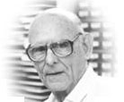
 Disney Legend O’Connor, an animation layout artist, was born June 7, 1908 in Perth, Australia. His dad owned a newspaper so the young O’Connor started his career as a reporter at the age of sixteen and then later provided artwork when no photos were available.
He re-located to San Francisco when his dad got a job with the Australian National Travel Association to promote tourism. In 1935, he saw the famous advertisement that the Disney Studios was looking for artists and he was hired as an in-betweener.
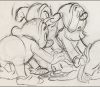
After Snow White was released, he got moved to assisting layout artist Leo Thiele and gained attention for his layout work on the Mickey Mouse short, Clock Cleaners (1937) and in particular the sequences with the vertigo inducing perspective that added to the drama of Goofy stumbling around impossible heights on the outside of a building. He violated a lot of rules of perspectives for dramatic effect that added to the suspense and humor.
 O’Connor contributed to thirteen full-length animated features including Pinocchio (1940), Fantasia (1940), Dumbo (1941), Cinderella (1950), Alice in Wonderland (1951), and Lady and the Tramp (1955).
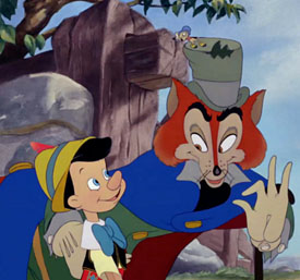
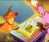
For Pinocchio, he was responsible for laying out that overhead scene from the song “Hi-Diddle-Dee-Dee” as Honest John the fox and Gideon the cat curve through the streets of the town with Pinocchio to convince him that he should pursue an actor’s life. He filmed live-action reference in a sound stage before laying out the scene.
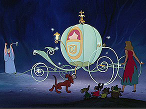
For Cinderella, O’Connor built an actual model of the pumpkin coach out of balsa wood and wire wheels and photographed it from different angles to aid in the drawing of changing perspectives of the magical vehicle. It was O’Connor who decided that the transformed coach would still have echoes of a pumpkin like the coachman’s seat would resemble a leaf on a vine as well as making the spokes of the wheels as spirals.
 In addition, he was involved with innovative shorts like The Whale Who Wanted to Sing at the Met (1946) which was a particular favorite of O’Connor’s because of the contrasts in scale, Once Upon a Wintertime (1948) and Toot, Whistle, Plunk and Boom (1953).
He was also the layout designer for the three Ward Kimball Tomorrowland television episodes: Man in Space, Man in the Moon and Mars and Beyond (as well as Magic Highway U.S.A. and Eyes in Outer Space).
O’Connor officially retired in 1974 although he found work as a consultant on such projects as the films for The World of Motion and The Universe of Energy pavilions at Epcot and the short introductory film Back to Neverland starring Robin Williams and Walter Cronkite at the Animation pavilion at Disney MGM Studios.
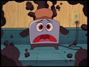 After his Disney retirement, he worked as an instructor at California Institute of the Arts (CalArts) and was the visual and color consultant on several non-Disney projects like Family Dog (1987) and Brave Little Toaster (1989). At CalArts, his students included Tim Burton, Jerry Rees, John Lasseter and Brad Bird.
The Disney company also brought him back as it did other old timers as a part-time “visual development consultant” to animation but his suggestions were for the most part ignored like his design of Ursula the sea witch for The Little Mermaid (1989) as a manta ray with the wings being a black cape.
He died at the age of 90 in his Burbank, California home in May 1998.
While O’Connor told this same information to the classes he taught at CalArts and a shortened version in at least one interview, this selection is from a lecture entitled “Designing Fantasia” he presented at the Chouinard Art School on December 4, 1959 about his work on Fantasia (1940).
Here is an excerpt from that lecture in his own words.
 “In ‘Dance of the Hours’ (with the alligators, ostriches and hippos dancing a ballet), the music seemed to break down into four sections and a recapitulation, much on the order of a symphony. Having the musical outline as a fairly clear patten, we decided to go along with that in the design motif. Our design would match the music.
“The first movement was quiet, so we started out with a quiet motif. We used verticals and horizontals, which were as quiet as we could get. The scene opened with a camera cruising down in a long hall. It moved in on a wide stage and wide, flat stairs. Vertical columns stretched high on each side.
“Ballerinas were arranged down the stairs, but they turned out to be ostriches when they stood up. The long, thin necks of the birds made more verticals, and they added to the motif. We tried to design everything symmetrical in verticals and horizontals, and we kept the colors very quiet and subdued. Then the music picked up, so we went to the ellipse as a motif for the next sequence.
“In the first movement, we showed the colonnades as verticals, but we changed the camera angles in the second movement to stress the elliptical shape. Within the hall was an elliptical pool, and the characters moved as much as possible in ellipses – that is, around the pool.
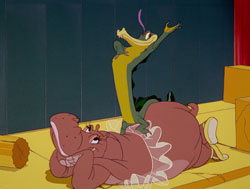
“The main character now was a hippopotamus, a rotund creature made up of ellipses, epsecially when we put a ruffle around her middle. So she was round, the pool was round, and she danced a little waltz step in an ellipse near elliptical collonades. All of this contrasted with the simple horizontals and verticals in the first movement.
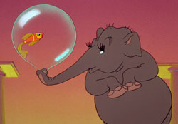 “In the third movement, the music got even faster, so we designed a more active motif, the serpentine. We used elephants, especially their trunks. We preferred elephants not only for the shape but for the way they moved, both themselves and their trunks. We tried to get more action into this movement than in the previous sequence – the pachyderms threw balloons and did silly things in a serpentine form.
“Then came the fourth section. Certainly it was the most active, so we took the most active line we knew, the diagonal, and applied it to the architecture. The simple lines of the opening that became ellipses with a change of camera angles now became slashing diagonals. Down shots and unusual angles presented the columns and colonnades in entirely new forms.
“We stretched the angularity of the bends in the hall. We introduced an alligator as a new character. He was a series of diagonal lines himself, in his basic geometry, and when he moved it was on a diagonal line out of the ground. Throughout the sequence we wanted the effect of the daylight hours changing. In the morning, it got brighter and brighter, and now it got darker in the evening. So this angular character came from the angular architecture in an angular path, and he zig-zagged about the hippo.”
 Jim Korkis is an internationally respected animation historian who in recent years has devoted his attention to the many worlds of Disney. He was a columnist for a variety of animation magazines. With his former writing partner, John Cawley, he authored several animation related books including The Encyclopedia of Cartoon Superstars, How to Create Animation, Cartoon Confidential and Get Animated’s Animation Art Buyer’s Guide. He taught animation classes at the Disney Institute in Florida as well as instructing classes on acting and animation history for Disney Feature Animation: Florida.


Ken got the last laugh I suppose. I seem to remember them revisiting a manta ray character in The Little Mermaid TV show who had a flowing ray shaped cape, voiced by Tim Curry no less!
Has Ken been named a Disney Legend yet? I feel like he should be one.